I think Google is a really interesting case study in brand identity, with many different layers. Passing over the ancillary brands (Blogger, YouTube, Android, etc.), Google maintains a very strong, clean visual brand. Chrome, Gmail, Google Drive, and Google.com all use the same typefaces and color schemes. They also exhibit the same clean lines and abundant white space. Google product LOOK like Google products.
But...
Google doodles are also an integral part of the identity of Google.com. Browsing the archives demonstrates the many ways that Google doodles deviate from or incorporate the brand identity. Yet no one is confused; it's all Google. And people actively seek out the doodles. I think it's really interesting that a major part of their identity is so unstable by design, forcing some sense of user engagement.
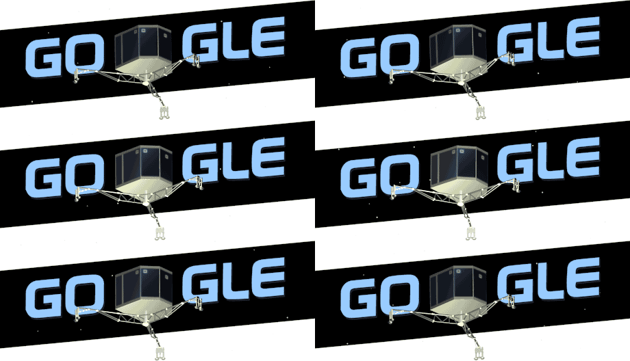
And they move fast! Right after the robotic lander touched down on the comet, the doodle switched to:
Yesterday's Veterans' Day doodle was lovely:
Other brand identities I like:
Moleskine
Tokyomilk
Andy Warhol
And I'm sure there are others that I just can't begin to think of tonight.

No comments:
Post a Comment