Saturday, October 26, 2013
Poster Advice Por Favor
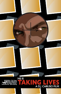
Hi guys, if I could get your opinions that would be great. I have scaled down the mans face a bit, and played with the placement. I think I found a good placement and size, but still feel like it is a little awkward (so maybe I haven't?). I have placed it in three different ways around the photos. Do any of them work? Which do you like best? Do you have any suggestions on how it could fit in with the series better? Thanks. I put the three options below. and then add the other two posters so you can somewhat see them in context. Let me know what you think. Thanks again!


4 comments:
Hi, Tracy. The scaled down guy looks great! I like the second version of Taking Lives best. I still think Amy is going to want to see the grid that the squares make be more symmetrical since your other tow posters have symmetrical patterns made by the background shapes. Have you tried a version where your squares align? They can still be diagonal, but not staggered. Do you know what I mean?
Thanks for the feedback Stephanie. The squares actually are aligned. Because they are angled it looks like they are going diagonally but if you take a ruler to the corners of any line they are exactly straight. Just wondering, but why do you like the second one the best. Brenden said he like that one best to (but I didn't listen much because he has no design background ha, you on the other hand do!) But I was leaning more towards the 3rd one. I am worried the tape still interferes or is a bit wonky in the first two... So just curious before I make my final decision
Probably way too late to chime in here, but I LOVE the third one. The slanted photos don't bother me, and I can see they still align to the grid.
Post a Comment