Wednesday, September 5, 2012

Billboards


I really enjoy creative billboards. What I like most about them is their simplicity. All the best billboards are simple. Below I've added a bunch of clever billboards and listed the various design aspects that make them great.

Readability. The content is large enough to read from a distance. When you're traveling 75 mph down the highway, it's unlikely that you're going to be able to read a novel on a big roadside board – although, I have seen this done before. The best billboards seem to have minimal content. They’ll have a website or a slogan and they’ll let the image/graphic do most of the informing. Hierarchy plays a big role here as well.


Attention grabbing. Because these billboard designs are so out-of-the-ordinary, they leave a lasting impression on the viewer. Even though they don’t have a ton of information on them, they are still informative and interesting. Like I said earlier, they are simple, but they make a strong statement.


Call to action. While some of these billboards don’t have a call to action written out the billboard, it clear what the company wants the viewer to do. In McDonald’s case, for instance, they’re asking the billboard viewer to eat at the restaurant. It’s not stated on the billboard itself, but the clock tells you what you could be eating at that time. 


Sometimes billboards only have a website listed on the billboard like quitplan.com. If you’re a smoker and you want to quit smoking, this billboard tells you where you can go to get help, but it's super simple.


RE: First! A Note on Authenticity

I stumbled upon this website for a consulting firm based soley on Authenticity. It's name--Authenticity, A fresh consulting affiliate.

http://authenticity.net/authenticity.html

I actually laughed when I read the name. Authentic, I guess. The website is creatively developed and extremely user friendly. The pictures go exactly with what the words mean. Balance = a pile of rocks balancing on each other. But then I looked into the actual meaning of the content they were listing. It's pretty simple. Straight to the point. It explains the meaning of authenticity. The importance of haaving it. The success of what will come to you if you follow their lead. In fact the opening page is an advertisement for them. It asks the simple question "Brand Anxiety?" and lists their phone number along with other little tid bits of information. Overall, I think it's a site that many could find useful. Maybe you don't want to give them your business, but at least go there, answer the listed questions, and maybe you can find a cure for your brand anxiety to become more authentic.

P.S Please pay attention to the Authenticity logo in the left hand corner. haha

Re: Authenticity

This is a really interesting topic. Many people look to other designs or designers for inspiration and I think that is a wonderful thing. As long as you are not copying their design directly but only using the parts you find interesting or what would make your design really speak to others, you are doing ok. I am constantly looking at other people's work including my friends. Sometimes they have learned a trick that I haven't yet but would love to use in the future. This is certainly a way to find what your voice will be in your design career.

Besides looking at other designs I am always looking at other photography and breaking it down to see how they created the photograph. I don't take the entire scene and copy it, but I pay attention to the light and dissect how they created the highlights and shadows and I pay attention to how the model is positioned and what that does to the body. I might not be original in my lighting process but it is helping me to build my repertoire and move forward in my career.

RE: First! A Note on Authenticity

I'm not sure it's possible to not draw some inspiration from others' designs. Like Marie said, this doesn't mean that our ideas aren't authentic unless we blatantly copy it. I think it's important to look for similar examples to what we are working on so we know what's been done, what works, and how we can move in a different direction.

This argument on authenticity made me think of a season of Project Runway in which a designer, Kenley, continually received comments on how her designs reminded the judges of things they'd seen before. Every time this was brought up, Kenley claimed that she rarely looked at other designers' work and did not knowingly copy ideas. One of the judges' accusations was saying that a wedding dress Kenley designed was too similar to an existing one by Alexander McQueen.

Here is an image comparing the two dresses. Alexander McQueen's is on the left, and Kenley's is on the right. Both dresses have the same silhouette, are made of feathers and tulle, and are a nontraditional off-white.


Assuming Kenley was telling the truth about not knowing of the original dress, this example shows how important it is to know what designs already exist. Even if we unintentionally copy someone's design, we wouldn't want to be accused of plagiarism or being unoriginal. The more informed we are as designers, the better and more authentic to ourselves our work will be.

Tuesday, September 4, 2012

RE: First! A Note on Authenticity

Authenticity matters to those who are already attached to a product but for newer customers, it's pretty worthless. If a company is willing to depart from a successful look and commit to a new one then it won't matter (see: Pepsi). The problem is when they pretend their previous (and highly visible) rebranding efforts never happened.

I grew up a fan of the Buffalo Sabres, a NHL franchise from my hometown. Through a short lifetime of watching them, I've developed a confused sense of their image and what 'feels' authentic in the way they present themselves.

So have they.

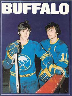
The team had the same uniforms for their first 26 years (I started following them during season 25).


For season 27, they moved into a new arena with new ownership and got rid of their blue and gold for red and black (see below). They got rid of their crest for something that resembled an angry goat's face. They also switched their typeface to a very mid-90's macho pro sports look.


Eleven years later they went back to their old colors but with bolder shades, a stylish neo-modernist typeface, and an object people called 'the slug' (below).


Five years after that, they decided their image was best when presented as something bearing rich tradition. So they switched back to their original uniforms with very minor adjustments (below).


And then to overcompensate, they created a third jersey that referenced all sorts of historic elements- many of which had nothing to do with the team's history (logotype, nameplate, four gold stripes instead of 3, stitched numbers, a mini crest with '1970' on it).


My personal imagery of them is a blur since I've experienced each look for similar lengths of time. They feel interchangeable even though each phase came with different meanings (intentional or not). For the franchise though, they now commit to the original look (and have decided to scrap the fake historical uniforms). This means that red and black goats are hard to find in the arena, on merchandise, or on any printed material. A 160-page photography book to celebrate the franchise's 40th anniversary includes exactly 8 pages with photos from the red and black era despite the fact it represented a quarter of the team's history and a particularly successful one at that.

The current branding policy cements its image in the pursuit of authenticity but it ends up as wholly inauthentic. While previous decision makers can be blamed for succumbing to the wild sports design trends of the '90s, ignoring the phase means creating a false, excessively curated image in the pursuit of a historic one. The team has already set the precedent that it is a franchise open to progressive rebranding, the sudden shift to one of rigid history can't help but feel fake.


RE: First! A Note on Authenticity.

I originally posted this in the comment section, but after re-reading the syllabus, I think Amy wanted us to respond to the blog posts with separate blog posts, (that's what we did in the last class I had, so I'm going for it)


Echoing Jen Roche’s point, about the collaboration of design, I also think looking to other designers and their work for inspiration doesn’t mean your work isn’t unique – unless, of course, you completely copy it, kind of like the weird cereal brands in the grocery store on the bottom shelf.

But Jill’s point about not being swayed by trends is spot on (ask Amy about the use of distressed typefaces). You want to design something that people will like and relate to, but something that stands out from competition.

When you incorporate too many super trendy elements into your design, you are limiting its shelf life and also possibly changing the entire meaning of the message you are trying to convey, perhaps even in a subtle way that people can’t really put their fingers on.

For example, take a look at President Obama’s campaign this year and the typefaces and color palette selected. Hand-drawn typefaces (even ones that aren’t actually hand-drawn but are meant to look like it) seem to be the super trend du jour, coupled with retro color palettes reminiscent of the early days of advertising. When I first saw it, I remember liking the typefaces but also kind of frowning at the same time and thinking that something was just … off.

And then I came across an article by Alexandra Lange of The Design Observer Group that hit the nail on the head:

http://observatory.designobserver.com/alexandralange/feature/obamas-new-fonts/35148/


“Rolled out during the president's recent Midwest bus tour, the fonts were chosen to present the Obama 2012 campaign's new slogan, "Betting On America." This only counted as political news because "America" was set in what looks like Revolution Gothic Extra Bold, from MyFonts, described as follows:

The original font is inspired by retro propaganda posters and wallpainting in Cuba from the 60s to 80s. And the original PAG Revolucion is the most popular font from Prop-A-Ganda. In other words: a Communist typeface conspiracy theory in the making.”

Lange asserts that President Obama is trying to create an image of reliability with the middle class and portraying his opponent as an “out of touch rich guy.” He also wants to portray a modern look and feel to attract those millions of young voters who voted in the first election.

“The curved square corners, the low-riding bar, the slanted ends of the arms all suggest a pre-digital, possibly hand-drawn typeface, not 1980s but 1940s [or maybe 1920s]. When paired with the script [identified in the comments as MVB Mascot, designed by Mark van Bronckhorst in 2012], the combination suggests to me early advertising, printed but "personalized" with a script message. My first thought was fruit crate labels, which often combine block letters, script, and images of fruit orchards and fields. What could be a better association for a trip to the heartland in summer, when strawberries, if not apples, might be consumed? […] And yet, something is missing here. I see the possible references, but the result is mechanical, cold.”

I understand Lange’s point—about the somewhat forced “down home” feel, especially with the stark color palette and absence of context. I could definitely imagine this typeface on a crate of peaches. It almost feels a bit like pandering with that nostalgic look. But I suppose that’s what politics are – a never-ending game of pandering, so in that respect it’s appropriate.

There's nothing wrong with the design per se, -- I think the pairing of the typefaces is great --  I just don't get any of the emotional feelings that the designers were so clearly trying to elicit. It kind of has the opposite effect, because I am aware that they're trying to manipulate my emotions.

Monday, September 3, 2012

RE: A note on authenticity

Authenticity is a grey area. Who is to say what is truly authentic when it comes to design? Henry Ford was a major designer and innovator for the transportation industry. Was he not authentic because the tire wasn't his design? No, in fact the opposite is true. With the collaboration of design, something amazing was created that wasn't fake at all. Pulling inspiration from others doesn't mean you aren't authentic, it just means you may have to mold it, tweak it, and develop it a little more to get what you want...and to turn heads.