Thursday, October 29, 2015

Netflix & The Stack


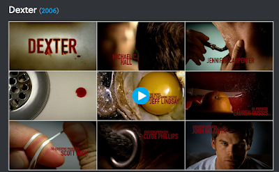
It seems like Netflix’s new global brand identity has been popping up in many of my design-related emails the past couple days, so I decided to check-out what all the fuss was about. Since the brand is so broad and has become much more popular in recent years with their original series domination, they hired Gretel to rebrand and unify everything. Something cool to note is that they did not change the logo – just the material and communication pieces. Gretel’s solution? Something they coined, “The Stack.” It is: “A visual metaphor and an identity system in one. It implies both the infinite, ever-changing catalogue and the custom-curated selections that make up the core of the Netflix service.”

Here’s Gretel’s Full Description:

Our solution: The Stack,

The Stack is a visual metaphor and an identity system in one. It’s an endless, living catalogue of shows and movies. The stack implies two ideas at the heart of the service: selection and curation. Netflix is both catalogue and curator, calling forth and constantly updating selections custom-tailored to users.


As an identity it’s distinctive, clear, infinitely variable and easy-to-use. It can scale to any size and translate to any platform. It works in motion, print, digital and out-of-home. It’s just as effective in Times Square as in Powerpoint. It connects everything the brand touches, internally and externally, and the brand ‘volume’ can easily be turned up and down as needed.

Watch:

Netflix Branding: Brand Hub from Gretel on Vimeo.


The rebrand seems to be very celebrated among designers as far as I can read right now. For a brand that was kind of all over the place and without a clear home in the market, this seems to really tighten everything up, moving it into a strong future as a company with a real presence.  In addition to implementing The Stack into promotional material and processes, they came up with the new tagline to go along with it, “See What’s Next.” They even integrated the re-brand slowly over time so that audiences wouldn’t be shocked by the change. 

Check it out. I think it’s pretty awesome and designed very thoughtfully, even when it comes to the balance of information on different “cards” in The Stack. I love that they crop the logo but still keep it recognizable in some cases. It’s just so versatile. I think it really brings home the point that simple is smart. 

What do you guys think about The Stack and the new identity? I have never heard of naming your brand concept before – but it’s an interesting tactic and a catchy thing for bloggers to talk about, for sure. Have you ever seen anything else like that (naming your branding tactic)? The only other thing that comes to mind since I spent so much time with it, is Airbnb – they actually named their logo the Bélo and it has a clear community/visual-communication concept/purpose behind it.

Charlie Feedback

Shannon --

This is looking awesome. The book cover is very eye-catching and modern, even though you are dealing with a standard "type" of book cover. I like the contiunation onto the back of the book. Maybe pull "My Autobiography" up a bit? Or something -it's a little hard to read/gets lost.

The only other thing I wanted to mention is that on the "Now Playing" Screen. I think the body type could come down a little in size and the authors of the quotes could be moved to left aligned. My eyes kind of bounce all over that page. Other than that, I think this is coming together really, really nicely!

Wednesday, October 28, 2015

re: tv show logos

Spike tv show logos usually go well with the featured show, considering the audience and the extreme content. Each show has a flashy intro with some special effect imposed over the logo, telling you exactly what to expect. Flashy decorative logos, and slabs serifs are the preferred typefaces on this channel.


I'm not a big fan of the rebranding of Spike, but it don't think it will make much of a difference to it's audience.


Tuesday, October 27, 2015

Re: TV Show Logos

I was a longtime fan of the  Showtime show Dexter and I always admired the awesome design and directing of their opening credits and the attention to detail of the logo. If you haven't seen it before, check it out below/read about the process. The show (a drama about a likable forensic/blood spatter analyst scientist who happens to be a bad-guy-only-serial killer) opens with mundane morning routine tasks turned gruesome-looking and ends with the blood spattered logo name:
http://www.artofthetitle.com/title/dexter/ 
 
Since we are just talking about logos, I'll focus on the type. Above, you will notice they use a more life-like looking design as well as a cleaner and a not so clean Dexter logo, which always resembles blood in some way. They are all used interchangeably with promos. While the blood splatter is an obvious nod to the show, I appreciate that the typeface itself is a clean and strong sans-serif, yet almost feels swift and somewhat sinister. Dexter is methodical and strong and his "kills" are well planned like an animal tracking prey. The treatment and the color work very well for the tone of the show. Additionally, the logo also perhaps shows that he is trying to hide who he is (his "dark-passenger" as he describes in the show) underneath his well-put-together nice guy persona. Kudos, Dexter designers. Now, change the series finale.


throwback shows

I just searched through all of the tv shows on Netflix looking for what stood out. The answer: not a whole lot. Most are the same and didn’t inspire me to jump to action. The ones that caught my eye were the throwback shows. Also, holy crap there are a lot of shows, and so many I’ve never even heard of!

Have you ever heard of Metastasis? It's the Spanish version of Breaking Bad. Cute, huh?


Or who remembers MacGyver? This guy was so 80s it's not even fair. The font they used looks like it could say "Excalibur" or something related to Knights.


Or what about Quantum Leap? See how clean they try to make it look here? It's like they took the original typeface and tried to make it look all sleek and still relevant. 


And one of my favorites:

la la laaa laaa la. 

Airwolf's was pretty bad, but the helicopter in that show was sick:


And last but not least:


Ugh, those R's and that M are pretty terrible. I can't believe I never noticed how bad it is.

There's not a whole lot I have to offer about these logos. After shuffling through about 400 of them, I was unmoved. I guess it's because I can associate these logos and shows with fond childhood memories. I also love Seinfeld, but that logo isn't winning any awards. With tv it's more about the show itself than its logo I think. Nowadays, the only way I'm trying a new show out is because of word of mouth. Does anyone else feel that way? I won't just randomly watch whatever's on NBC at 8:00 PM. The only shows I watch now are reruns of Seinfeld, the occasional Jeopardy, and a Netflix series when I can squeeze it.

Monday, October 26, 2015

Charlie Chaplin Feedback cont.

Here is what I have for my book cover and ebook. Again, any feedback would be appreciated!!


book cover


ebook cover


icon


ebook menu


ebook linear read


ebook movie trailers

TV Logos

After reading Laura's post about how It's Always Sunny never changed it's logo or opening scene, I did some research on the progression of tv logos that have changed. The first article I found was of Pentagram's redesign for The Tonight Show Starring Jimmy Fallon.


The decision to go with the full moon was based on Jimmy's fresh new take on the show, creating a full circle emblem that could be used as a photographic logo or a flat image. 

The Tonight Show is one of the few shows that has a good reason to rebrand when they hire a new host. For other shows, subtle and gradual changes may work, but it probably isn't a good idea to create a completely new logo or look.

Charlie Chaplin Feedback

Hi guys, so I made a little progress on my website and logo. Since I won't be in class this week, any feedback would be greatly appreciated!!! Hopefully I'll have my ebook up soon.


Logo


 This would be the opening page highlighting the featured film.


This would be the page that shows all titles of production company. When you hover over a photo, it screens the blue.


Once you've selected a title, this is the page where you watch the trailer.


About page.

Re: TV Show Logos

I can't talk about TV shows and design without mentioning my favorite comedy of all time--It's Always Sunny in Philadelphia.

To truly appreciate the show's typographic and design aesthetic you have to know the show's origins. The original pilot (never aired) was shot by the actors themselves using a digital camera and cost less than $85 to make. The creators shopped it around until FX bit. After they were picked up, these three actors who had no significant acting or production experience whatsoever were somehow allowed to be the show-runners but were given a scant budget. So what did they do? They used open-sourced and public domain materials, including the font for the opening credits and all the musical scores. Rob McElhenny and Glenn Howerton even shot the opening credits on their own digital camera. The show, which is now the longest-running live action comedy on cable TV, has retained ALL of these low-budget elements despite becoming hugely successful. I'd like to think the show kept all these things not for recognition's sake (shows change opening credits all the time, especially after becoming popular) but because they work so well with the nature of the show while paying homage to the show's roots.

What I also love about the show is how it is promoted each new season. Because like Senfield, it's essentially a show about nothing that doesn't always carry over story lines, the characters become like a blank canvas that they use for different motifs each year. I LOVE this because it almost creates an entirely new mini-story distinct from the actual show. It works because it's humorous and zany and offbeat, just like the show. It's wickedly creative, and as a big fan, I always look forward to it. Although, I will say this year's new trailer has come out but not the entire promo package. I hope they haven't abandoned this concept.

2014-15 (glam rock)

2013-14 (French new wave cinema)
2012 (80s sitcom/campy)


2011 (mini series drama)
 

2010 (babies?)