Off topic but funny:
LOOK
Wednesday, September 30, 2009
Monday, September 28, 2009
unfinished
After many revisions i decided to go with the flat sides on the letters of the ahp logo. It looks cleaner and the straight lines offer a steady foundation which serves as a good metaphor. The round edges give the logo a wobbly feel that doesn't represent the stability that the foster homes provide.

So the further i am good with the "ahp" portion of the logo, the more i want to change the "half heart." I realize there are hundreds of possible styles and i'm trying to narrow it down to the best one. If anyone can provide some feedback as to which of the below may be working or not working, i appreciate it.
Free textures
I'm not sure if anyone needs textures for their designing, but this seems like a good resource. I need to create a distressed look in illustrator to give my Big Bad Wolf logo some legitimacy. I think I'll find what I need here to get started. It's intended for Maya users, but who cares?
Project 2 DVD Packaging Design


So I am just trying to decide which DVD box to redesign for the second project. Two movies boxes in terrible need of a redesign are Children of Men and Last King of Scotland. I am particularly draw to these two movies not only because the current designs are so unremarkable but more importantly they're very misleading. The Children of Men cover doesn't tell you anything about the movie, except that you can imply it's a Clive Owen action movie and it is. But if you've ever seen the film, its real focus are the deeper political and sociological themes (hope and hopelessness, immigration, the global wealth gap, etc). As for the Last King of Scotland, it misses the mark entirely. I honestly find this box to be comical. It looks like the movie is this inspiring, feelgood Forest Whitaker biopic, and it's most definitely not that. Last Kind of Scotland is a challenging and at time frightening depiction of a cruel but complicated dictator.
Anyone seen either of these?...
iStock to Sell Logos
On the lookout for inspiration for project one, I stumbled across a blog post on Logo Design Love, which also touches on 's theme of policing copyright. Apparently, iStock plans on selling stock logo designs in 2010 and to make the practice even more deplorable, they are advertising that they will pay designers $5 for every logo uploaded to their site.
With designers in an uproar, iStock went on to make this guarantee:
With $5 logos, I will be interested to see how many copyright lawsuits are filed next year.
With designers in an uproar, iStock went on to make this guarantee:
“Files purchased and used in accordance with the iStock license, will not breach any trademark, copyright or other intellectual property rights or rights of privacy. We’re calling it the iStock Legal Guarantee and if a customer does get a claim, iStock will cover the customer’s legal costs and direct damages to a combined total of $10,000. Here’s the best part: it’s on us. Starting Wednesday, every iStockphoto file automatically comes with a free Legal Guarantee.”
With $5 logos, I will be interested to see how many copyright lawsuits are filed next year.
Saturday, September 26, 2009
Popular Logos with Hidden Symbolisms
Relevant stuff/inspiration
http://sixrevisions.com/graphics-design/popular-logos-with-hidden-symbolisms/
http://sixrevisions.com/graphics-design/popular-logos-with-hidden-symbolisms/
Random musings
Kristin: Great post. I had no idea about these new font rules, but then again I haven't been doing alot of web stuff either. That obviously will open up a world of possibilities for companies making typeface decisions in their web design. One thing you can always count on staying the same in business: things change and evolve.
2nd project idea: Well, it was Brew magazine, but I did some additional research and found an existing "Brew" magazine, but is has suspended publication of the magazine, pending it's sale.... to me (okay, just kidding). It is actually being sold, but I don't know when their website was last updated, so who knows if that is still accurate. It may as well be defunct. Anyway, their tagline is (er... was): "Traveling America's Brewpubs and Microbreweries" which is pretty much indicates the same audience I was targeting. Looks like it's back to the drawing board...
Here are the pepsi logos (2 of many) I brought up in class. I was wrong. The circle on the diet pepsi isn't skinnier, it's the line in the circle that's skinnier...like "hey, the line got skinnier just by being on this diet pepsi can":


Friday, September 25, 2009
Typography and Copyright
I don't know how many people are familiar with the new @font-face CSS rule now available for the most recent versions of FireFox, Safari, Opera, and Chrome, but it's been a revelation to me this week. If the letters C-S-S make you want to stop reading don't worry, this isn't a post about code. But to give you some background in case you haven't heard about @font-face, it's a CSS code that allows web designers to embed typefaces. With @font-face visitors do not need to have the fonts installed on their computer. Instead they are loaded from the site itself. This kind of technology would make it easier for companies like IKEA to use the same typeface across all media without having to resort to Verdana. If the technology takes off it could mean the days of only being able to use 11 web-safe typefaces could be behind us.

The catch? Most font foundries are unwilling to allow their typefaces to be embedded, fearing the fonts could be downloaded and used by anyone. They are want some kind of digital rights management (DRM) before they will get on board. [If you're not familiar with DRM, it's a term for technologies intended to restrict the use and distribution of digital files] As a person who hopes to one day be paid for my ideas, I can appreciate the dilemma the foundries are facing, but I really question whether DRM is the solution for two reasons. The first being that, font files themselves don't use any kind of DRM. Files can be copied and distributed to anyone. I have worked at companies where typefaces are routinely sent from designers to editor, typesetters, and printers. I honestly don't know if this is a violation of the end-user license agreement (I suspect it would depend on the agreement), but I don't think it's an uncommon occurrence. The point being that if someone wants to get their hands on these fonts for free it's not very difficult to do so. The industry already depends largely on the honor system and has for sometime.

My second objection is to DRM in general. Typography is facing the same challenges as other creative media--how to successfully monetize the sale of electronic content without risking unauthorized distribution. However, the trend in music at least is moving away from DRM (iTunes announced in January of this year that they would be doing away with DRM on their content while Amazon abandoned the use back in 2007). Why? Because while it discourages casual copying, it is ineffective at stopping someone who is determined to circumvent it. And it does so at the expense of loyal customers who are then restricted in how they can use the content.

I don't expect foundries to give away their typefaces for free, but I would like to see them extend the licensing agreement to include embedding fonts for the web. After all restricting how I use the typefaces I paid for because someone else might steal them doesn't seem fair. I understand that embracing this new technology and making fonts so accessible is risky, but I think foundries that are willing to embrace what could be the future of web design will find themselves better off for having taken the risk.
I don't know. Any thoughts?
The images I included come from this site, which uses a number of interesting quotes from various parties on the pros and cons of the technology to demonstrate some of the best free fonts currently available for @font-face embedding.
Some other interesting (and spirited) articles on the topic:
CSS @ Ten: The Next Big Thing
The Potential of Web Typography
21 Awesome @font-face Embeddable Typefaces
Fuck the Foundries
Free Fonts Manifesto
Thursday, September 24, 2009
A few things:
First, I'd like to say thank you to Bob-- I am currently saving my work a catrillion times a second juuust incase my computer internally combusts. Of course, this didn't save me from Monday's not so happy accident when I pushed moved the MAC screen in the lab juuuust enough to see the screen perfectly, but also just enough so that the power plug could fall out the back. Thank you Bob....you've jinxed me.
On a brighter note, did anyone else go to the "Find a Design Job" talk on Tuesday? It was funny to me how much a really did know already about finding a design job, setting up my portfolio, and other smart tacticts. Yet, when I was ready to frown on the fact that he hadn't told me anything I hadn't heard before, I realized that reguardless if I had heard the topics and suggestions before, I was yet to put them all to good use. What I'm getting at is, we can have all the tacticts, and information and rules on just about anything, but they are utterly useless if we never use them. Just think: where would you be if you used all the skills and suggestions that you've ever been told. (Well, the good ones anyway.) I wish I had a simple conclusion to this for everyone, but other than pure persistance, self-modivation and lots of self-discipline, I don't know of any shortcuts to using all your knowledge-resources to reach your potential.
Any suggestions?
Project Two: DVD

It sounds like a lot of people are opting to do the magazine assignment for Project Two. I was thinking about doing the DVD redesign. I've spent a lot of time this week just trying to pick a movie, which has been harder than I thought it would be. I blame it on the Criterion Collection. They have been re-releasing great movies with outstanding design. I found this site that has a listing of some of their best work. Hopefully, you'll find it inspiring, especially if you opt to do the DVD packaging...
Simplicity in design
Great article about the simplicity of design from RISD President John Maeda.
http://www.huffingtonpost.com/john-maeda/technology-design-apple_b_291748.html
Articles like this make me smile. When simplicity in design and functionality are incorporated into products or projects everyone benefits. Sometimes, as a problem solver, I have to remind myself that the simple solution usually is the best. Simple usually doesn't mean the easiest or the first, but on the contrary, it can be the hardest and most elusive to conceive. Great innovators like Steve Jobs of Apple and David Kelly of Ideo know the importance of simple solutions, getting to the root of the problem and developing real, functional and timeless solutions. We should all emulate this philosophy as designers. Sounds easy enough.
Second Project
For the second project I want to design a magazine about "stylish food" for young urbanites, like Bon Appetit for a younger crowd. Still fleshing out ideas, but I think it will be a fun project. I am thinking of calling the magazine "Haute Cuisine" kind of a play on phonetics. I will bring a few ideas to class tonight.
Logo Design Tutorials
Here are 100 of them.
http://icon-library.iconshock.com/design/100-best-logo-tutorials/
http://icon-library.iconshock.com/design/100-best-logo-tutorials/
director choice: Catherine Breillat
For project 3, I'm using a French director, Catherine Breillat, who makes strange, dark films about love and sex. Front-runners for movie choices: Romance (1999), Fat Girl (2001), and Sex Is Comedy (2002). The critical response to her work is pretty mixed, and I don't unreservedly love it myself, but it does interest me. Some of it gets pretty steamy (such as Romance, which explores a young woman's sexual adventures after her narcissistic model boyfriend stops sleeping with her). Some of it is drier and funnier and almost anti-erotic (such as Sex Is Comedy, which focuses on a film director's frustration with her uncooperative actors as they keep botching a pivotal love scene).
So the poster presents a challenge--broadly speaking, sex and the body are the common themes I'm working with, but I definitely don't want the poster to come across as overtly sexy. Suggestive, sure, but it shouldn't scream "sex." I think using illustrations instead of photographs might help with that.
Wednesday, September 23, 2009
Social Networks
I believe in them.
Follow me on Twitter: http://twitter.com/YouKnowBobbyG
&
Join me on LinkedIn: http://www.linkedin.com/pub/robert-gillespie/10/163/9aa
Come network with me.
Follow me on Twitter: http://twitter.com/YouKnowBobbyG
&
Join me on LinkedIn: http://www.linkedin.com/pub/robert-gillespie/10/163/9aa
Come network with me.
David Lynch
I'm using director David Lynch for project 3. I find his films interesting, wild and insanely creative. I've chosen to use Blue Velvet, Lost Highway and Mulholland Drive as my three films to work with. If you haven't seen these pictures, I would suggest you find the time. They are by no means mainstream, but as creative types we can embrace what's different. It also seems that watching Lynch's movies can make you smarter:
http://www.sciencedaily.com/releases/2009/09/090915174455.htm
If this is true, I'll be even MORE smarter in class this week.
http://www.sciencedaily.com/releases/2009/09/090915174455.htm
If this is true, I'll be even MORE smarter in class this week.
Tuesday, September 22, 2009
2nd Project Idea
I have an idea for my second project. I'm announcing my rough ideas now so I can save a little time from explaining it in our crit on Thursday when I hope to show some graphic ideas for it. I'm doing a magazine on beer, and my initial plan is to call the magazine BREW. I took Magazine Design last semester with Bert, so I'm hoping to leverage some of that experience. I think this is a great opportunity...colors are nice and fall-like. Deep dark browns, tans, ambers, blondes, etc. Departments might include "Regional favorites", "Brewery Spotlight", "Recipes", etc...I need to do some additional brainstorming to flesh-out some other ideas...but the thoughts are flowing on this.
I'm pretty excited about the possibilities and I think it would lend itself to a web presence as well...we'll see where this goes.
I'm pretty excited about the possibilities and I think it would lend itself to a web presence as well...we'll see where this goes.
Circulon
Just recently I went to Macy's to buy new pots. I was looking for good quality because the ones I usually buy, are horrible to cook in after a couple months. The representative there was telling me that circulon was good..blah blah..to make a long story short, I bought the circulon pots. But as I'm looking at their logo and looking at the pots, I realize that everything goes together. If anyone else has circulon, you would know that the bottom of the pots has a raised circular design on them (which the lady told me is designed for distribution of heat). Also the logo are full and half circles and the most obvious, their name Circulon. I've never noticed it before, but that is one brand that is completely consistent with their designs. From my understanding no other company that makes cookware has the raised circles, but if it's designed to distribute heat evenly why aren't all companies using it? Maybe that's just a way to tell the brand without actually having to see their logo, which a lot of other companies do. I thought this was interesting because it made me think of Project 1 in redesigning a logo. Making something consistent, cohesive and recognizable makes for a good design, or at least a good start.

AVA Book on Visual Comm
This is the text I was referring to in class last time. I highly recommend it. This is the text we used in Ed's Theory of Visual Communication class and, just as Amy pointed out, having an understanding of VC will help you talk the talk about your work, ideas and reasoning behind it all. That def. comes in handy when interviewing, talking with other designers or speaking with clients.
Visual Communication: From Theory to Practice by Jonathan Baldwin and Lucienne Roberts
It is on Amazon for about thirty bucks.
Visual Communication: From Theory to Practice by Jonathan Baldwin and Lucienne Roberts
It is on Amazon for about thirty bucks.
Link to article
I found this article on Identity Forum.
Top 10 identities that should never change
http://www.identityworks.com/forum/logo-design/top-10-identities-that-should-never-change/
I found it interesting.
Top 10 identities that should never change
http://www.identityworks.com/forum/logo-design/top-10-identities-that-should-never-change/
I found it interesting.
Talk Tonight
I don't know how many of you have ACTUALLY read the emails flying through your inboxes but there is going to be a talk to night in the business center auditorium that might interest you. Dan Shub, a partner at SDYM, a long standing design firm in town, is going to talk about finding a job. The talk is tonight (Tuesday, 9/22) from 6-7:30. It's free. I think it might be worth your while.
:D --a
:D --a
Monday, September 21, 2009
Director-Blake Edwards
Right now I am leaning towards Blake Edwards who directed Breakfast at Tiffany's, the Pink Panther, and Victor/Victoria. Still need to watch a few more of his movies.
Rebranding London
Upon reading Elaina's post, I was inspired to research more examples of rebranding. That's when I stumbled upon this, a blog post referring to an RFP for rebranding London. How cool is that?
Moving Brands, a firm that specializes in branding, is one of the many firms who applied for the project. They created a blog called "A Brand for London," to document their work and collect input and ideas from the public to further their design process. Here is the link to their submittal. Unfortunately, they did not get called back, but it is still worth a look.
 Also, if you are looking for a good book about rebranding, I recommend The Brand Gap by Marty Neumeier, its an easy read with a lot of great advice.
I was searching around the web using the Ronald McDonald House as a reference because it seems to be one of the more "franchised" charities. I found that some RMH's in various areas usedifferent logos. They all seem to be spin offs of the "official" RMH logo, but i wonder why the just dont all carry the same logo and just signify with a geographical reference? I bring this case up because the Aunt Hattie's Place re-branding I chose may be an organization with franchising opportunities in its future, and I want to be able to add "Baltimore, Pennsylvania, etc... with out obstructing the logo. Should I be thinking that deep into it? I appreciate any feedback....

Sunday, September 20, 2009
List of Directors - Third Project
I really want to work with Michael Gondry, and the three movies that I'm thinking to go with are The Science of Sleep, Eternal Sunshine of the spotless mind and I have to look for the third movie. I will watch Be Kind Rewind and Human Nature this week and choose one. I will choose the one movie that best represents his style and manipulation of mise en scene (typically does not represent a realistic setting).
My other option is Jean-Pierre Jeunet, he is probably most well known for directing Alien:Resurrection but he has made a trio that I really like to work with Delicatessen, The City of Lost Children and The Fabulous Destiny of Amelie Poulain. The style of the movies is CineFantastique and they are crafted with so much imagination and fantasy that is a good place to start.
If none of these options work, I will work with Tim Burton movies, Beetlejuice, Big Fish, Edward Scissorhands or Charlie and the Chocolate Factory. His directing style emphasizes the other side of human nature, sometimes dark but I really like it.
Any thoughts or advise would be appreciated.
Saturday, September 19, 2009
Director
My Director is Oliver Stone. I'm going to watch some of his movies to refresh my memory about a few things, but my theme right now is focused on his directing technique and how that causes tension in his violent movies.
Friday, September 18, 2009
response
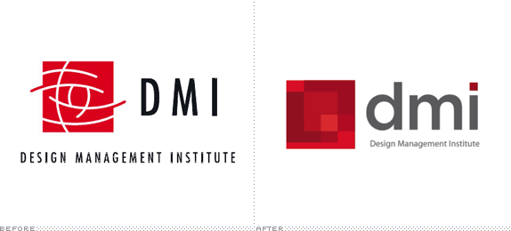
Great samples of re-branding Elaina! I'm especially unimpressed with the DMI logo. You'd think a design institute would come up with something a little more provocative. Love the Nonprofit Finance Fund...they've muted the bluish-gray and pumped up the gold to liven the sucker up, not to mention the good contrast between the corporate/cold branch on the left and the organically-shaped blossom on the right. The modernized font makes it less hoity-toidy as well. Nice.
On an unrelated note, I took a tour of Pavsner Press over by Golden Ring Mall on Wednesday before my Designer's Survival Guide class. The tour is actually a requirement of the class, but I had an easy "in" because my step-brother, John Ermatinger, works in Sales at Pavsner. That place is just awesome. When you first walk in, it's like you walked through a time-warp to the 1950's...the front office consists of small "cubes" and everyone in one room (Much like the Office..btw, people say I look and act like Andy Bernard, but that's a story for another time). My tour took me through the part of the building where all the old equipment was and where a bunch of guys stood around stripping plates...a process which is now obsolete. Now proofs are made off of the "stripped and ripped" files. This process is done in lieu of working off of the native file and allows the printer to make adjustments to satisfy their printing requirements. After finally reaching the "Quality Control Room", a very well-lit proofing room where clients are brought to sign off on jobs, we entered the 21st century. Pavsner has 3 Heidelburgs...the best press in the world. On top of this, all 3 are Speedmasters, which means they are souped-up, and then on top of that they run on the Autoplate system, which means they require no manual feeding of plates and hence are considered the Bill Gates/Donald Trump models. One press is a 7-color 40 inch press, another a 2 color 40 inch press, and the last a 5 color 29 inch press. Another thing that was awesome to check out was the book-binder and how that whole process works. I realize as I'm typing this it probably doesn't mean much unless you are there in the moment seeing these things, but man were they impressive, and I couldn't jot stuff done fast enough.
While I was there I did ask John if they use synthetic inks, etc. He said they've been using soy-based inks for 10 years and went on to explain how they comply with all the green concerns. I'll say this...he's in Sales and it's a popular question, so he knows his stuff. The most surprising thing, and probably because I just have never really sat down and thought about it, is that it's less environmentally-friendly to use recycled paper because no one wants yellow paper or paper with brown specks and so the chemicals used to bleach the recycled paper and the old ink that's extracted go right back into the...you guessed it...environment. I won't bore you with other details on this discussion about environmental-concerns, save to say he knows an awful lot about the history and the politics of printing. A very interesting and enlightening tour and I highly recommend it, regardless of class requirements now or in the future.
Nard-Dog out...
Redesign
What makes a great redesign? 


Yes, there are some obvious things to avoid doing, i.e. Tropicana, but a subtle change in typeface or colour can make the biggest difference. I think our crit last night was a great start to this topic. It helped us get those creative juices following, but it also helped us to look at design from someone else’s standpoint.
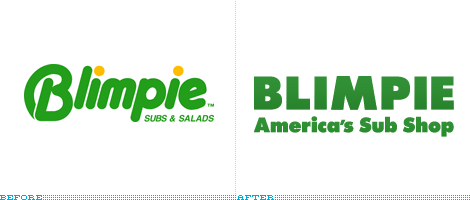
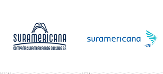
On that note, I found some example of both non-profit and corporate redesign. Posted below are several examples of redesigns, what is your take on the redesigns? Personally, I like the Non-Profit Finance Fund. The content is much stronger and it is a clearer concept, and a better typeface. I also like Suramericana, it was never change before, and it was time for it to be done. (FYI, the company is located in Colombia). The worst on this list is Blimpie, what happened?
Thursday, September 17, 2009
Motley crew of directors
So, I was originally thinking about going with Robert Altman, and the three movies I was going to go with are Nashville, Short Cuts, and Gosford Park. All three deal with the interconnectedness of people.
But I have a couple of other directors I am still drawn to, including Billy Wilder. Of his films, I was thinking about three of his film noirs--Double Indemnity, The Lost Weekend, and Sunset Blvd. Because they are all of the same genre, there are a lot of common themes, styles, and elements and might be an easier pick.
I also thought about doing Hayao Miyazaki who directed a number of excellent Japanese animated films--Princess Mononoke, Spirited Away, and Howl's Moving Castle--or David Cronenberg, a sci-fi/horror director whose films often focus on the contrast of technology and the natural. There are so many to choose from, including Scanners, Videodrome, The Fly, Dead Ringers, Crash.
I guess I am leaning toward Billy Wilder at the moment, but your thoughts are much appreciated.
Typophile Film Fest 5 Opening Title Sequence
Does any one else ever read Typophile? Being one of those type geeks alluded to earlier, I'm a fan. It's a great resource for information on typography and the forum offers a lot of feedback on type design. I know once we start working on our custom typefaces, I'll be nosing around there often.
Anyway, they have a film fest coming up and just posted the opening title sequence, designed by BYU design students and faculty. I'm always interested when meat and design collide. If you are too, definitely check it out. And if you aren't so much into meat fonts, there are a lot of other creative type treatments as well:
Anyway, they have a film fest coming up and just posted the opening title sequence, designed by BYU design students and faculty. I'm always interested when meat and design collide. If you are too, definitely check it out. And if you aren't so much into meat fonts, there are a lot of other creative type treatments as well:
International Packaging & Color Palettes
I spent a good part of the spring semester discussing wit in Creative Concepts. It is interesting to see how British designers use wit to sell products. This image from http://lovelypackage.com is a great example of British humor. A Smile in the Mind by Beryl McAlhone and David Stuart has more clever packaging ideas as well.

Upon viewing http://lovelypackage.com and http://www.pentawards.org, it is interesting to note how international designers use color. Not to be too off subject, my boyfriend's mother is Korean, and I am always intrigued by her choice of color palettes, whether it is for home decoration or clothing. A great book for color inspiration is The Designer's Guide to Global Color Combinations by Leslie Cabarga. The author sampled advertisements, artwork, textiles, and even food from around the world to create country-inspired color pallets.
Wednesday, September 16, 2009
Green Design in Publishing
Some useful tips on green design in publishing can be found in the The Little Green Guide to Printing and Design on the U of Melbourne's website. There's a fair amount of detail on the nitty-gritty of green printing, papers, and design considerations as well as an extensive list of additional resources to check out.
Tuesday, September 15, 2009
The Poster (slightly off topic)

I just wanted to share this with you.
I am taking The Poster class instructed by Bert Smith. We are learning type setting and letterpress at Globe Poster Company. If you get the chance to take this in the future, do it. The guys at Globe, Bob & Frank, are awesome and to have the opportunity to learn this, dare I say, ancient art of design, you should jump at the opportunity. It is a lesson in the history of print & design, while you get hands on experience designing and producing posters the old school way. I'm not sure if it gets any cooler than that.
They are having a show in the student center and the opening night is Thursday, 6—8. They are going to share stories and there is a reception afterward.
Re: Good Design and Pentawards
Thanks for posting that, Mariana! The lovely packaging site is, well, lovely. What was curious to me, as I looked at some of the photos there, is that I felt like it was easy for me to guess whether the packaging was designed in the US. (And when I checked the fine print, I was usually correct.) Yet if I had to pinpoint what specific design elements clued me in, I don't think I could. I know it's not just the words, though--the Fish, Bird, Dog, and Cat pet food packages looked "different" to me despite their English labels. I'm not sure what it is that makes me think "Yeah, that looks kind of familiar" or "Nope, haven't seen anything quite like that around here." Maybe I could pinpoint it in a few cases. For the gorgeous Duck Rice package from Vietnam, it was the typeface used for the words Duck Rice.
Anyone else have this experience looking at packaging from around the world?
Monday, September 14, 2009
Re: Ikea Futura Verdana
Interesting post, Nichelle. I'm surprised that anyone at Ikea thought the change would go unnoticed--don't they know the world is full of font and typography geeks? And I totally agree with your assessment of the change: cheesy. The Futura spreads look simple/elegant/modern; the Verdana spreads just look... bland.
Interesting link within the blog post you linked to: Know Your Type: Futura, part of a series.
Good Design & Pentawards
The true story about this post is that I desperately wanted to find something that will engage us in discussions about good design and some applications that are happening these days. So I first started looking on the internet for some of my design heroes and see what are they up to but I did not know what to say or how to start.
So today I got news from Rodrigo Cordova, he was one of my bosses back in Mexico City and one of many people who motivated me to start the M.F.A program, and I am honored and thrilled that we have become friends over the last few years because I have learned so much from his work as designer.
This is what our talk was about, "Good Design" which is a book by the designer Rockport Terry Marks, who tries to define what is "good design". This project was conducted by interviewing 30 designers from around the world including legends like Kit Hinrichs, Pentagram San Francisco, Art Chantry icon of modern poster design as well as Clement Mok, founder of the first Apple brochures and packaging. And Matteo Bologna of Mucca Design founder. From Mexico, Rodrigo Cordova participates with his company Factor Three. The designers not only shared their views and perceptions about what they consider good design, but that talk of design work from other designers and firms, what they think is high-level design through specific examples.
In addition of that great news was another one, Factor Three is nominated for one of the top three spots in Pentawards, European competition in Packaging that specializes in different areas. The awards will be at the Forum in Brussels, Belgium.
So finally, I got something to post meaningful and that maybe can make us talk about it. Here is the link to the Pentawards site and also to the page that have some of the best package design.
http://www.pentawards.org/
http://lovelypackage.com/
Recommended Books
What are your must have design books?
Here's mine (in no order):
The Business of Graphic Design, Ed Gold (yep, our Ed)
Citizen Designer, Steven Heller
Breaking Into Graphic Design, Jefferson
How to Grow as A Graphic Designer, Fishel
How to Be a Graphic Designer Without Losing your Soul, Shaughnessy
Thinking with Type, Ellen Lupton
A Smile in the Mind
The Tipping Point, Gladwell
The All New Print Production Handbook
Seventy-nine Short Essays on Design, Micheal Beirut
Handbook Pricing & Ethical Guidlines
U&LC Influencing Design & Typography, Berry
Discussion Digression
Sorry gang, I'm not going to belly-ache about my job, lack of job or anything in that vein. I really don't see any benefit in one-upping each other about how much their nine to five blows. To be honest, I really don't care.
I want to talk about design.
In class last week I refereed to a webcast I watched about beautiful & sustainable packaging. I tried to find the link to it, no luck so far. Here is the link to the article on Printmag.com:
http://printmag.com/Article/Creativity-and-Commerce-Honorable-Mention-Pangea
Their stuff is smart and it really looks great. I love the look of the molded paper cartons. I've seen it used in other applications and I foresee it as a cure for this country's addiction to over-packaging everything. Eventually Pangea's art department will be a competitor of yours and mine, exciting.
There is a great site by Jacob Cass, he does a ton of "how-to" stuff, and he is a great resource for designers. He has an article in Layers magazine this month about logo design. I would recommend finding the article if this is your first foray into creating an identity. Here is his site: http://justcreativedesign.com/
Photoshop is the greatest program ever. But, people don't work hard at being good at it. I do, but you don't care. You are interested in seeing people who totally shit themselves with their lack of skill and art direction. That's why I recommend one of the best design blogs ever: http://photoshopdisasters.blogspot.com/
Enjoy!
I found a disaster at the food store this past week, my handy iPhone helped me capture the creepiness.

You all see that, right?
Chris's world: disturbingly similar to mine...
Although I work in a totally different industry, I could very much relate to Chris's comments about his job and how distant it is from the design world. I am also not a designer by trade. I've worked as a teacher and as an editor, and currently work in curriculum development, which sounds more exciting than it is. I left my previous position in part because I thought I'd have more of a voice in decisions and more opportunities for creativity here, but that's... not quite what it turned out to be. A lot of what I do is cutting and pasting and spreadsheets. Such glamour! I'm not complaining, and yes, I'm glad to be employed, period, in this economy--but I am not exactly creatively fulfilled, nor am I fully convinced that my role is actually contributing in any meaningful way to the educational betterment of America's youth.
So the pub design program is really important as a creative outlet for me, both the writing and the design side of the program. It's not just a creative outlet; I entered the program to get a better understanding of the design piece of publishing, and I want to be able to use what I learn here to create better products. Of course, I work in educational publishing, so when I say "better products," that means "better products that nevertheless avoid any content that could even remotely be considered edgy or unconventional." Still, there's a lot of room for improvement within those constraints.
I do understand why people get intimidated by the tougher courses in the program. I'm reasonably confident as a writer but very much a beginner as a designer, and have no plans to become a full-time designer, so yeah, I'm slightly intimidated by all you designers out there. But hey, if you're not challenged, you don't grow. Words & Images was a huge challenge to me as a writer and as a designer, but I got so much out of it. If this semester is similar, it will be a success as far as I'm concerned. (And will also involve massive sleep deprivation, but I can live with that.)
Sunday, September 13, 2009
Design Brief
Hey Gang,
Anyone have any opinions about this design brief? I have it down on paper but it isn't robust as I think it should be. Following the approximate methodology from the book, I addressed the following so far:
Design Problem
Target Audience
Objectives
Channels of Distribution
Green Concerns
Message
How in depth should be be getting on each of these? Any thoughts are appreciated!
Saturday, September 12, 2009
Ikea and their new FONT...
So, I was in Typography class and someone bought up an interesting topic. Ikea has changed their font in their 2010 book. Their font used to be Futura, which if you guys are interesting in type is actually a great font to use in print, to Verdana. Verdana is a "web" font. Used to allow people to read clearly on the internet, but usually not used in print. Ikea's explanation is that it was abandoning its own version of the Futura font because it wanted one that would be effective in many different languages and on the Web, and that Verdana was designed for just that purpose. They didn't think people would notice, but quite frankly when I picked up the new version versus the old version, I noticed a difference immediately. Ikea is known for their inexpensive furniture and the new font makes it look cheesy.
Here is a link to a blog post about it. It also shows you the difference between 2009 and 2010.
http://idsgn.org/posts/ikea-says-goodbye-to-futura/
There is also a petition out for Ikea to change back to their original Futura font, and it was even a Twitter trending topic.
Futura looks more of their style. But I guess in this economy right now, everyone is looking for "simple and cost effective."
Friday, September 11, 2009
Welcome to My World
As I sit here drinking a Beam and Coke, I'm reflecting on how tired I am from my work day and how fried my brain feels. I'll ramble...cause I can...
Mind you, I've been busy the whole week (haven't we all?) but today was just icing on the freakin' cake. I'll try not to bore you too much with what I do, but this is a prelude to why I look forward to class and a future in the world of design. Suffice to say that "Retirement Plan Coordinator" isn't a glamorous position. One of about 10 things going on today illustrates this... High level, I have a client who let about 110 people contribute to their 401K accounts from 1997-2008 erroneously (yeah, 11 years). This population previously took hardships and should have been suspended from making contributions for 6 months. It actually gets quite sticky when you consider account history and stock diversifications (huh?), etc, etc. At any rate, I've been working on 6 different mail merge populations for the communication about this debacle, tweaking language in those letters, and staring at spreadsheets...for the better part of 2 months. Corrections were actually started in 2008 for this, but this kind of thing drags out. Luckily, this animal should be off my plate in the next 2 weeks...and will leave room for some other shit-storm to fall in my lap. There is some silver lining to these kinds of projects however...I've developed into an Excel master, my internal and external client communication skills are on-point, and I've been offered a job internally by our Control Dept who processes the fix for this. Think my job is glamorous?...mine doesn't hold a candle to that one...I appreciate the kudos, but no thanks. Today sucked. I can totally deal with normal workloads of "tasks I don't enjoy" on Fridays...but when I've been at this for the whole week, am short on sleep, and would love to spend some time researching a project for school...a pounding workload at week's end is unwelcome.
Now, on to school..
I have to say, I'm kind of shocked and disappointed that some Pub Designers are intimidated by Amy and Stephanie, and in some rare cases avoid their classes. Look, I don't have a background in design. I was really good in art in high school, aced a drawing class in college, then went into a Mass Comm/Advertising major at Towson. I've been at T. Rowe for 11 years this October, and worked in a restaurant before that. I sat in with a designer at T. Rowe in Fall 2006, and the light went on. I started the M.A. program in Spring 2007 with the mindset that I wanted it tough the entire way because that's the way you get better. I would rather it that way than get to graduation never having been challenged. Who in the hell wants to look like a deer in headlights when you get challenged at a job outside of school?...and it will happen sooner than later. This brings me to our last class. I heard that Amy was a tough critiquer (sp?). I knew my logos for Flagship weren't even close yet, but I prepared myself to get shot down. Know what? She's right...they aren't cutting it. I knew it, and she just validated that thinking. I want to be pushed and am thrilled that it's happening. I may be tired from work, and projects, and two kids at home, and lord knows what else, but I'll be a better designer and much more confident about my work when I leave this place because of the professors that want to see top notch output. They expect it, and I expect it of myself. Don't take critique personally...use it to your advantage. I think any students who avoid tough classes, or professors, or whatever, are doing themselves and the program a disservice. They are doomed to fail.
Eat or be eaten. "No Mercy...sweep the leg Johnny!" Okay, I'm done...
Thursday, September 10, 2009
Harpless Harp

In the spirit of our rebranding project (and to also play off of Tess's post about brand packaging in other countries), I thought I would post something I found interesting when I was in Ireland. Harp Lager, which I have always considered to be the other Irish beer, looks really different over there and is not nearly as popular among lager drinkers as Carlsberg and Heineken and is actually hard to find in pubs.

Apparently the brand split from Guinness in 2005 and lost its harp, which belongs to Guinness. According to people I talked to over there, the marketing since then has really focused on Harp's Northern identity (down on the bottom of the can it reads: Brewed with pride at the Great Northern Brewery) and caused it to fall out of favor in the Republic.
Wednesday, September 9, 2009
Visual Research Text
Hey gang, I found a few copies of the text on Amazon. As of right now there are 3 left. If you are like me and want a sweet library in the home office, here's one to add. AVA makes beautiful books.
http://www.amazon.com/gp/product/2940373205/ref=ox_ya_oh_product
http://www.amazon.com/gp/product/2940373205/ref=ox_ya_oh_product
Research
After reading chapters 1 and 2 of Visual Research: An Introduction to Research Methodologies, I am a bit overwhelmed. Here are a few links that you may find helpful for conducting your research:
GuideStar: Useful web site for downloading free financial information about non-profits
Questions for non-profit logo redesign: This is a good set of questions to help direct preliminary research for any company or non-profit
And last but not least:
Here is a link to Pepsi's 2008 Design Brief, absolutely hilarious.
Monday, September 7, 2009
Scanner?
Hi all. After updating to Leopard, now Snow leopard I have left my scanner useless. So, I need a new one, does anyone have some good advice for me? Any to stay away from? Thanks.
British Bluntness vs. the Marlboro Mystique
 So I spent part of this long weekend with old friends hanging out in Sea Isle City, NJ. Our motley crew of five can be broken down along certain demographic lines:
tobacco use: two former smokers, two current smokers, one pristine-lunged nonsmoker who must have some other vice we don't know about
country of residence: three US residents, one native Brit, one US-born academic who's lived in England for about a decade.
Thus the opportunity to compare cigarette packs.
Well, it's not hard to guess which country has a coherent national healthcare system and which is completely beholden to corporate interests. On the right, a pack of Marlboros purchased in the States, with its shameless appeal to the Marlboro-country mystique: the bucking horse! The cowboy silhouetted in the sunset, arm triumphantly raised! The purple mountains' majesty (well, OK, blue) in the background! The outer wrap works with the little red-and-gold logo doodad to evoke the idea of the setting sun. Because after a hard day of wrangling cattle, it's your God-given American right to enjoy a relaxing smoke as you gaze serenely out over the boundless horizon, secure in your belief in Manifest Destiny—oh, wait, you mean you're just a 9-to-5 cubicle drone who's never been near a bull in your life? Eh, that's OK, you can still buy our product.
On the left, a pack of Marlboros purchased in the UK. No sissy 6-point Surgeon General's warning here; they get right to the point in stark black and white. Smoking kills, you know it kills, I know it kills, so we won't even bother going into the particular means by which it might kill you, as you're probably already quite familiar with the grim details, but we thought we'd do you the little courtesy of reminding you that you're choosing to spend money for the privilege of inhaling toxins that—did we mention?—might kill you.
Disclaimer 1: I'm not mocking smokers here; I know how compelling this irrational habit can be.
Disclaimer 2: I'm not sure how effective the warning actually is—the two smokers in the crowd also happen to be the two UK residents, but obviously this is a limited sample size to draw any conclusions about. It's interesting to see the difference in what makes it onto the pack, though.
Friday, September 4, 2009
Shiiiieeeeet, it never goes the way you want.
Today was special.
Sometimes life remembers you exist and drops some bullshit on your head to keep you honest. I know it is getting late into the first night of this long weekend and just now I am hammering away at these keys, listening to some old Tom Waits, drinking some cold ones and fulfilling my promise to my new stranger friends.
As some of you may remember from class, I lost my steady paycheck this week. No biggie, that place was a living nightmare and a true test of my gumption, but I see it as a win for me. I get a month of full pay, once that dries up I can get some free gov-ment monies in the amount of a bit over half of my former earnings. Hell, I am still happy as can be, I don't have to go there anymore!
But I digress. Today was special, I was reminded that this game ain't fair and, to quote Eastwood, "Deserve got nothin' to do with it." Only if it did… So, with my first Blog entry I am going to discharge my stressful fucking day onto you, just don't let me hear you bellyache this excuse after reading this. Shit, I shouldn't 'ev had to deal with this crap myself.
Gather 'round.
Three full days relieved from my job I decided to back up my handy portible hard drive. I sat down at my desk near 8 A.M. I Reached into my canvas bag, pulled out the drive and plugged it in.
Fuck.
OK, let's go back a few. I bought this drive about 18 months ago. She quickly earned my trust; saved all my work, keep all of my secrets safe and never betrayed me. But, coming from a rough beginning, that was never enough for a guy like me. Trust wasn't something you could rely on, it was just a minor convenience, give it to much and your screwed. So, in this case I had strength in numbers. I keep a backup of my portable friend at the office and another one at home-sweet-home. But, there was no more work; backup number deuce was gone forever.
Back to fuck.
So I plugged in the drive, an error message immediately fires up onto the screen: (and I paraphrase) "Yeah, your fucked." "What?" I yelled. Well, no worries, I thought. I have my backup. Just as I tried to access my fail-safe I got a solid hay-maker to the jaw from our ol' friend Murphy. The drive went south and was completely and totally and absolutely corrupted. That damn Murphy packs a series punch. So, here I am at eightthiryaaaemm, my primary drive is kaput, my backup number two is verboten and my backup number three is kaput. Great.
Alas, no freakin' out yet, I'm a smart and resourceful dude. I began troubleshooting the situation, all scientific-like. Macs are reliable, my mantra, until I hung up the phone with Apple Tech Support, it wasn't my Macbook, it was the drive. Hm, that makes this very worse now. The freakin' out starts seeping in. Nothing on the drive would cost me clients, I didn't have any, but I had a ton of gig-a-bites of bad ass design work on there. Hours and weeks and months of photography, photography made better by Photoshop; illustrations, PDFs, .indd's, ideas, resume. Damn, everything on there I need now more than ever! So here I was, dealt the hand of death, almost TKO'd by Murphy's Law, but with a little bit of Rocky in me I was still standing.
I'm reminded about the resourcefulness of hobos and crack heads when times seem completely hopeless. That always gives me strength. I wasn't going into this long weekend, and perhaps long unenploymentness, with my stuff gone. I tracked down the manufacturer of the drive, found pricing on drive recovery (twelve-hundred god-damn American dollars and up), shitted a brick and called the manufacturer. The time is sixfifteenpeeehm. The bastards want twenty-five bucks to just call them. Shit, I paid it and went through five minutes of online forms and got the number. Within 3 minutes of the guy answering I had total access of my drive, nothing was lost and I beat the crap out of Apollo Creed! ADRIAN!!!!
Sorry. I'm a Philly guy.
Hell people, I was lucky. My stuff was almost gone. I thought it was safe, backup and good to go. Again, luck saved me, but I'm not a victim and refuse to be one.
Now, I am looking forward to a long and light weekend. My stuff is safe and I only have to worry about enjoying life, 'cause I was just smacked silly by reality, but this time my reminder just made this a very special weekend.
Have a great semester and never forget my suffering.
Subscribe to:
Posts (Atom)