Monday, September 30, 2013
Sunday, September 29, 2013
Menu Design
I was hungry when I came up with this idea, but why not talk about restaurant menus?


Menus are tricky, because you have to juggle three different concerns. The first is aesthetic: the menu has to look good, and it has to fit the tone and decor of the restaurant as a whole. Second is informational: the menu has to effectively convey to the reader the nature and prices of the dishes; this is where readability comes in. The third concern is promotional: the menu must, in addition to simply giving information, actively sell the dishes, and should influence the reader to purchase the dishes that the restaurateur most wants to sell.
In recent decades, menu design and consultation has turned into an industry with its own tropes, methodologies and vocabulary. A "star" is an item that is both popular and carries a high profit margin. A "plowhorse" is an item that is popular, but carries a low profit. A "puzzle" is unpopular but has a high profit, whereas a "dog" is both unpopular and has a low profit, and should probably be struck from the menu immediately. In the words of author William Poundstone, "Consultants try to turn puzzles into stars, nudge customers away from plowhorses, and convince everyone that the prices on the menu are more reasonable than they look." (Source: Menu Mind Games)
Poundstone uncovers more trickery for Wired UK by analyzing the menu of The Wolseley in Mayfair. Even something as simple as placing a box around a particular dish has been statistically proven to increase sales.
Needless to say, there is no shortage of menu consultants eager to sell you their expertise. "Menu engineer" Gregg Rapp has been working with restaurants for over thirty years, and websites such as Must Have Menus offer templates for designers looking for easy, prefab solutions.
Have you ever paid attention to menu design? What design decisions will entice you towards a dish or dissuade you from it? Do you suppose menu psychology ever backfires if a customer is already savvy about its techniques? (The upper right-hand corner is the most visible spot, so a designer might place a "puzzle" there to boost its sales. Do you go along with that, or do you avoid the dish because you don't like falling for this sort of thing?) I'm curious to hear about your experiences with menus, whether as a designer, a restaurant employee, or a customer. Bon appétit!
Edit: I can't believe I forgot to include this link! Art of the Menu is a site that showcases some of the best designed menus worldwide, in the opinion of professional graphic designers. Check out a few over there and see if you think they work, both in terms of aesthetic design and as sales tools.
Thursday, September 26, 2013
RE: Art as a Political Statement
It took me a while to think about the differences between art forms and their forums for this post; but ultimately I think what makes yarn art different from graffiti is its form. Graffiti can easily be seen as a more "masculine" art form; one that suggests dominance, aggression...one that challenges the status quo in an act of defiance against the cultural norms. It's bold colors, non-traditional canvas, and striking messages (in text or images) may be seen as threatening to authorities (who are traditionally male as well). On the contrast, yarn bombing seems almost feminine. Knitting is traditionally associated as a female hobby, one that is quiet, peaceful, gentle, soft, etc. When this form of art is placed in society it doesn't appear as threatening. Of course both males and females can participate in graffiti, street art, and knititng as they please; but, when it comes to breaking the law, males are arrested far more than females, so males are typically culprits of crime because police are looking for a certain demographic. Just my two cents :o)
Re: Art as a Political Statement
I love this discussion. I try to use my art as a spoken word artist and a graphic designer to make a difference which often means being controversial and political. I love graffiti because it will always have a place amongst the hip hop generation. I also believe that it is the art thT is often on the for front of social and political movements. We can't avoid it!
Re: Art as a political statement
You've touched on two things: not only art as a political statement, but street art as an art form in general. For example, street art can tell a story about the history of the city. I will however agree that it seems street art often has some kind of political connection, whether or not the artist admits or intends for that connection.
First, let's go with obvious political statement:


If you want to view street art from all over the world, check out this website.
Here is an example of street art that is focused more on the history of a city then a political protest or opinion:

First, let's go with obvious political statement:
US president Obama visit Stockholm, Sweden - Artists covered the city's statues with orange


US president Barack Obama visit Stockholm, Sweden today and some artists and activists covered the city’s statues heads with orange. – a clear link to Guantánamo. Click here to read more.
If you want to view street art from all over the world, check out this website.
Here is an example of street art that is focused more on the history of a city then a political protest or opinion:
Street art can be found around the world. Some city's promote this kind of art and give young artists a change to express their art around the city. In Heerlen, in the south of the Netherlands near the German border, a group of famous artists got the change of making a brand new mural.
Earlier artists such as ROA and OsGemeos got the change of making a big mural on the streets of Heerlen. The local government also takes responsibility of maintenance of the art walls. The municipality will reserve €40.000 a year for projects like this. That's why Heerlen has become the most important city in street art in The Netherlands.
Heerlen got two premiers at the reveal of the new murals. Chinese artist DAleast and South African artist Faith47 never painted on the streets of Holland before.
This mural with the caged bird and gas mask refers to the old days when mine workers in Heerlen took a bird with them to see if there were gas leaks. This is a perfect example of street art being used to tell something about the history of a city.
Wednesday, September 25, 2013
Re: Art As A Political Statement
Let's just start this off with the greatest act of yarn-bombing ever, shall we?

That's the ten-foot-tall, four-ton bronze statue of Mister Rogers in Pittsburgh, sculpted in 2009 by Robert Berks, and the crocheted cardigan was graciously provided by Alicia Kachmar, because what would Mister Rogers be without his cardigan? (Fact: All of the cardigans he wore on his show were hand-made by his mother.) Look, it even has a zipper! Although I'm not a fan of the statue itself, the addition of the sweater is the perfect tribute to one of the greatest people to ever live. More here.
Tributes to Mister Rogers aside, I much prefer it when graffiti or other street art serves a political purpose rather than an aesthetic one. Take the rainbow stairs in Turkey: In support of gay rights, or in opposition to an oppressive government? I'm all for them. Just to brighten up the place? I'm not a fan. I like the anti-nuclear "NEIN DANKE" piece from Germany, although I don't necessarily agree with it, and I dislike the striped tree. I simply don't like colors, and unless they serve a practical or symbolic purpose, I find them distracting and annoying. I don't like them in my neighborhood.
I suppose you could call me a local anaesthetic.
Tuesday, September 24, 2013
For Antoinette, For Guys
I was browsing Pinterest today (because it is completely addicting) and I came across the image below. It made me think of Antoinette's project, For Guys. I thought it was a super creative and neat way to package a group of items. I know what I am showing is obviously for baking and more feminine, but replace the red oven mitt with one of those large, silver, fire resistant ones; the baking tools for a spatula and tongs; the cookies with burgers, and there you go! Anyways, just a thought I wanted to share. Hope you enjoy, even if you have other amazing ideas underway. Can't wait to see what everyone comes up with.
 |
| Found on Pinterest |
Sunday, September 22, 2013
Re: Art as a Political Statement
Art and political statements is is an interesting topic, Tracy. I think there is one determining factor that stands between art for art's sake and art as a political statement--the artist's intent. If Huseyin Cetinel painted his stairs to simply brighten up the neighborhood, no political statement is being made. If he painted them to show his support of the LGBT community, then he is making a political statement through art. It sounds like his intent was just aethetics. It is actually a shame if his photograph was taken and used without his permission to represent his support of the LGBT community without knowing his stance on the issue. The government's involvement in repainting the stairs reminds me of the Columbia Association--if you do not paint your house an approved color, they have the right to make you change it (while I don't like the policy, someone who buys a house under the association is committing to comply with the bylaws, etc.)
This brings up a second issue--public or private property. One of the issues with graffiti is that it is done by defacing public property. The word graffiti denotes that something is drawn/scribbled/sprayed illicitly. I think some artists are trying to move graffiti away from its illicit beginnings to be recognized as an honest art form. There has been success, which is why cities commission artists to make murals on city walls. Of course the same elements of art must apply to graffiti as they do with all other art forms--if there is good composition, line, form, etc, then I think you can consider it good art. But above all, it must be done legally. :)
Check out this recent NPR article about painter Jean-Michel Basquiat, who "was deeply shaken after he heard the story of a black graffiti artist who was beaten to death by New York City police. Seeing his own life reflected in the death of a fellow artist, Basquiat went on to create Defacement (The Death of Michael Stewart), not only to commemorate the young man's death, but also to challenge the state-sanctioned brutality that men of color could face for pursuing their art in public spaces."
Friday, September 20, 2013
Art As A Political Statement
Originally, I was going to make this post purely about yarn bombing, but the other day I came across this article, about a man who painted a 145-step stairway in Turkey, "to make people smile." However, the government thought it was a deeper statement and decided to repaint over the man's hard work. This created a commotion among the people in the area. They took a stand and began painting other staircases in the area in different, colorful variations until the government backed down, and again, repainted the stairs the rainbow pattern. (read more about my view on this matter).
This got me thinking, what makes art, specifically street art, an act of activism or a political statement versus an act of self expression and simply art?
The trend of yarn bombing is quickly spreading and gaining popularity throughout the world. There are even group websites dedicated to yarn bombing together. But what makes this form of street art more acceptable then others, such as graffiti? After all, isn't yarn bombing technically a form of graffiti? Yarn bombing is illegal; however it is not pursued as a crime like graffiti. Yarn bombings are harmless forms of protest, but then again so is graffiti. But, do you think the reaction would have been the same if a tank was painted in pink rather then yarn bombed in pink?
Two students have taken it upon themselves to yarn bomb against nuclear plants. But they have made the papers rather then being arrested. Is this because it does not have the same stigma as graffiti? Or because it is easily removable? Why is it that yarn bombing is looked at in awe as inspiring and creative, but most graffiti is looked down upon as rebellious and disrespectful scribblings?
And, why does a rainbow staircase become an issue of a government suppressing free rights, but a rainbow tree is just a creative piece of art?
Maybe I am wrong. What do you think?

And, not to open another whole jar of worms, but, there is also the question of what makes graffiti art, and what makes it a crime? After all, Banksy makes his living off of political "graffiti." Why is his accepted and other not? Is it the way it is approached? The country he lives in?
Hopefully I have not overwhelmed you with everything that has been going through my mind. There is so much to explore. I would love to here your thoughts and stance on the matter.
 |
| Artist with his work. |
 |
| The government cover up. |
 |
| Military tank, Copenhagen, Denmark |
 |
| A tree in Germany, protesting nuclear power plants |
And, why does a rainbow staircase become an issue of a government suppressing free rights, but a rainbow tree is just a creative piece of art?
Maybe I am wrong. What do you think?

 |
| A tree down the street from UB. |
And, not to open another whole jar of worms, but, there is also the question of what makes graffiti art, and what makes it a crime? After all, Banksy makes his living off of political "graffiti." Why is his accepted and other not? Is it the way it is approached? The country he lives in?
Hopefully I have not overwhelmed you with everything that has been going through my mind. There is so much to explore. I would love to here your thoughts and stance on the matter.
Yahoo--more like, Yanoo!
Nathan, thanks for your post (and the cookies last night!). I really dislike Yahoo's new logo and found the takedown article spot on (and suprisingly civil). I like how they articulated the issues of Yahoo's new logo and how they showed the potential improvement of the logo had the designers used proper kearning. Great post!
Thursday, September 19, 2013
Re: Get Ready to be Scared!
Ah, the classics. Thanks, Stephanie. I'll never stop laughing at the Instituto de Estudos Orientais logo, because I am twelve years old.
Speaking of logo disasters, has anybody taken a look at the new Yahoo! logo? (Was anybody aware that Yahoo! still existed?) Apparently it was designed more or less singlehandedly by the CEO, Marissa Mayer, over the course of a weekend... and it looks like something designed by a CEO over the course of a weekend. The weird kerning, the mismatched Os, the goofy exclamation point... every glance reveals something new and terrible.
You can read about the design process in Mayer's own words, depending on your tolerance for corporate cluelessness, or you can read this takedown by Fonts In Use. You may also enjoy this lengthy, and brutal, MetaFilter thread.
RE: Get Ready to be Scared!
I do agree
logos are a lot fun but can be tough! Gestalt helps to bring unity and variety into
the design. The tough thing about using Gestalt to design is that visual
perception can communicate something totally different than what you expect. Below are a few of my favorite logos that uses
Gestalt Theory.


RE: Get Ready to be Scared
Some of these Logos are simply shocking! As designers, I think it is important to have other people look at our work. Not just anyone, but individuals (and sometimes groups) who aren't afraid to give us their honest opinion of what our work. As we spend hours perfecting every line and choosing just the right color we may overlook the obvious...as seen in your post! If you don't have anyone to help you out, there are many places to go online (see below). Sometimes the truth hurts but it I'd rather hear it BEFORE my work is posted and/or printed!
Online Critiques:
http://www.reddit.com/r/design_critiques/
http://www.pleasecritiqueme.com/
Online Critiques:
http://www.reddit.com/r/design_critiques/
http://www.pleasecritiqueme.com/
RE: Get Ready to be scared!
Logos, both good and bad, seem to be and endless source of entertainment, awe, and comedy. We've discussed them in every design class we've ever had. I think I even remember writing another blog entry (for another class) where I likened the act of creating a logo to the act of creating a poem: you have a very small space in which to work and must be concise, economical, clever, and extravagant in your aesthetic decisions all at the same time. As a result, things can either go very well or go horribly, horribly wrong.
Anyway, some of my favorite design show and tells ever revolve around looking at logos with hidden images and symbols in them--some obvious (Fed-Ex, even UB), some not as much. Here are a few I discovered recently that I hadn't seen before. They all speak for themselves, except perhaps for the first one: the Sony Vaio logo is made up of symbols which represent an analog (V & A) and a digital (I & O) signal.


Anyway, some of my favorite design show and tells ever revolve around looking at logos with hidden images and symbols in them--some obvious (Fed-Ex, even UB), some not as much. Here are a few I discovered recently that I hadn't seen before. They all speak for themselves, except perhaps for the first one: the Sony Vaio logo is made up of symbols which represent an analog (V & A) and a digital (I & O) signal.


Wednesday, September 18, 2013

Tuesday, September 17, 2013
RE: Get ready to be Scared!
I agree that the logos Stephanie has selected are either 1. Truly awful, or 2. creatively simple. I was looking through the 80 inspiring logos link you provided and I was going to post my favorite, but I realized I liked so many of them that it would be hard to choose. Instead I have decided to post a few of my favorites in no particular order:


Looking at the logos I have selected all together I have noticed a trend. I like clever, but I also like simple. If you look at the logos, each makes you feel a certain way, each has substance to it, each has depth. But if you take a closer look at the logos, you realize that each is merely a set of letters to form a word. They are all black and white (except for the small amount of blue in the last logo). There are no fancy or intricate decorations or designs. So, how can something so simple create so much emotion?
I think it is the simplicity that creates this feeling around the logo. (Note: I am not saying these logos were is to create. I am sure it took days if not months to think of having the word "peeled" look like peeling paper in all the right places, or to have the word "boot" stacked into the shape of a boot...). But think about it. Would Bison have as much of an impact if it was the word "Bison" layered on top of an image of a bison? Or, would the hole in the logo HOLE have as much significance if it was a hole around the entire word? How about if the quotation marks in talkmore were around the entire word rather then made into the "a' and "e?" Maybe, but probably not.
I have learned that when creating a logo, or anything for that matter, less is more. You must learn to compliment and enhance your design with each addition and change you make. And, it can be the little additions that make or break the design. I am sure that The Computer Doctors thought that their computer mouse concept was brilliant, and it probably could have been. But the execution was not there. This is not to say the designer is not a good designer, but as we discussed in class, take a step back to make sure everything is working. I loved my Active sweatband, but I never would have thought it could be misconstrued as a head wound because I was too close to the subject. I am sure that is the same as Shirley's comfy chair design. It is an awful (sometimes funny) feeling when you realize this, but all you can do is grow move on, and make a better design.
Friday, September 13, 2013
Get Ready to be Scared!
This topic is inspired from our discussion last night about inappropriate
logos. Want to know how to be a good
designer? Start by avoiding bad design. Below are some of the most notorious logos (I think you can see why)—view
at your own risk!


Here you can find more bad logos: http://www.hongkiat.com/blog/logo-design-gone-wrong/
Too scared? How about a few well-designed logos according to the same blogger:


What do you think about the above three logos? I like them but I am not a fan of gradients in logos in regards to the coffee logo.
Here are some more good logos from that same blog http://www.hongkiat.com/blog/80-creative-and-well-designed-logos/
Take a look at the 2010 Fortune 500 top 10 most valuable corporate logos:
http://www.thelogofactory.com/logo_blog/index.php/fortune-500-10-most-valuable-logo-properties/
What do these top 10 logos have in common? Simplicity. Sometimes less is more and not all logos have to distinctly spell out what your company does. Here is a great article by The Logo Factory on design tips: http://www.thelogofactory.com/logo-design-tips/
Happy Friday the 13th!
Need some good karma this Friday the 13th? Why not chip in to Scares That Care's $5.00 donation drive? https://www.facebook.com/events/420382241348858/

Wednesday, September 11, 2013
Re: Typography's Role In Art / Dance or Type?
Warde's assertion reminds a little of literary formalism, where readers of literature are to regard things like authorial intent, cultural context, history and biography as superfluous and irrelevant when they evaluate a text. To most of us, this seems not only a ludicrous way of looking at literature, but unrewarding and ultimately very difficult to accomplish.
The further we progress into our roles as designers, the more difficult I imagine it will be to not notice a well developed typographic logo, nicely kerned store sign-age, and the charm of a deceptively hand-written typeface (remember Jinji chocolate?). The same goes for all the bad examples of these things we encounter everyday.
There's a parallel metaphor happening in Maryam's Daft Punk video post, a commentary on the value of art and performance in our culture (literally) on a street level. First, we have the dancing and the elaborate manipulation of the sign object through movement, framed by the perplexed and occasionally disapproving stares of passerby; second, we have all that type, a pastiche of fonts on the side of a building and on a flying foamcore arrow pointing both nowhere and everywhere. Would Warde regard this handling of letterforms with equal confusion and skepticism?
Just like history and culture matter in literature, aesthetics matter in type. They MATTER. But is it because the message isn't interesting enough on its own? Do you just need to dress it up with a snappy collection of typefaces and some fancy footwork? No, I don't think that's the point. Sometimes the message IS the aesthetics.
 |
| Image by Amandine Alessandra |
Re: Dance or Typography
This was a difficult topic, but I researched dance and type and found an interesting student project from Behance that I wanted to share:

- STUDENT PROJECT 2012IDENTITY / BOOK DESIGN / ILLUSTRATION / ANIMATIONThis workshop is called Dance Typography and its aim is to connect the art of writing with the restof our body, to bring us into a different relationship with type, typography and space. All this can beachieved by using authentic movement in relation to space, as well as by learning the correlationsof the Alphabet (letters) to the different body-parts (organs). Through various exercises of improvisationthe participants are to create their own typographic synthesis, by using their bodies as the main tool,their voices and the space around them.This was a workshop coordinated by Magdalena Papanikolopoulou. In the context of the universityproject, it was part of a series of workshops called “Typography Workshops”, which also containsCalligraphy and Graffiti workshops.Inspired by the workshop results, a traditional watercolour style has been used for the various illustrations. However, a more modern approach towards typography has provided contrast, and a contemporary feel tothe project as a whole.
- LOGOTYPEThe design of the logo uses the letter "a" to dance.
Tuesday, September 10, 2013
Typography's Role in Art
Great videos, everyone! I think this brings up an issue of whether or not typography is a medium used to disseminate information or whether it is an art form in and of itself. Many of you may recall reading Beatrice Warde's essay, The Crystal Goblet, or Why Printing Should be Invisible. In her essay, Warde contends that the most important purpose of printing is that "it conveys thought, ideas, images, from one mind to other minds." Warde tells us that the fine arts will stimulate our aesthetic sensibilities, but that is not the purpose of printing--that printing, first and foremost, should do something (i.e. transmit ideas). Moreover, Warde believes that the type which has "arbitrary warping of design or excess of 'color' gets in the way of the mental picture to be conveyed, is a bad type."
What do you think? Do you agree with Warde? Having wrote this essay in 1930, I wonder if Warde would feel differently now. It might be taking the easy way out, but like a typical Libra, I see both sides of the argument. In addition to serving the purpose to transmit ideas, Typography/Graphic Design is an art form if the product design was designed solely for the purpose of art. For example, I have a large "S" in the shape of a pancake framed and hanging in my kitchen--while it includes typography and transmits an idea, it is clear that this piece was designed, and should be thought of, as art.
Here's an image of the syrupy "S" poster I own:

Re: Dance or Type?
We're talking about typography in music videos now? Cool. Typographic music videos are actually a thing-- see kinetic typography. As an example, I'd like to share the video to "Weird Al" Yankovic's tribute to Jim Steinman's epic ballardry, "Stop Forwarding That Crap to Me," directed by Koos Dekker. Enjoy.
Monday, September 9, 2013
Re: dance or type
This post reminded me of this video that switches out the original typeface in movies for a crappy typeface. It's fun and accentuates the importance of type in design. As you see, not any font will do. It also is a good reminder of the importance of readability.
Saturday, September 7, 2013
RE: Dance or Type?
I think I counted 15 different typefaces, but like Antoinette said, some scenes moved so quickly I may have missed some or counted the same twice. When I first watched this video after reading the blog title "Dance or Type" I was expecting to see people making words or letters with there body. I realize this may have been a kind of ridiculous idea, but I must admit I was a little disappointed to find a typical music video. So, I went searching the internets and found this cool little RickRoll typographical "dance." For your viewing pleasure please click here.
But back to the music video. When I first watched the music video, I honestly didn't think much of it. I saw some cool break dancing, sign spinning, and interesting neighborhood scenes. Nice, but nothing special. But, when I watched it a second time, I realized that everything was shot at a certain angle, in front of a certain sign, for a certain length of time, for a reason. Just like print design, everything was in the screen for a reason. The graffited stores, and store signs, and lettered posters where not in the background just because that was the easiest place to shoot the video. Each decision, each typeface and word and letter help to set the mood of the video. It gives the song and music and dancing another level of meaning.
But back to the music video. When I first watched the music video, I honestly didn't think much of it. I saw some cool break dancing, sign spinning, and interesting neighborhood scenes. Nice, but nothing special. But, when I watched it a second time, I realized that everything was shot at a certain angle, in front of a certain sign, for a certain length of time, for a reason. Just like print design, everything was in the screen for a reason. The graffited stores, and store signs, and lettered posters where not in the background just because that was the easiest place to shoot the video. Each decision, each typeface and word and letter help to set the mood of the video. It gives the song and music and dancing another level of meaning.
RE: Dance or Type?
First of all, I LOVE this song. I was distracted by the music and the cool tricks performed by the sign twirlers because I also love to dance. Aside from those interests, this video is a good example showing that typography is everywhere- you can't walk down a street, enter a store, or watch t.v. without encountering examples of it. Selecting type in your design is essential. As designers we are trying to communicate a certain message, theme, idea, product, etc. to an audience and a fantastic way to reach our clientele is through the use of type in different contexts and environments.
When looking at this video, I thought it was fun to try to guess the number of different typefaces in the video. Some clips are fast, but I counted at least 10. Did anyone see more?
When looking at this video, I thought it was fun to try to guess the number of different typefaces in the video. Some clips are fast, but I counted at least 10. Did anyone see more?
Friday, September 6, 2013
Dance or Type?
The first time I watched this, I could only see the dancing.
The second time, I can only see Typography.
Thursday, September 5, 2013
Re: Flat out loud
My first instinct was to lean towards skeumorphism, simply because I enjoy it, even when it is a bit campy like the faux wood on an old station wagon. However, after reading Nathan's post, I found myself more torn. His point about fighting skeumorphism if it's not perfectly to his taste is extremely valid and a great way to approach this debate. If knowing your audience is so important, isn't every designer taking a risk when using skeumorphism. It's impossible to design for your entire audience.
There are always going to be a few stragglers who do or don't know what an 8 track is. That's not to say using it is such a bad idea, but it should certainly be used appropriately, with your audience at the forefront of that decision.
I found a great article at uxmovement.com that outlines good and bad uses of skeuomophic design. It helped me to understand some of the reasons you would want to use it and reasons you should leave it behind. The author "anthony" points out: "Skeuomorphic design is useful when the functionality of an interface mimics a real-world object....For example, this eBook reader interface allows users to turn pages by swiping the screen....Poor uses of skeuomorphism are found on interfaces that only look like, but do not function like the real-world object it’s mimicking."

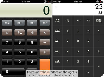
Although, I have to admit, I still like the skeuomorphized calculator in lieu of the flat design. But I totally agree that the fake paper in notes on the iphone is tacky and doesn't add anything of value to the experience.
There are always going to be a few stragglers who do or don't know what an 8 track is. That's not to say using it is such a bad idea, but it should certainly be used appropriately, with your audience at the forefront of that decision.
I found a great article at uxmovement.com that outlines good and bad uses of skeuomophic design. It helped me to understand some of the reasons you would want to use it and reasons you should leave it behind. The author "anthony" points out: "Skeuomorphic design is useful when the functionality of an interface mimics a real-world object....For example, this eBook reader interface allows users to turn pages by swiping the screen....Poor uses of skeuomorphism are found on interfaces that only look like, but do not function like the real-world object it’s mimicking."
Although, I have to admit, I still like the skeuomorphized calculator in lieu of the flat design. But I totally agree that the fake paper in notes on the iphone is tacky and doesn't add anything of value to the experience.
So I come away from this debate as an advocate on both sides. Like Tracy said in her post, "it just depends on the context of the design." I don't think you should use skeumorphism if it's going to clutter the layout, but if it makes sense for the design and your audience, why not?
Wednesday, September 4, 2013
Re: Skeuomorphic design vs. Flat Design

I'm digging flat design! I still own an original Nintendo and my eyes can't stand the 3D "realism" of those new video games those kids are playing nowadays!
Click on the image for an interesting article on converting skeuomorphic design into flat design.
Tuesday, September 3, 2013
Re: FLAT out loud: Flat Design versus Skeumorphism?
The more I think about this topic, the harder it is for me to write down my thoughts on it. Flat design on skeumorphism? Crunchy peanut butter or smooth? Toilet paper facing inside or out? Mac or windows? The list goes on and on...or so I thought. When I first read Shirley's post and began thinking about which style of design I prefer, I immediately thought I was a flat design type of girl. I am drawn to clean crisp features in a design, nothing so extreme as to cause any chance of confusion (at least when I am looking at designs, I tend to overdo when I am working on my own first drafts). But as I started researching I found my division between the two styles is not so clear. I too found the article Antoinette sited (Flat Design: An In Depth Look), and I was on board, that is until it got to the "Buttons" section.
As stated both design styles work (Windows created an entire phone line with "flat" buttons), but over and over again I find myself adding those skeumorphic features, the gradient, the drop shadow, the shine, to my web buttons.
After some thought I have come to the conclusion that it just depends on the context of the design. I think you need to know about the goal and overall look of your design before you can choose the style: flat or skeumorphic. With the Windows phone, the entire screen is a grid of buttons. There is no need to make them anything but flat because it would feel too cluttered. To have 12 buttons "popping" out at you on one 4.5 inch screen is more then overwhelming. However, when I design web buttons, the button is usually intertwined with a slew of information. The small rectangle needs to stand out on the page somehow.
Then there is print advertising. I have noticed that a lot of the debate between flat design and skeumorphism comes when talking about designing user interfaces, but why is skeumorphism "tacky" on the web and not in a magazine? Is it because the paper the skeumorphic ad is on is tangible like the design visual? A computer screen and phone screen were initially made for looking (let's not get into the new touch screen fad). Ones initial instinct is not to reach out and touch the screens wooden "texture," but a magazine page or poster has that possibility. I like the advertisements that you have to touch because they are so life like you do not know if it is actually textured or and illustrated texture (as long as it does not take away from the message). I also like the advertisements that are clear and right in your face. Again, the side of the line I stand on is a bit wobbly; I am a smooth peanut butter girl, unless I dip into it with just a spoon - you have to spice it up once in a while.
As stated both design styles work (Windows created an entire phone line with "flat" buttons), but over and over again I find myself adding those skeumorphic features, the gradient, the drop shadow, the shine, to my web buttons.
 |
| Nokia Lumia 1020 |
Then there is print advertising. I have noticed that a lot of the debate between flat design and skeumorphism comes when talking about designing user interfaces, but why is skeumorphism "tacky" on the web and not in a magazine? Is it because the paper the skeumorphic ad is on is tangible like the design visual? A computer screen and phone screen were initially made for looking (let's not get into the new touch screen fad). Ones initial instinct is not to reach out and touch the screens wooden "texture," but a magazine page or poster has that possibility. I like the advertisements that you have to touch because they are so life like you do not know if it is actually textured or and illustrated texture (as long as it does not take away from the message). I also like the advertisements that are clear and right in your face. Again, the side of the line I stand on is a bit wobbly; I am a smooth peanut butter girl, unless I dip into it with just a spoon - you have to spice it up once in a while.
Re: FLAT out loud: Flat Design versus Skeumorphism?
Funny you should mention Apple and iOS7, because they've got some weird things going on with flat design versus skeuomorphism. If I remember correctly, they're abandoning a lot of the shiny, "lickable" style in the icons and such, going for a flatter, matte style. I also seem to recall that they're getting rid of decorative details like the "spine" in the address book. But at the same time, they're adding in new pseudorealistic elements like icons that tilt in simulated 3D when you move the device.
My main problem with skeuomorphic design is that I often want to fight it if it's not perfectly to my taste. I don't necessarily want the style of a 1950s notebook, or a 1990s address book. What if I'd prefer, say, a 17th century ship's log? Why can't I have that, if the differences are purely aesthetic? I'd rather have a purely functional flat design that forces me to take or leave it.
Of course, for my money, the ultimate in flat design is the LCARS interface from Star Trek: The Next Generation. It's the 21st century; why don't more things look like this?
Basic LCARS Design Guidelines
LCARS Standards Development Board
RE: FLAT out loud: Flat Design versus Skeuomorphism?
I definitely prefer flat design over skeuomorphism (thanks to Shirley's post, I now know this term). I have always considered myself a minimalist in training so that is probably why. Also, flat designs use saturated, pure colors which appeal to my aesthetic.
I agree with Antoinette that they flat design makes it easier to zero in on the intention/action of the design. (thanks for posting that great article!) The less visual clutter there is, the quicker a reader can decode the message.
Here is a BBC article I found on the topic of skeuomorphism: http://www.bbc.co.uk/news/magazine-22840833. It is interesting that words are also considered skeuomorphism. Taken directly from the article:
"Skeuomorphs are not strictly something that can be designed," he says. "They occur unintentionally when aesthetic styles are inherited without thinking."
Motors were originally placed at the front of cars because horses pulled carts from the front, he says. The word "horsepower" is itself a skeuomorph, remaining long after the horses had disappeared.While some may think flat design is a trend, the redesigning of icons that no longer make sense is a necessity. For example, take the cassette tape. Today's youth barely know what a cassette tape is, so why would it make sense to keep that icon to symbolize music. While it is sad for my generation (or maybe just me) to see most of the technology I grew up with die off (vcr, cassettes, cds, etc), it is a reality that we can no longer avoid.
Monday, September 2, 2013
FOLLW UP: FLAT out loud: Flat Design vs. Skeumorphism?
When I read this post, I immedietly gravitated more towards Flat design than Skeumorphism. I believe there's something compelling about flat design; its simplicity and clarity draw my attention and forces me to take in whatever is on the page. Much like its definition, flat design is smooth, even, and I would argue against referencing it as dull or boring. Maybe I don't gravitate towards skeumorphism as much because my brain has to work harder at decoding the message due to the various colors, patterns, and other visual elements on the page. I know that not everyone views the world through the same lens and as such, some people may enjoy skeumorphism because it's not "flat" and can compete with other visual and verbal messages from any other medium. However; in this age of visual overload I believe the simplicity of flat design stands out more than skeumorphism.
Subscribe to:
Posts (Atom)