Last year I took a workshop through Plaza Art on screenprinting. It was super fun and I made a cool design for a shirt! The whole experience was great and it inspired me to do more screenprinting. Plaza has other workshops that I'm sure are great for fun or inspiration, so everybody should definitely check them out if you're interested. Here's a link to their workshop schedule: http://www.plazaart.com/index.php?page=4.
Monday, October 31, 2011
Re: Baltimore Print Studios
I've been hearing about Baltimore Print Studios since they opened up, but I haven't a chance to take a workshop yet. It sounds awesome though. I'm glad that they're getting national recognition in HOW.
Sunday, October 30, 2011
Re: Baltimore Print Studios
I've never heard of Baltimore Print Studios before, but I checked out their website and would love to take one of their workshops. I don't really have an extra $130 to shell out for the intro to letterpress class, but the concept is really cool. It's worth pointing out that their October workshops were both sold out. I guess there is a bigger demand for these back to basics type classes than I thought. We've been studying logos in designer's survival guide, and I have to say that I think Baltimore Print Studios could have done something a lot more creative for their logo. Maybe something with a better typographical treatment.
Saturday, October 29, 2011
Re: Baltimore Print Studios
I think the idea of Baltimore Print Studios is fantastic. I have never been myself, but I have had some friends who have gone to one of their workshops, and I have another friend who uses their letterpress on a regular basis (until she can get hers back up and running). She told me they are very helpful too and the price is just right. One day I will try and make it down there to take a workshop.
Thursday, October 27, 2011
Baltimore Print Studios
I’m not sure if all of you are familiar with Baltimore Print Studios, but it’s a letterpress/screen printing public studio run by 2 MICA grads, Kyle Van Horn and Kim Bentley. They wrote their first blog post in 2009 announcing their idea and asking for help, had their grand opening in 2010, and now they’re celebrating their 1 year anniversary this weekend. The studio is on North Ave, a couple blocks from The Charles and right near The Windup Space. The place is uber cool (and super cold in the winter) and they have semi-affordable 1-day classes to get you up to speed on letterpress and/or screen-printing techniques, and then you can rent a press at an hourly rate. They also have Mini-DIY-Magnetic-Poetry workshops, which are super fun, very affordable and kind of “beginner” (the workshops won’t substitute for a class). At the workshop, BPS has pre-made words, phrases and imagery for you to make your own holiday card (Valentines, Christmas, etc) and you letterpress them right there and then take home a pack of 30. I added a photo below from the Valentine workshop I went to. Proving how successful they’ve become in the past year, they are featured in this month’s issue of How magazine.


Find out about classes and workshops: wwwbaltimoreprintstudios.com
Follow them on Twitter: @baltimoreprints
I’ve found that getting off the computer and doing something hands-on and creative motivates and reinvigorates me as a designer. Has anyone else been to Baltimore Print Studios? If not, where have you been that made you get hands-on and in turn got you re-exited about being creative?
Wednesday, October 26, 2011
RE: Responsive Design
I'm so happy that you blogged about this topic! I'm with everyone else who had been baffled by the technology that goes into formatting a web page for a mobile device. I had been thinking about this very topic all week while I was working on my mobile app for project 2. It's really good to know how things work "behind the scenes", especially when it will help out your (hopeful) career! I have a lot to learn about web design so things like this really help. Thanks for the post!
Re: Responsive Design
This was a great post although I don't know anything about web design, it was nice to see the examples you gave to resize and adapt to the size of the browser. I always wondered, like Anthony, how they were able to resize the websites to fit the screens of smartphones and tablets. I always thought that they had more than 1 design for this website that resize to fit different type of device (thinking about it now it doesn't really make any sense).
Thank for the posts and explaining how some of it works.
Thank for the posts and explaining how some of it works.
RE: Responsive Design
I actually don't have a smart phone (gasp), but my fiance was trying to watch a clip on Hulu on his phone recently, and the phone basically freaked out. It knew he was on a phone and told him to download something, which ended up taking forever and it was a huge mess. I've wondered how phones know the difference, but I have noticed the m.facebook on his phone before... but I don't have to type it in-- it just does it automatically when I try to go to Facebook. I can't wait until all websites work like that-- it will make reading something on a small window at work MUCH more efficient. And Sarah- I have definitely noticed the slow/awful restaurant sites from phones, which is a huge bummer because other than facebook, that is probably what I use the web on a phone for most. Aaron or Jaime-- is this a lot more expensive to design? I feel like whoever mentioned limited resources (Sarah?) was probably right in that it could take some time before smaller businesses, like local restaurants, are willing to pay to jump on board.
RE: Responsive Design
That's really awesome. I've seen it on smart phones where the web address has an "m" in it. Like Facebook would be m.facebook.com. Sometimes the address would include ".com/mobile", and that would be a whole other confusing thing. When I had my old crap phone, I would have to figure out which one I needed to look at a certain website. Sometimes it would automatically sense I was using a phone, but other times I would have to type it in. I'm really glad this is a thing now so that there won't be x amount of pages dedicated to a different browser size.
Tuesday, October 25, 2011
Re: Responsive Design
This is a great find. I don't know much about designing for apps or mobile media, so its nice that there is something out there that makes it a tad easier to do. I also feel like you could really make some creative websites with this technology.
Re: Responsive Design
We had briefly talked about this in Advanced Web Development, and I believe Peter Kaiser (prof) said that some web designers were going back and redesigning their sites based on this idea.
I'm not sure if it's any harder or easier, as Rich was asking - I think if it's your standard for designing than that's what you're used to. I'm also not sure about the learning curve - from Jamie's post, it looks like if you have web design down than it would be relatively easy to move in this direction.
Re: Responsive Design
That is really interesting.
The emergence of this type of design structure has become prominent since smart phones have evolved into internet browsers as well.
Responsive Design gives designers and their customers a chance to truly decide on the hierarchy of their website. It forces the client to think about the most important sections in their website and in turn gives the designer a better understanding before considering their final design.
I wonder if designers believe that this makes their job harder since they need to design different versions for multiple platforms and browser sizes or easier because they have been given a better sense of hierarchy by their client.
Re: REsponsive Design
There are a few CSS grid/boilerplate systems that use a fluid grid to create a responsive design down to mobile using media queries. I've used a few of them for some projects, and they work very well, although they require a lot of tweaking depending on the device you are using.
Inuit CSS:
http://csswizardry.com/inuitcss/
Skeleton (my favorite)
http://getskeleton.com/
1140 grid system:
http://cssgrid.net/
They all seem to work in about the same way. When the screen resolution hits a certain point, all of the divs of the grid become the same size and stack on top of each other.
Tablet Portrait: Between 768px and 959px
All Mobile Sizes: Less than 767px
Just Mobile Landscape: Between 480px and 767px
Just Mobile Portrait: Less than 479px
Using media queries, you can add appropriate backgrounds/sectors/etc for all of the sizes.
It is a very interesting way to design once and create a cohesive experience across all of the platforms.
Comic book mastheads
I thought this collection of super lettering might be a good source of inspiration for Rich's movie poster concept.


Monday, October 24, 2011
Re: Responsive Design
Awesome post. I have been curious about the technology behind mobile versus desktop versus tablet websites. I've noticed a fair amount of sites have a "mobile" version of their actual site. But that version is of course used for any screen smaller than a desktop, I would assume. And I also think something in the code or the phones browser tells the site that someone is viewing it from a mobile platform. Aaron, being a more well versed web designer, do you happen to know how this works? Is it a css or java thing?
Re: Responsive Design
You know, ever since I got my iPhone I've wondered how sites know that I'm using an iPhone and not a full size computer. In the past year, I've noticed that most sites I go to on my iPhone are formatted so I can see actually use the site. However, have any of you ever tried going to a local website (like a restaurant) on your smartphones? The page takes FOREVER to load, and it usually isn't formatted properly so it is extremely difficult to navigate. I don't design websites professionally, so I'm not sure about the logistics, but I'm assuming the smaller companies don't have the resources to code their mobile sites properly..?
Re: Responsive Design
Thanks for the resource. It's important to see how designing for mobile is not limited to miniaturizing a site done for a full size web browser but rather to play to the strengths of the screen size.
In advanced web design Peter Kaizer has suggested that a better approach when designing for web is to start with mobile and then build up from there. Fortunately the tools at our disposal today make this far more feasible then even 5 years ago. It adds another wrinkle for designers to contend with but at this point I'm sure we're all used to rolling with punches.
In advanced web design Peter Kaizer has suggested that a better approach when designing for web is to start with mobile and then build up from there. Fortunately the tools at our disposal today make this far more feasible then even 5 years ago. It adds another wrinkle for designers to contend with but at this point I'm sure we're all used to rolling with punches.
Sunday, October 23, 2011
Re: Responsive Design
That resizing is super cool. I'm wondering if this responsive web design started when content had to fit into little tiny phone screens. I would think it's even more important now that we have a variety of different screen sizes, including phones and tablets. Now that I'm thinking about it, it seems like responsive web design should be a standard instead of an option.
I found another cool website that uses responsive design: http://artequalswork.com/. I enjoy this one because it uses my initials! (And Aaron's too!)
I found another cool website that uses responsive design: http://artequalswork.com/. I enjoy this one because it uses my initials! (And Aaron's too!)
Saturday, October 22, 2011
Re: Responsive Design
Wow...that's really cool. Such an obviously simple solution to such a prevalent obstacle. Why didn't I think of it?! Well, probably because I'm not a web designer. How does this work, Aaron? Do you have to have designs for all of the different possible screen sizes, or does it just magically adjust?
Friday, October 21, 2011
Responsive Design
As a web designer, I find one of the greatest challenges to be all the different browsers and monitor sizes you have to account for. A design that looks great on Safari at 1200 pixels wide totally falls apart on IE 7 at 800 pixels. Now with mobile devices accounting for a large percentage of web traffic, there is even more to think about.
Lately I’ve been hearing a lot about a new trend: responsive web design, where the design of a site changes depending on your browser size. As your browser size decreases, images and content areas start getting smaller, and the layout even changes altogether to suit very small screens, like smartphones. It’s not a technique I’ve used yet, but one I can’t wait to try!
Here’s a great example of one:
http://owltastic.com/
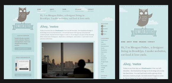
Open this page, then resize your browser and watch what happens.
Here’s a page with a bunch of great examples, some better than others.
http://webdesignledger.com/inspiration/30-creative-examples-of-responsive-web-design
Lately I’ve been hearing a lot about a new trend: responsive web design, where the design of a site changes depending on your browser size. As your browser size decreases, images and content areas start getting smaller, and the layout even changes altogether to suit very small screens, like smartphones. It’s not a technique I’ve used yet, but one I can’t wait to try!
Here’s a great example of one:
http://owltastic.com/
Open this page, then resize your browser and watch what happens.
Here’s a page with a bunch of great examples, some better than others.
http://webdesignledger.com/inspiration/30-creative-examples-of-responsive-web-design
Wednesday, October 19, 2011
Re: Print Handbook
Thanks for sharing that. I can't wait to see it in person in class and it seems like a very useful guide. It's nice because you can see all the concepts on the printed page. I might need to pick up a copy of that.
Re: Print Handbook
This book seems really useful. I think this type of information, the technical aspects of print design, is what I was sorely missing when I started working in a professional design environment. I had never taken Designer's Survival Guide, so dealing with file types, inks, paper, and printers was something I had no experience in. OF course, having to work with it every day makes you learn it very quickly. However, I made a TON of mistakes when I started. I think the majority of my mistakes were dealing with spot colors, dealing with file setups (i.e. bleeds, gutters, stepping up files, etc.), and dealing with offset print design.
re: Print Handbook
This definitely looks like a very useful resource! I will have to get my hands on this. Not to be totally redundant but I agree with everyone who mentioned the Krause series. I bust those things out on the reg for design advice (particularly color). So if this print handbook is anywhere near as resourceful, it seems like a smart purchase! Thanks for the tip!
Tuesday, October 18, 2011
re: Print handbook
I've been meaning to get "The Print Handbook" ever since the link got passed around FB a while back, but alas...
The designers toolbox (www.designerstoolbox.com) is a really helpful site that seems similar to the book's content. The site has your basics for print and web (envelope sizes/types, paper sizes, binding styles), plus proofreading marks (awesome addition). It has an awards calendar area as well, which could be nice to subscribe to but unfortunately hasn't been updated since 2010.
In response to Matt's post, I don't have a Guild membership, but I do own the latest handbook. Definitely a must have.
Sidenote - that video was so funny!
re: Print handbook
The Print Handbook looks like a great resource as well as being branded very nicely. It's useful to have just the facts at your fingertips rather than having to google it and possibly get shady information.
The Off Register series was spot on and hilarious. Luscious neatly sums up the frustration that often occurs between client/designer/printer. I used to (pretend) punch clients in the face whenever they would say they wanted a more sophisticated look. I still kinda hate the word.
 I remember the Graphics Artist Guild being the bible for every successful freelance designer and illustrator. Has anyone had a chance to look at it lately? For $40 you get a guild membership and the book. Check it out...
I recently read Jessica Hische's article The Dark Art of Pricing and thought it would be good to share with the class as well. She focuses on licensing and rights management as a way to guage the true value of your work.
The Off Register series was spot on and hilarious. Luscious neatly sums up the frustration that often occurs between client/designer/printer. I used to (pretend) punch clients in the face whenever they would say they wanted a more sophisticated look. I still kinda hate the word.
I recently read Jessica Hische's article The Dark Art of Pricing and thought it would be good to share with the class as well. She focuses on licensing and rights management as a way to guage the true value of your work.
Re: Print Handbook
I've been meaning to buy the handbook for a while. I tend to keep textbooks and other materials from previous classes, but a lot of them soon become outdated (also don't have the heart to throw/sell/give books away). I feel like this can be really handy and stand the test of time, so I wouldn't have that guilt of not using it.
Monday, October 17, 2011
Print Handbook
The Jim Krause series from PBDS 601 is the best "textbook" purchase I've ever made. I use it all the time, but it does look like this would be awesome resource. I will definitely order it.
Re: Print Handbook
Although I've never seen a physical copy of this book, I am intrigued by the content matter. It seems like it should be a required text for anyone in our program. I like the Print Design Resource section of the website, especially the "why use a spot coloUr" article. This correlates perfectly with the information we're learning in Designer's Survival Guide right now. The list of the best print design sites is also pretty cool. I'll definitely bookmark it and come back to it when I need some inspiration for future projects.
Sunday, October 16, 2011
Re: Print Handbook
I think I’ve seen the Print Handbook before, maybe someone
brought it into class, or maybe it is actually a required book for a class? I’m
not sure where I’ve seen it, but I do remember thinking that it seemed
incredibly helpful and that I should probably purchase one. It sounds like it’s
something right out of Designer’s Survival Guide. In fact, the “Designer’s
Survival Guide” seems like a pretty fitting name for the little book. If it’s
not already a book for a class, then it should be. It’s so nice when the
required reading is useful even after the class is finished. Kind of like the
Index Series by Jim Krause; I bought his series for PBDS601 and I still
continue to use his books all the time, whether it’s for color inspiration or
layout guidance.
PSD iPhone 4 Icon
Found this, thought I would share...
A free, pixel-accurate iPhone 4 icon PSD by @cocoia: http://coc.io/agFnKJ
Saturday, October 15, 2011
Re: Print Handbook
The Print Handbook is a great resource. The information in the handbook is important for any designer to know, and it's nice to have it all compiled in a neat, beautifully-designed, little book. My favorite aspect of the handbook is all the helpful measurements and conversions it offers. As Kelly pointed out, the book itself is measured in several different formats, so you're able to see what 28 picas actually looks like.
A lot of the information in the handbook is stuff we learned in Designer's Survival Guide. If there was a textbook for that class, the Print Handbook would be it.
Thursday, October 13, 2011
This is a Print Handbook for Designers
I wish I would have received the Print Handbook many years ago. It's such a simple idea, yet no one ever thought of it ''til Andy Brown did at The Media Collective agency located in the UK. The little book (it's only 28 pica x 42 pica, er… 4.667 inches by 7 inches) covers everything from overprinting, to colour (er…color), to what music the designers were listening to when creating the book. It's a great quick and simple reference. The paper size section gives dimensions for everything you need including a 48 sheet billboard and even the Gutenberg Bible. It also has a great handy dandy dots per inch section, showing the same photos 50dpi up to 600dpi. Makes telling people who have no idea what dots per inch is a lot easier.
The book costs £6 ($9.40 US), but it's worth the money. It is loaded with experiments and examples all related to printing. If you don't want to buy the book, you can sign up for their newsletter, which offers links to helpful resources. You can view the latest newsletter here. One of the links they featured in the newsletter took you to a Youtube channel (fyi for anyone doing a Youtube channel for project 2). It's a pretty funny video and I don't think I would have found it if not for the newsletter.
Definitely check out the newsletter and the links featured in the latest newsletter. I'll bring in the book on Wednesday for anyone who wants to see it.
Wednesday, October 12, 2011
Re: Video Games
Great blog post. A lot of these games were so great even with the limited graphics capabilities.
I had the NES as a kid, but did anyone else have a Commodore 64? :-) Jumpman was the game I remember most fondly. Talk about simple graphics! But such a great game.


I had the NES as a kid, but did anyone else have a Commodore 64? :-) Jumpman was the game I remember most fondly. Talk about simple graphics! But such a great game.
Francis Ford Coppola
I haven't decided if which one the godfather's i want to do. I have already seen all 3, still depabating which one would be more exicting to do.
I am still trying to decide which 2 of those 3 movies I would like to see.
Rumble Fish
Tetro
Peggy sue got married
Tim Burton
Big Fish
Alice in Wonderland
And I'm between Charlie and The Chocolate Factory and Corpse Bride...
Alice in Wonderland
And I'm between Charlie and The Chocolate Factory and Corpse Bride...
RE: Video Game Design
I forgot about SO many of these! My two favorites are the "Jaws" game from 1987 and "A Nightmare on Elm Street" game from 1990. First of all, the graphics are hilarious, but what I love the most is how old school video games used to revolve around popular movies. I remember getting the "Home Alone" Game Boy game for Christmas and losing my mind thinking it was so cool. I played that thing until the tiny game cartridge died. There wasn't a single road trip taken without my Game Boy and Walkman in tow... Clearly miss those days.


Tuesday, October 11, 2011
Re: Video Game Design
I love this website! I had several game systems growing up (mainly because my father really wanted them; I was content playing with my Barbies.) A couple years ago I gave my old Sega to a friend who collects game systems. I was amazed then at the graphics, and remember thinking when the games came out, how fantastic the graphics were. I so glad graphic technology has come a long way since the 80s/90s. There is something very nostalgic about playing the old Super Mario games, and now with the Wii you can play all the old games through their Wii shop.
Director Trailers
My director is Zach Snyder, director of 300, Watchmen, and Sucker Punch among others.
Re: Video Game Design
I know exactly what you mean regarding these old video game title screens. It gives me a feeling of nostalgia and I am amazed when I think about how far design has come since then. I don't know if any of you have played the Scott Pilgrim video game but it manages to incorporate the same style throughout the game.
 The same basic feel is there, and the game is done in entirely 16-bit era video game style.
There is something to be said for the creativity of game designers in a time when everything needed to be extremely simplified to accomodate the lack of color and graphics.
There is something to be said for the creativity of game designers in a time when everything needed to be extremely simplified to accomodate the lack of color and graphics.
Re: Video Game Design & Roland Emmerich Movie Trailers
I love Buzzfeed & love the gallery! I still have my SNES and have the Super Mario All Stars game pack, which carries I think 5 of the Super Mario Bros games (from 8-bit to 16-bit). When 64 came out, I remember thinking how amazing the graphics were. Now we're at a point where everything is almost lifelike.
This reminds me of the a bunch of 8-bit videos this guy produces. I first caught on with the 8-bit Dr Horrible's Sing-Along Blog:
Some of them were made to be interactive (I think) but now most are videos up on YouTube. They have a Harry Potter one and a Saved By The Bell one, but Dr. Horrible's my favorite.
As for videos for my director, Roland Emmerich: here are a few for you to enjoy.
Independence Day
Godzilla
2012
Monday, October 10, 2011
re: video game screens


As for the design of the screens themselves, it's sad what was "current" at that time. But I have a feeling we may look at what we are doing in 25 years in almost the same light.
Wedding design

I check Style Me Pretty and a handful of other wedding-related blogs religiously these days, and this wedding, which features a program that says "I think you are more perfect than Helvetica" obviously caught my eye. He is an architect and she is an interior designer, and their wedding is super modern and clean. Not my wedding style at all (I think it's a little cold, boring, even), but it's cute :) Just thought I'd pass it along!
re: video games
Cool topic Sarah. From the army of crafters on Etsy making Mario Brother pillow cases (or whatever) to the world of high fashion with Alba Prat, it's amazing how much inspiration artists have mined from the aesthetic of 8 bit graphics.
A while back I wanted to relive the glory days of Atari 2600 and Coleco and after visiting a few Goodwills amassed a nice collection. Building the collection was fun but playing the games was torturous and boring. Not only were the graphics lousy but the gameplay sucked too. How could I have wasted so many hours of my little kid life to this? It was a total "Hey Dude" moment and I realized nostalgia had gotten the best of me.
So yeah, the look and feel of 80's video games. Often times its used ironically such as
George Plimpton's Video Falconry

But lately another direction has been along the lines of this. Superbrothers Sword and Sorcery has a genuine appreciation for the look of 8bit but without being deliberately retro. I've yet to play it but it sure looks nice.
Audience Calibration Procedure from Superbrothers: Sword & Sworcery on Vimeo.
People may be interested in Art of Video Games exhibit at the Smithsonian starting March 16, 2012.
Re: Video Game Design

I used to play a bunch of these! Especially (and obviously)
Super Mario World. Not long ago, I was hanging out at a friend’s house and he
brought out an old school Nintendo and a box filled with the classic games. It
was actually in the middle of Donkey Kong when I noticed the late 80’s graphics.
It almost hurts to see now. I don’t think I ever would have paid attention to
this as a kid, but now it’s a little more like a smack in the face.
It’s kind of like how Nickelodeon just brought back all of
the 90’s shows that we used to watch. Last night I was so excited that the first
episode of “Hey Dude” was coming up next, but when it was over, I couldn’t help
thinking about how much it sucked. I worshiped that show when I was younger. I
thought the plot was hilarious and I wanted to be some of the characters. Now
as I watch it, I realize that it was mostly the innocence of childhood that
made it so great and I’m afraid to watch another episode for fear of ruining that.
Saturday, October 8, 2011
Re: Video Game Design
Love this post! I'm on board with any excuse to take a walk down memory lane.
I definitely remember some of these games, but I don't remember paying attention to any of the graphics. Now that I'm paying attention, it's really interesting to think about how the developers created the graphics when they had to work with such limited technology. I'm particularly impressed with both the graphic effects and the name of "The Adventures of Bayou Billy."
 I was hoping there would be a few more title screens to check out, but it looks like the site owner is adding more all the time, so that's something to look forward to.
The design of the site is great as well. Like Hannah said, many of the plugins used on the site have been customized. Everything is working well together and the site conveys the retro game graphic look it's going for.
I definitely remember some of these games, but I don't remember paying attention to any of the graphics. Now that I'm paying attention, it's really interesting to think about how the developers created the graphics when they had to work with such limited technology. I'm particularly impressed with both the graphic effects and the name of "The Adventures of Bayou Billy."
The design of the site is great as well. Like Hannah said, many of the plugins used on the site have been customized. Everything is working well together and the site conveys the retro game graphic look it's going for.
Re: Video Game Design
I remember playing some of these!
P.O.W.
Final Fantasy V
Where in the World is Carmen Sandiego
My brother and I got the first Nintendo for Christmas one year and we played that thing into the ground. Specifically (and I'm guessing because they came in the box) Mario and Duckhunt. I don't remember ever thinking about the graphics, but I must have thought they were awesome because you know the Wii commercials, where the whole fam gets in on the game—that's how I remember the Duckhunt experience. We stood up, we shot at the screen, we high-fived and had family bonding time.
Also, did you guys notice the Lightbox design on the site? I've never seen that plugin so customized. Usually I see a black opacity over the background screen, and there's standard typography for the title and info. The designer for this site added a different color, font and Twitter/Facebook/email buttons—awesome!
Friday, October 7, 2011
Project 3 Movie Posters- John Hughes
I chose John Hughes for the movie posters, and I'm doing Ferris Bueller's Day Off, The Breafkast Club, and Uncle Buck.
Ferris Bueller's Day Off trailer:
The Breakfast Club trailer:
Uncle Buck trailer:
Ferris Bueller's Day Off trailer:
The Breakfast Club trailer:
Uncle Buck trailer:
Thursday, October 6, 2011
Assignment 4
This is a project of the UBGreen Initiative. UBGreen’s project & sustainability planner is looking for a poster, posters, or series of posters to publicize (i.e.: romanticize, promote, highlight) the great things about living, working, and playing (and studying) in mid-town Baltimore...that is, here near UB. You can do anything you want, as long as you speak glowingly of all the possibilities of UB’s neighborhood.
It's not a contest, the prize is your work will be displayed. It’s a nice perk. UBGreen is not dedicated to selecting a single student, they’re happy to display as many posters as are good, and it’s also possible posters could also be included on the website. UB might potentially develop capabilities to include a QR code on the poster that could be scanned with a smartphone that would direct users to a website highlighting Midtown with live/work/play Midtown links.
It's not a contest, the prize is your work will be displayed. It’s a nice perk. UBGreen is not dedicated to selecting a single student, they’re happy to display as many posters as are good, and it’s also possible posters could also be included on the website. UB might potentially develop capabilities to include a QR code on the poster that could be scanned with a smartphone that would direct users to a website highlighting Midtown with live/work/play Midtown links.
Wednesday, October 5, 2011
Video Game Design
As I was perusing through one of my favorite blogs, Buzz Feed, I came across a posting about this website. Title Scream is a collection of the "home" screens from 16/8 bit games. Most of these games are from the 80s/early 90s. The site itself is very simplistic. The main page only has thumbnails from each game. Once you click on a game, it shows you the year and company, as well as a little animation of what the title screen actually looks like. The site is maintained by an interactive designer who wanted to preserve the art work from classic video games.
 I think the screen art for these old school games are extremely fascinating. You would NEVER find these designs in games today. The difference of pixels vs vectors in games presents such a drastically different playing experience. Although video game technology and graphics have certainly changed for the better, there's something cool about looking at, and even playing, games like these. Do you guys remember playing any of the video games on this site (or any others you can remember) when you were younger and thinking the graphics were awesome? I remember firing up GoldenEye on N64 not too long ago and thinking to myself that I never remembered the graphics being quite so pixelated when I was younger.

Whoops..
So I just checked the blog to see what other people have written, and I realized my post was totally incorrect. I just looked up the term "outsider art", and it's so fascinating! I had no idea such a concept existed. I sort of just thought all "art" was classified under the art category. The section on Wikepedia about "art of the insane" really stood out to me. One of my friends is actually in a class right now that focuses on art work done by people with disabilities and trauma in their lives. I talked to her after reading about outsider art, and she said that many studies have been done about interpreting art based on the specific mental illnesses that people have. She's currently learning how to interpret artwork that is made by children that have been physically or mental abused. I know it's not quite the same, but it is still very interesting.
Tuesday, October 4, 2011
Re: Outsider Art
I also have to admit that I’m not too familiar with Outsider
Art. Naturally, I googled my way to several sites that helped me get a better
understanding of the concept, including the Wikipedia site and several sites
belonging to outsider artists, past and present. I stumbled upon The Other Side Gallery, an organization that aims to raise awareness of the value and
significance of Contemporary Outsider Art.
The Other Side Gallery showcases work from over 200 Outsider
Artists.
One of the artists that stuck out to me was Noorghana Malik.
She uses really bright, beautiful colors and interesting shapes. I really liked this
piece titled “Rhythm of the Heart".

Thanks for introducing me to this new genre
of art, Matt. I’m also interested in seeing Jessica
Yu's documentary.
Project 2: Josephine Baker
For project 2 my historical figure is Josephine Baker. Below I attached a youtube clip of her most famous dance, the Banana Dance, so everyone has some idea of who/what I am talking about.
Re: Outsider Art
Yeah, I definitely had to look up outsider art. I found some really interesting things. A lot of the outsider art that I found was weird and bizarre, but simple at the same time. It reminded me of the year-long exhibit that just ended at the American Visionary Art Museum in Bmore called What Makes Us Smile? I saw the exhibit this summer AND it was my first time visiting the AVAM.
The exhibit was awesome! It was full of fun and funny drawings, sculptures, paintings, videos, and more. It was particularly interesting because the works featured in the exhibit weren't all created by "artists." Some of the work was done by people outside the traditional art world like comedians and writers. Here's one of my favorite illustrations featured in the exhibit:

The exhibit was awesome! It was full of fun and funny drawings, sculptures, paintings, videos, and more. It was particularly interesting because the works featured in the exhibit weren't all created by "artists." Some of the work was done by people outside the traditional art world like comedians and writers. Here's one of my favorite illustrations featured in the exhibit:
I think this exhibit showed how a different perspective can completely change the quality of art.
Monday, October 3, 2011
Re: Outsider Art
I wasn't really aware of what Outsider Art was or that it even existed. After reading the blog entry I quickly headed over to wikipedia.org. Darger's story is quite amazing and sad at the same time. The documentary is now on my list of things to watch (when I have time). I think it's fantastic that his art and story are now being shared with the world.
An interesting fellow I have come across is Daniel Johnston. I'm not sure if he falls under the Outsider Art umbrella, but he came to mind when reviewing what exactly Outside Art was. He was the subject of the 2008 documentary The Devil and Daniel Johnston. I attached an interview with him below. He writes and sings folk music and also is an artist. Here is his website if anyone has time to take a gander.
I had to really think about your question, because I don't think that I follow any outsider designers/artists. My interests are pretty mainstream, but I'd like to expand them. I do however love to look at other graduate students' work. I don't know if any of you have ever checked out the graphic design work done by the grad students at MICA, but some of their stuff is really fantastic. Here is the link to all of the graduate work: http://www.mica.edu/Browse_Art/MICA_Artists/Graduate_Students.html. I'm not an illustrator by any means, so I find the illustrated work really fabulous. I really like this piece. I almost can't tell if the pieces of paper are actually there or not.
Sunday, October 2, 2011
Outsider Art
First, this post is fantastic. I have never heard of Harvey Darger and his work is simply amazing. I am planning a trip to the American Folk Art museum to see his work in person. Recently I came upon the work of Vivian Maier. She is a photographer with no formal training who took over 100,000 photographs of New York City and Chicago over her career. Her photographs were discovered in 2007 by historian John Maloof.
She is an untrained photographer, and most of her work was found as undeveloped film, but her photographs are masterful. Not only is the composition and exposure amazing, but every photograph captures the era.
http://www.vivianmaier.com/
She is an untrained photographer, and most of her work was found as undeveloped film, but her photographs are masterful. Not only is the composition and exposure amazing, but every photograph captures the era.
http://www.vivianmaier.com/
Re: Outsider Art
Sufjan Stevens' 2010 album Age of Adz features art from the outsider Royal Robertson and also draws inspiration from Robertson. While the album is about Sufjan himself it explores themes from Robertson's life and work. Some of Robertson's work is on permanent collection at The American Visionary Art museum as well as several other museums. He died in 1997.
As a side note - he's really interesting to read about. He was born in 1936 and lived in Louisiana as a sign maker. Him and his wife had 11 children. She cheated on him, left him, took the kids and became a minister. He either was or became a self proclaimed prophet and had visions of aliens, the end days, etc. A lot of his art had to do with his wife or women in general.
I would have never known about Royal Robertson but after I got into Sufjan Stevens' and got the new album, a friend told me that he had heard that Sufjan was inspired by a schizophrenic artist.
The documentary Make is about several artists, including Royal Robertson.
MAKE the documentary from Asthmatic Kitty on Vimeo.
Age of Adz:
I should probably say here that I did google "outsider art" before I started to write up this post - if you need a refresher, here's the Wiki link:
Saturday, October 1, 2011
Project 3 (Director Series)
First off, here's a great link of a movie poster series.
Second, I wanted to add the trailers to the movies I was doing.
Movies:
Hannah Takes the Stairs
Nights and Weekends
Alexander the Last
Director:
Joe Swanberg
Subscribe to:
Posts (Atom)