Sunday, December 25, 2011

A lovely site


For your enjoyment (if you like colors as much as I do)

http://design-seeds.com


Friday, December 16, 2011

New Google ad

In the mood for 3 minutes of emotional highs and lows? Why not check out Google's 2011 year in review.

Wednesday, December 14, 2011

Re: Design Portfolios

Ever since taking Advanced Web Development, I've had time to think about a design portfolio and what I would like it to include. For showcasing videos I've made, the default is to have a YouTube page or Vimeo page. But now I've taken more classes in the ID program, I have more to show in different media.

I agree with what a lot of people have been saying, about how the website should reflect the designer's style and easy to navigate through. Also having a blog is good. Hopefully these all can be incorporated into my portfolio.

Submitting work via Dropbox

Sorry for the lateness of this post, but I pretty much forgot about it!

To submit via Dropbox (Here is a link to get it if you don't - Dropbox )

If you have Dropbox on your computer...
First you need to create a new folder within the main directory. Then place the files to share in that folder. After they have uploaded, right click on the folder and hover over the "Dropbox" selection and select "Share this folder..." This will take you to the Dropbox site where you can put in the email address of who to share with.
And that should be that!

If you use the website...
First you need to create a new folder within the main directory. Then place the files to share in that folder. After they have uploaded, click the "Invite to Folder" button and input the email address to share with. And that should be that!

Hope this helps

Re: Portfolios

As a writer, I am constantly asked if I have a blog— both by colleagues, and in interviews (and I go on a lot.) I have several, because they are each specific to a topic, and my interests are always shifting. I’ll write for one every day for a month, and then not again for six. For example, I keep one about cooking/learning to cook, and another about running/learning to run (I am not a natural by any means..) and sometimes I'll go a few months straight training for a race, and then (like now) I'll go a few months without running. So, when people/potential employers ask about it, I often tell them about one and then RACE home to update it. Although the writing part is really fun for me, maintaining the blog(s) to a level I’d want a potential employer to see, and knowing that they are out there for anyone to check at any time, is a constant source of anxiety. The biggest thing is making sure that they are always updated, I’m always posting new things, etc. , and I’m sure the same will go for our digital portfolios here. Creating them sounds like a doosey of a task in itself, but the idea of keeping them up to date makes me the most crazy. And like blogs, I’m sure that once they are created, not only will the quality of your work be judged based on the content and design of the site, but your work ethic and diligence will surely be judged based on how dedicated you are to keeping on top of it, and adding new things as you go along. YIKES!

Tuesday, December 13, 2011

Re: Design Portfolios

Great post. I recently started thinking about my digital portfolio for next semester. It's interesting to see how other designer's showcase their work. I've also been reading Ignore Everybody by Hugh MacLeod http://gapingvoid.com/. He says everyone has a blog, so you should too. I definitely want to incorporate a blog into my portfolio site. There is just so much to think about!

Re: Design Portfolio

Nice post Anthony.

It is always important for us as designers to remember how to showcase our works.

I thought it was really interesting that the first body of work had a tag line, I never considered adding something like that.

The idea of adding an info graphic to the about section of a webpage is certainly a unique way to display the information as well.

Re: Design Portfolios

I think this is a fantastic topic. Something to consider is allowing your work to speak for itself by designing a very clean, plain portfolio site that really puts your work on display. A simple, grid based site with excellent typography might be easier for a someone with limited web experience to design and develop.

http://www.postmachina.com/
http://www.shyamagolden.com/

Monday, December 12, 2011

Re: Design Portfolios


I think about this all the time. And by thinking about it, I really mean freaking out about it. It will have been a year since I took Hypermedia when Portfolio starts, and I’m slowly forgetting bits and pieces. I am going to try to refresh my mind over winter break so that I’m not completely lost, but I want my portfolio to be awesome and I know that I need to step up my html game for that to happen.

I think a good portfolio is designed in that designer’s particular style. That way, someone isn’t looking at a site in one style and portfolio pieces in a completely different style. To me, that would be confusing and misleading. I also think simplicity and easy accessibility are both really important. A portfolio site should not make you dig around to find the designer’s pieces. They should be displayed in a direct, but creative way. 

Re: Design Portfolios

Anthony, I am so dreading coming up with ideas for my own digital portfolio! I'm graduating next semester as well. I have seen a ton of professional design portfolios, and I know that I don't have the capabilities to make mine look as great as theirs. On my list of things to do is to compile a collection of portfolios that I really admire, and put together a list of elements I want to include in my own. I really haven't even started thinking about what I want to do for mine yet, so I'm going to have a really great time in portfolio next semester.

Sunday, December 11, 2011

Posters

Heyo. So I adjusted a few things on my posters, including desaturating the background on each poster. Amy suggested pulling back the color of the background to make the things in the foreground pop out. I'm not sure if I like the desaturated look, but let me know what you guys think.


Oh, P.S., some weird white lines popped up toward the bottom of the posters on the PDF, so don't pay attention to that.

Saturday, December 10, 2011

Re: Design Portfolios

Great blog topic Anthony - I've been thinking about this as well. I think personality is very important. I got my first bit of writing experience in Words and Images, and paired with what I learned in Writing for the Marketplace, I feel like I was able to sit down and express myself via my site. The fact that my personality shows a bit has been brought up to me professionally.

I know we've been talking a lot about Jessica Hische lately, but her portfolio site is very cool, and I think it shows off her personality as well.

Friday, December 9, 2011

Design Portfolios


I'm commandeering the blog this week and jumping ahead to what I have coming at me next semester. It'll be my final semester in the Publications Design program, so I'll have to prepare my portfolio. I've been kinda preparing by looking at my past projects and creating a starter portfolio website in my other class, Advanced Web Development. I've also been scouring the web looking at other designers' portfolio sites, trying to get a sense of what makes a good, great, and fantastic portfolio.

So far, I've discovered that most designers have a logo and/or tagline throughout their website. This helps brand the designer and gives viewers an idea of what their skills are right away. Collin Henderson, a Canadian web designer, has an informative and fun tagline:


I also found that you have to show what you can do, not just say what you can do. And if you can do it in a way that reflects your personality, giving viewers a sense of what kind of person you are, that's even better. Deidre "Deda" Bain has an awesome "About Me" section that shows off her personality, her skills, and her experience:


The other common thread that I've found throughout most of the designer portfolios that I scanned is a blog. A blog allows you to constantly keep visitors updated about you and what you're doing. It also shows that you have a sincere interest and dedication to your work. Jacob Cass has a pretty good blog where he posts his reflections on design, gives helpful tips, and links to other insightful articles:


What are some things that you guys think should be part of an online design portfolio? What makes a portfolio good and what makes a portfolio great?

Wednesday, December 7, 2011

Re: Title Sequences

That Versteeg video was great, Matt! Also, it's a shame that the oscars don't recognize title sequences but it's great that the Emmys do.

Pixar often use their title sequences as a way to do some different forms of animation as opposed to their super-polished CG animation.

Monsters, Inc.


Ratatouille end credits. (This is not the actual music... I couldn't find the real one.)


They're really cool, it gives the animators a chance to do something a little different.
Great topic Kat! Looks like a lot of the usual suspects have been named (Madmen, Dexter, Catch Me if You Can)but of course there's a million more. I didn't realize there's an Emmy award for best title sequence which the Oscar's have chosen to ignore.
Here is a graduation project by Dutch Jurjen Versteeg that gives a clever and brief history of leaders in the field.

A History Of The Title Sequence from jurjen versteeg on Vimeo.

RE: Title Sequences

Interesting post! I was in Principals of Design with Amy, and I too became a huge fan of the "Catch Me if You Can" title sequence. Beautifully done. I also immediately thought of the "Mad Men" intro, as Hannah pointed out. And from a totally non design perspective, I am a huge fan of the intro to "Workaholics" (a crass comedy). It's super short, but fits the tone of the show perfectly.


To the contrary, I DESPISE the intro for "Suburgatory"

Title Sequences

I really had to think about this one, because I HARDLY EVER see a title sequence. If I am watching a movie or television show, 9 times out of 10, I will just fast forward the DVR through the opening. But something that I like is when the title sequence of the movie actually has plot or character information, something to keep me involved. This is one of the few that I can recall:


From a graphic design perspective, I like the treatment of the Kiss Kiss Bang Bang opening sequence:


Tuesday, December 6, 2011

Re: Title Sequence


Well, since I was literally about to post the opening to Dexter, and then noticed that Steve beat me to it, I will not be posting that anymore. I love when title sequences are clever, like the Dexter sequence, because it gives the show or movie just that much more interest. I know that the Simpsons opening sequence isn’t a title sequence (most of the titles come after) but I do always look forward to whatever little clever scene happens at the end of the sequence. Anyone who has seen the Simpsons knows what I’m talking about. In May, comedian/actress Kristen Schaal was wrongly credited as "Kristen Schall” and the Simpsons cleverly corrected it using the opening sequence. I think this is really clever and as Kristen put it, classy.

Re: Title Sequence

So, I am not a movie person at all (in case you couldn't tell), but last semester we watched a series of title sequences, I think in Kate Talent's principles of design class (is that right, Rich? I wish Blogger had a tagging feature!). Anyway, one of them was the beginning of Catch Me if You Can. I am OBSESSED with it. I'm not sure what it is I love so much, but I was totally bored with the presentation of them until we watched this one, and ever since and I've become more and more interested. I can't sit through the rest of any movie, but I ALWAYS pay attention to the the title sequence.

I actually even suggested to Stephanie Gibson that they make a class for it eventually. I would love to take it!


(PS I can't remember who already posted it, but I think Casino Royale's is pretty cool too!)

Title Sequence

I love well done opening credits, note the well done part! One of my favorites is the Dexter opening.


I find it a nice play on the subject matter of the actual show.

Monday, December 5, 2011

Re: Title Sequences

I've been interested in title sequences since my sophomore year in undergrad when my instructor gave a lecture on them. I like when filmmakers take time and effort to make an enjoyable and interesting title sequence.

I agree with Sarah about the Bond films having great title sequences. My favorite from recent years is the one in Casino Royale. 

I love everything about this title sequence including using the symbols of playing cards as other things like bullets, blood, and throwing knives. And now that I've seen the Mad Men title sequence, I definitely see some similarities between that one and this one.

Re: Title Sequences

I never tire of the Mad Men title sequence -
you can view it here (sorry, embedding has been disabled):


I always stay for the end credits, partially because I like watching them scroll and seeing whatever graphics are in place, and partially because I want to make sure there's not a hidden scene at the end of the credits. The latest Twilight movie, for instance (judge, I'm fine with that) had a hidden last scene, and I was super glad I stayed. I feel like the Marvel Comics movies always do as well.

Poster Series


Sorry to take away from your topic Cat, but I was wondering if anyone has any suggestions/feedback on my posters. I hand drew the font for Nancy Meyers, and then edited it in Illustrator to make it look more uniform and nicer. I also made the objects larger and made all of the fonts smaller. I know the locket poster is hard to read, but it's also unreadable when I make the text white. I still think the placement of the text needs work, but I don't know what to do with it. Feedback is greatly appreciated!

Sunday, December 4, 2011

Re: Title Sequences

One that came to mind right away was the LOST sequence. It's so simple (it's just type!). I think the music also has to do with why that title sequence works so well too. I also always enjoy the Tru Blood title sequence.


I do try and stay for the closing credits for almost all movies. You never know if they are going to throw something in at the end like a preview of a sequel or an alternative ending.

Re: Title Sequences

Bond, James Bond
The movies that popped into my head after reading your post are the entire series of James Bond movies. The title sequences for these movies take the time to display all of the credits with interesting visual effects. It makes you actually want to read the names of the people that worked on the film. Of course, the title sequences all end with the famous gun barrel sequence that James Bond is known for, which features Bond shooting directly into the camera, and then blood streaming down the screen. I really like the title sequence that features Sheryl Crow's song. The graphical treatment is great. You can watch it here.

Thursday, December 1, 2011

Title Sequences

I wanted to share with you two resources that showcase film and television title design. Art of the Title and Watch the Titles

I'm always interested in seeing if the films or TV shows take the time to create imaginative and memorable title sequences. The good ones can put me in the exact mood the director wants me to be in before watching the movie. The better ones can stand alone as it is without the movie. Occasionally, they're better than the movie itself.

Sometimes I feel cheated when films and television shows put the titles during the movie or TV episode, so you’re less likely to pay attention to them. Even some movies include creative closing credits, which I appreciate as well. Last semester in Advanced Motion Graphics class with Sarah Verville, one of our assignments was to create a title sequence for a book we've read using After Effects. While difficult, it was extremely rewarding to complete. I was always a big fan of title sequences, but that assignment just made me appreciate the art even more.

Some of my favorite title sequences are
LOST
Chuck
and Catch Me If You Can

Saul Bass is one name that is thrown around in class a lot. The book "Saul Bass: A Life in Film & Design" was just released and a fan put together a video of some of his most celebrated work. Thought you all would enjoy this.

What are some of your favorite title sequences? Do you pay attention to them at all? Do you stay for the entire closing credits? Have any of you attempted to create a title sequence?

Wednesday, November 30, 2011

Re: Inspiration


That's a great site. This poster sort of reminded me of what I'm doing for this assignment, and gave me some ideas how I might make mine a little better. Hmm... Thanks for sharing!

Re: Inspiration

Thanks for the site Rich, definitely cool! I also really like the blog coverjunkie.com. It has a zillion examples of fabulous magazine covers to look at for inspiration. My favorite ones are the ones that make me scratch my head upon first glance (see below)... Totally worth looking at if you have never been to this site!

Tuesday, November 29, 2011

Project 3 Poster


Trying to get a little help on this project before class tomorrow. I re-worked my idea to focus on the bloody and gory nature of del Toro's movies. This is just the concept for Cronos, but the idea will be used in the other 2 posters. I'm also playing with the idea to use all red blood, or use colored blood on the other two posters as del Toro often uses different colored blood for his creatures. Any help and comments are appreciated.

Monday, November 28, 2011

Re: Inspiration

That's a great blog for inspiration and I love that they update it frequently. Lately, I've been checking out typo/graphic posters for inspiration. The site itself is interesting because the reader has the option to change how the website is viewed, even change the background color. It's sometimes a little hard to navigate, but the site has some awesome examples of posters centered on typography created and submitted by designers from around the world. Also, society6 is a site that posters, prints, and other things by great artists and designers. I can get lost for hours on that site, gradually adding approximately a gazillion items to my shopping cart. Here's a few gems I came across: 


Sunday, November 27, 2011

Re: Inspiration


 Thanks for the site, Rich! This site not only has really awesome stuff, but through it I stumbled upon an artist (Nate Duval) who makes really awesome screen printed posters for a bunch of my favorite bands/musicians!

Saturday, November 26, 2011

Re: Inspiration

Ya, thanks Rich—I just added OMG Posters to my Reader as well (and BTW, has anyone checked out the app Reeder for the iPhone? I'm in love.). There's some great poster design sites and poster designers to get inspiration from on the web. I like to look at Jeff Everett's work on eljefedesign.com. He does a lot of music posters that are featured locally, and he's always at craft fests. Oh and he was just featured on Fab. Speaking of Fab, that site is turning into an amazing place to get some design inspiration. I downloaded the app on my phone, and they always have posters and prints and just awesome awesome stuff. I'm so happy Anthony brought the site up in class for his topic. Grain Edit (http://grainedit.com/) also blogs about cool posters and other design stuff and I subscribe to their feed as well. There was just recently a post on Ross Gunter's posters (see below).

Wednesday, November 23, 2011

RE: Inspiration

What a great site! Thanks for sharing!
Besides Google Images, I don't really have a direct source for print design inspiration. But I'll definitely add this site to my RSS feed.
However, while taking Creative Concepts, I found that the site Toxel helped out a lot in thinking of clever ideas, like packaging, calendars and billboards.

Tuesday, November 22, 2011

Re: Inspiration

I've never been to OMG Posters before, but I can definitely see why you come to this blog for inspiration. The posters that I browsed through have awesome designs. I wish I could draw as well as some of these designers can! When I'm having a design slump, I check out the blog Oh So Beautiful Paper. If any of you are interested in invitation design, I definitely suggest checking it out. Some of the invitations are so creative and cute!

Friday, November 18, 2011

Project Three Poster

This poster would be for Boogie Nights. I've been playing with the concept of 7 Deadly Sevens, relating them to allegorical images.

Here is what I've come up with:
Lust=Snake (Boogie Nights)
Wrath=Toad (Magnolia)
Pride=Lion (There Will Be Blood)
Gluttony=Pig
Greed=Bull
Envy=Bird (Jackdaw Bird)
Sloth=Cat (Domestic)

I added a neon glow to the snake to represent Boogie Nights. The images would stay in the same places, but with each movie, one would be highlighted like the snake is. With Magnolia, the toad would be highlighted like a game show sign, and with the Lion for There Will Be Blood, I was thinking of adding fire behind/around it.

I was also thinking of making the images in the small circles the same tone, or maybe overlay them with a specific color.

I haven't worked on the type treatment yet. Any thoughts and/or suggestions would be appreciated. Thanks!

Re: Inspiration

This is a really great site. I can see why this is a source of inspiration. There are so many great posters from different artists. I really liked the Pearl Jam screen prints and was surprised how inexpensive they were. It's awesome that for very little money you can have a limited edition print.


Inspiration

So we often talk about inspiration in class, and my main source of inspiration is OMGPosters.com.

This blog shows new limited edition prints available by different print shops across the nation that are available for purchase. Some of these are computer generated, most are silk screened.

From text treatment to compositional factors, this is the site I visit for inspiration. Last semester in my typography class I completed a table of contents based on these two posters. I tried to buy these but they sold out in minutes...


And they have some great insight for movie posters, for a recent Bill Murray show they released this.


It is a fun site that shows up and coming artists as well as established shops that are creating amazing pieces of art. It is definitely worth a visit if you have some spare time as it is updated daily.

This is the illustration treatment I hope to accomplish on my next poster, or something similar to it.

Wednesday, November 16, 2011

Re: NAPP


Sometimes the only thing that standing in the way of my vision for a project is not knowing how to use photoshop to properly execute it. Most things that I know about photoshop, I’ve learned from googling and watching various youtube tutorials. However, I’ve never had one consistent place to look for those little tips and tricks that I need. I could google for hours just to find the type of tutorial I’m looking for. I feel like the NAPP could be a solid resource to turn to for any future quandaries.

re: NAPP

Thanks for sharing this magazine Chris. I was looking at it online and it seems really helpful. I always flip through Computer Arts magazine when I'm at B&N. I've bought an issue here and there but since it comes from England it makes my wallet sad. They do a have a ton of tutorials online however, these are all the ones tagged as photoshop tutorials people may find helpful.

I think it's best to do an occasional tutorial to get a better understanding of a technique and to stay in practice. Plus lessons from one tutorial transfer to other effects. But yeah, it can be difficult to remember exactly which issue of a magazine had what article but that's why google is everybody's best friend.

Another valuable photoshop tool are actions presets. There are a million out there that can help anyone add a vintage or horror look to a photograph. Of course it's way more fun to create your own but seeing what others have done is a good place to start.

Oh and before I forget a couple of links to add to Jaime's Saul Bass post. A fantastic montage of his work over the years and album covers he's done. A new big book is coming out that's sitting in my wish list.

Re: NAPP

Thanks! I also signed up for my free issue, I can't wait to look through it. My Photoshop skills are ok, but definitely could be much better!

The You Suck at Photoshop videos were great. I liked the bit of humor while also picking up some good tricks.

RE: NAPP - National Association of Photoshop Professionals

This looks like an awesome resource! I'm weary of subscribing to magazines like this because they build up at home, and if I'm looking for a specific tutorial, I'll have to go through all of the issues. Or if anyone can recommend a system for that? But the articles and features are very interesting, enough for me to subscribe to...maybe.
As I was looking through the issue, I saw one of the overused fonts (Cracked) that I mentioned in response to Jaime's post (pg 23)! It's everywhere!!!

Re: NAPP

I just filled out the form on this website for a free issue, thanks for the resource! I took digital photography as well, and it was definitely an awesome class for learning photoshop. That software is seriously ridiculous and capable of so many cool design tricks. I welcome ANY information that will help me get better at it!

Tuesday, November 15, 2011

Re: NAPP

I kind of have to agree with Sarah here, I never really learned much about Photoshop and it seems like it is the most in depth of the Adobe collection. I would love to learn more about the basics, but I guess that is on me to go out and find the resources, and NAPP is a perfect place to start.

NAPP seems like a perfect place to help learn about the basics as well as more advanced techniques used in photoshop and can really take projects to another level if used well.

That photoshop tutorial video with the cat was hilarious, is that how most of that guys videos are?

Re: NAPP

It's kind of weird, but I've sort of lost my touch with Photoshop. Most of my classes here at UB require heavy use of InDesign, but not so much Photoshop. I'd love to start following some tutorials or even take a class for advanced Photoshop skills. I wish I would have taken a photography course where we learn how to use Photoshop to make our photographs look the best they can.

Job Opportunity

Hi there everyone,
The company that I work for has an opening for a multimedia designer (full time with full benefits). The position involves both print and web design. You can read about the job description here: http://cpsgumpert.com/about-us/careers. We already have two UB Pub Design people in the office and would love to have more. If you don't think the position is for you, please pass it along! Thanks!!!

Re: NAPP

Thanks for this resource. I find that is very difficult to walk the line between "natural" Photoshop and "overkill" Photoshop, and I think the tutorials and examples in these types of publications generally encourage good Photoshop habits.

Monday, November 14, 2011

Re: NAPP

Thanks for posting this. It's always good to find some resources for photoshop. I for one find myself using it for less and less powerful applications and more for general photo editing or web streamlining. I know you can do some crazy powerful things with the program too so I would be nice to get back into it.

And as for "You suck at photoshop" that Hannah mentioned... this I love. My favorite is the Cat video / tutorial I'm posting with this. There really is something to be said for using laughter to help team people difficult applications.

Sunday, November 13, 2011

Re: NAPP - National Association of Photoshop Professionals

Thanks for posting, Chris. I definitely have been wanting to further develop my Photoshop skills, so I'm glad this resource is out there. I always get flyers in the mail from Kelby Training, but I haven't ever attended a seminar. I'm thinking I should seriously consider one soon.

Re: NAPP - National Association of Photoshop Professionals

This looks really cool, thanks! I really like that you can browse through the magazine and see what they're offering. The Kung Fu Panda article is good - once I see how things can be done in Photoshop (or wherever), I feel like my mind opens up to other possibilities for my own work.

I find the "You suck at Photoshop" tutorials a great resource for Photoshop questions as well—http://www.youtube.com/show/yousuckatphotoshop?s=1—and Julie Simon's digital photography class (has anyone else taken it?) was awesome for Photoshop tricks.

Saturday, November 12, 2011

NAPP - National Association of Photoshop Professionals

I don't know if you guys heard about this association for photoshop user.
I first heard about them about a year ago and I wanted to know what they did. I got a sample of the photoshop user magazine and I decided to be part of them. I also attended one of their day long workshop about photography and photoshop.
Like every design association, they try to help designers and photographers to be better at using photoshop. If you are a member, you get acces to tutorials, discounts on kelbytraining.com, discount on software, and much more.
Even though they are more a photography than design, it really help when using photoshop.
You can check out their website: www.photoshopuser.com

Thursday, November 10, 2011

Saul Bass

We were talking about Saul Bass in class last night and the Fast Co Newsletter this morning had an entire article about him. It is a FANTASTIC article and there are a lot of examples of his movie posters.

http://www.fastcodesign.com/1665392/martin-scorsese-on-the-economical-genius-of-saul-bass

Enjoy!

Wednesday, November 9, 2011

Re: The Eight Worst Fonts in the World

I design a LOT of emails for my job. When the goal of an email design is to use actual text instead of graphics, that pretty much narrows my choice of fonts to: Georgia, Arial. So exciting! Can email clients just start supporting Google Fonts? So, yeah, you could say I'm pretty sick of those two fonts.

RE: The Eight Worst Fonts in the World & Jared Hess Trailers

I don't really have a favorite font, but I set my default fonts on my home computer to Calibri and Cambria (just for writing text stuff on Word or something).
I used the font Cracked way back when for an undergrad project, and since then I've seen it everywhere. I think it's a font I'll never use again.
Cracked.com (not a website for the font) has a funny (but true) take on fonts.


Jared Hess Trailers:
Napoleon Dynamite


Nacho Libre


Gentlemen Broncos

Re: 8 worst fonts

So I know that a lot of designers are way over Helvetica, however I'd have to say that I am mildly obsessed with it. I just feel as though sooooo much can be done with it, especially when you manipulate the kerning. I don't see myself ever disliking that typeface... Also, since we are currently discussing movies/movie posters, I found this novelty font last year for a movie poster project called Steeltongs. It made my life SO much easier. Perfect if you ever have to work with movie poster credits. I also bought VF Sans Condensed for my Vanity Fair piece and have fallen in love. I plan to use this very frequently in the future.

Monday, November 7, 2011

Re: 8 Worst Fonts in the World

Great list.

It's neat to see what other designers think about certain fonts. I especially love the explanation of the 2012 Headline font, I remember seeing the logo and remembering how awful it was. I never realized the advertisements leading up to the event used this font as well. That font is truly awful, and London had to deal with it for a whole year before the Olympics.

As for EcoFont, well... what can be said about that? Was the 20% savings on ink really worth sacrificing the look and feel of the design?

Re: Eight Worst Fonts in the World

Cool lists. I wasn't surprised with any of the fonts, although I found it funny that Brush Script was listed as the #5 least favorite font. When I was in elementary school, I used to print out pretend menus that would have clip art images of food on it, and I would pretend to be a waitress to my parents. My font of choice for the menu headings? Brush Script. I had PCs growing up, and they only had the select fonts that PCs come preloaded with. I guess little Sarah liked script fonts (which I still love today), so I chose Brush Script as my font of choice. At least I knew better than to leave the font in the default font of Times New Roman! I also think it's funny that a couple of you have brought up Papyrus, because I feel like I always see signs for stores/restaurants that are in Papyrus, and they are absolutely hideous! Man do I hate that font.

Sunday, November 6, 2011

Re: Eight Worst Fonts in the World


I agree with that entire list. I find Eco Font hilarious. I used to be amused when I would spot Papyrus around the world. Now it’s just plain irritating. Like any typeface, there is a proper time to use Papyrus (although I’m struggling to figure out when the right time to use that awful Gill Sans Light Shadowed might be). The irritating part is that no one can seem to figure out when that time is. In fact, it seems like people use Papyrus in the worst possible ways. I used to be one of those people who would spot it and send my sighting right along to sites like papyrus everywhere or papyrus watchers. That used to be kind of fun. Not anymore.

On the first day of my internship, I was asked to grab a binder. I asked the girl next to me where I might find said binder and she showed me to the mailroom, where there are cabinets filled with supplies. I noticed that each cabinet was labeled in 72 pt. Papyrus. I pointed to one of the labels, laughed out loud and then said, “That’s funny”, thinking that this was some kind of inside office joke. The girl turned and said, “Actually, it’s not a joke”,nodded over to the 75 year-old receptionist and continued to say, “Marge labeled everything, she says it makes it easier to find things". And that’s when I realized that you just can’t beat it.

Movie Poster Trends

I just ran across this hilarious post about movie poster trends. Thought it would be nice/funny break from working on our projects!

Check it out here: http://ohnotheydidnt.livejournal.com/64047251.html

Re: Eight Worst Fonts in the World

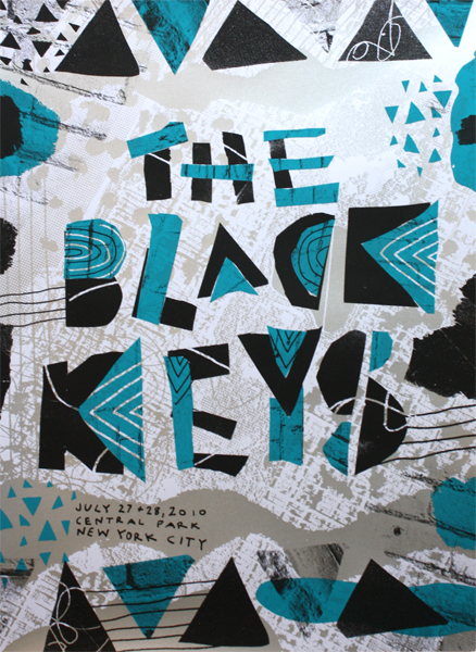
So, I went out to watch a football game and the SPORTS BAR down the street from my house was using Bleeding Cowboys on their menu, so I had to take a photo!! This font is completely overused! And it's not even legible!!

UB Midtown Posters

Hey all!

Can someone tell me which neighborhoods are considered part of UB Midtown? I think there were some conflicting ideas in my group last time we discussed it, but I am thinking of using map elements in my poster re-design, and want to make sure I get the location correct! (I know the general idea, but for this I'd have to know specifically).

Thanks!

Re: Eight Worst Fonts in the World

I actually tend to use Baskerville as my go-to for copy-- Gill Sans is my go-to sans serif. I cannot WAIT to get my hands on this list though-- thanks for posting, Jaime!

Re: Eight Worst Fonts in the World

I have a love affair with Eurostile. Its modern and clean, which I love. I tend to use Garamond too a lot. Its a really nice serif. Optima annoys me. I think its because when I interned at a local hospital, they used Optima and Futura on everything. Optima is so 2002. I saw a work van the other day that used Papyrus in their name. It's so awful. And I have no idea what's going on with that logo either.

Re: The Eight Worst Fonts in the World

I did see this article last week and I immediately read it. I love top (insert number here) lists!

I have to discuss good ol' Papyrus. It's so ridiculous that when you see it out in the world, it's unmistakeable. I never wonder, "Hmm...is that Papyrus?" No, it's an immediate acknowledgement. I ask myself if I'm in Egypt (or looking at something Egyptian-themed) and, if not, usually discount what I'm looking at as awful and/or amateur. Papyrus isn't a completely bad font, but it's just been so abused and overused over the years that it's become untouchable.

Saturday, November 5, 2011

Re: The Eight Worst Fonts in the World

Oh! Bleeding Cowboy! I never knew what it was called and I—ahem—kind of like it, but you are right, it’s definitely overused.

Personally, I’ve got a love/hate relationship with Futura. I love it so much that I hate it. I always start with it, I always have to play with the kerning, and I always switch it 17 billion times to “try something different for once.” And most of the time it ends up in my final design. It’s just...so...perfect. Helvetica, on the other hand, just irks me. But it’s symbolic of design in general, and I appreciate that.

Just in case anybody’s missed the Comic Sans monologue at McSweeney’s (warning: profanity), here it is:

Suggestions


Hi kids,
I am trying to change the colors of my poster to make it look more modern, and I need opinions on this color scheme. I was also thinking of trying it in various shades of red, but I'm not sure. Opinions?

The Eight Worst Fonts in the World

Last week in the Fast Company Blog, there was an article entitled "The Eight Worst Fonts in the World." The article starts with an interesting survey of designers who were asked to identify A) the fonts they used most B) the ones they believed were most highly visible C) the ones they liked least. The author then gives his opinion of the Eight Worst Fonts in the World: EcoFont, Souvenir, Gill Sans Light Shadowed, Brush Script, Papryus, Neuland Inline, Ransom Note, and the 2012 Olympic Font.

While I have to agree with a lot of his choices, there are some fonts that I dislike more than that:
1. Arial (because in web design, if a PC doesn't have Helvetica installed, it will default to Arial which gives the web page a COMPLETELY DIFFERENT look and feel)

2. Bleeding Cowboys (http://www.dafont.com/bleeding-cowboys.font), a super trendy grunge font that is completely overused.

3. Hand of Sean (http://www.dafont.com/hand-of-sean.font) An overused handwriting font. On my drive to work last week, I counted it being used in outdoor advertisement at least 12 times.

How about you? What fonts do you wish designers would retire forever?
Or, what fonts do you really love working with?

Wednesday, November 2, 2011

re: Baltimore Print Studios

Oooh, thanks for sharing that. I might have to attend one of their workshops at some point. I have not done much traditional print. (or any?) It's often really good to know analog methods in addition to the digital methods. (Video and photography are the same.) Anyway, it would be really interesting to learn!

re: Baltimore Print Studios

Neat Post.

That place sounds really cool, I always wanted to take a screen printing class in college but they always filled up so quick. I ended up taking lithography as my print requirement in school, which is a boring and antiquated process. Screen printing on the other hand is such a cool process, from posters to clothing.

I love the idea of a local small print shop and definitely need to stop by. Is this the same place that does the Hops and Pulp night, or whatever it is called? Every year there is the event and I always want to go but never do.

re: Baltimore Print Studios

I took a screen printing class in undergrad at UMD. Back then we learned how create our own screens with wax paper and an xacto knife. That was an interesting process to say the least. However doing something like that definitely humbles you when it comes to creating art/design with only the most basic of tools. I was a studio art major in college so I often try and incorporate hand drawn art into my designs whenever possible. It just makes my projects feel more personal. It must also be said that I am not as skilled in Illustrator as I would like to be, so I always draw by hand first, and then scan into the software...Probably a little bit tedious, but thats just how I roll.

re: Baltimore Print Studios

I was really excited about Baltimore Print Studios when it first opened but have yet to try their facilities. I did a lot of screen printing for a project a few semesters ago. It was 30˚, windy and wet, as I was spraying out a screen with a garden hose. I realized the importance of working with proper equipment. As far as getting my hands dirty I prefer a good ol' pencil and sketchbook or painting with acrylics. So much easier to clean up and a lot cheaper.

Right next door to Baltimore Print Studios is The Windup Space which hosts Dr. Sketchy's once every couple of weeks. Dr. Sketchy's is hosted in cities around the world and bills itself as "a cocktail of dames, drawing and drinking." It's a fun way to master your figure drawing or just get wasted. Check out their website to learn more.

I'd also like to recommend Make Magazine. I like reading it at the bookstore although I've never attempted any of their projects. But they at least got me believing I can put stuff together that would otherwise seem impossible. Anyway if anyone's interested here's their site.

RE: Baltimore Print Studios

I've never heard of BPS, but I'm glad I know about them now. I miss being able to get away from my computer and create something with my own two hands (I'm particularly fond of origami). I get more satisfaction when I make something hands-on rather than in front of a computer (video editing is different - I would rather be a part of the filmmaking process than the editing process, but editing is still fun). Michaels and Plaza Art are awesome because there's so much you can do. I think I'll sign up for one of their classes in the future.

RE: Baltimore Print Studio


I went to the Baltimore print studio when they first open last year. They were hosting the paper show. I had a chance to make a small poster on their presses. Every month I get their newsletter and by the time I decide to take one of their workshop, they are always sold out.
Like Anthony I also check out the plaza classes, I haven't taking one yet but I'm planning on doing it pretty soon. Maybe I'll have more luck getting into their classes than Baltimore print studio.

Tuesday, November 1, 2011

re: Baltimore Print Studio

This is pretty cool. I always enjoy hearing about / finding new things in my neighborhood. I'm sure all of us at some point in time have discussed or dreamed of opening a studio of our own. It's great to see someone do that, and do it as successfully as these two have.

I have always had an interest in shirt and screen-printing. I have used the freezer paper method on many of shirts but have stayed away from full blown screens for lack of working area. It's nice to know they have a tutorial to teach the interested.

Monday, October 31, 2011

Re: Baltimore Print Studios

I've been hearing about Baltimore Print Studios since they opened up, but I haven't a chance to take a workshop yet. It sounds awesome though. I'm glad that they're getting national recognition in HOW. 

Last year I took a workshop through Plaza Art on screenprinting. It was super fun and I made a cool design for a shirt! The whole experience was great and it inspired me to do more screenprinting. Plaza has other workshops that I'm sure are great for fun or inspiration, so everybody should definitely check them out if you're interested. Here's a link to their workshop schedule: http://www.plazaart.com/index.php?page=4.

Sunday, October 30, 2011

Re: Baltimore Print Studios

I've never heard of Baltimore Print Studios before, but I checked out their website and would love to take one of their workshops. I don't really have an extra $130 to shell out for the intro to letterpress class, but the concept is really cool. It's worth pointing out that their October workshops were both sold out. I guess there is a bigger demand for these back to basics type classes than I thought. We've been studying logos in designer's survival guide, and I have to say that I think Baltimore Print Studios could have done something a lot more creative for their logo. Maybe something with a better typographical treatment.

Saturday, October 29, 2011

Re: Baltimore Print Studios

I think the idea of Baltimore Print Studios is fantastic. I have never been myself, but I have had some friends who have gone to one of their workshops, and I have another friend who uses their letterpress on a regular basis (until she can get hers back up and running). She told me they are very helpful too and the price is just right. One day I will try and make it down there to take a workshop.

Thursday, October 27, 2011

Baltimore Print Studios

I’m not sure if all of you are familiar with Baltimore Print Studios, but it’s a letterpress/screen printing public studio run by 2 MICA grads, Kyle Van Horn and Kim Bentley. They wrote their first blog post in 2009 announcing their idea and asking for help, had their grand opening in 2010, and now they’re celebrating their 1 year anniversary this weekend. The studio is on North Ave, a couple blocks from The Charles and right near The Windup Space. The place is uber cool (and super cold in the winter) and they have semi-affordable 1-day classes to get you up to speed on letterpress and/or screen-printing techniques, and then you can rent a press at an hourly rate. They also have Mini-DIY-Magnetic-Poetry workshops, which are super fun, very affordable and kind of “beginner” (the workshops won’t substitute for a class). At the workshop, BPS has pre-made words, phrases and imagery for you to make your own holiday card (Valentines, Christmas, etc) and you letterpress them right there and then take home a pack of 30. I added a photo below from the Valentine workshop I went to. Proving how successful they’ve become in the past year, they are featured in this month’s issue of How magazine.


Find out about classes and workshops: wwwbaltimoreprintstudios.com
Follow them on Twitter: @baltimoreprints

I’ve found that getting off the computer and doing something hands-on and creative motivates and reinvigorates me as a designer. Has anyone else been to Baltimore Print Studios? If not, where have you been that made you get hands-on and in turn got you re-exited about being creative?

Wednesday, October 26, 2011

RE: Responsive Design

I'm so happy that you blogged about this topic! I'm with everyone else who had been baffled by the technology that goes into formatting a web page for a mobile device. I had been thinking about this very topic all week while I was working on my mobile app for project 2. It's really good to know how things work "behind the scenes", especially when it will help out your (hopeful) career! I have a lot to learn about web design so things like this really help. Thanks for the post!

Re: Responsive Design

This was a great post although I don't know anything about web design, it was nice to see the examples you gave to resize and adapt to the size of the browser. I always wondered, like Anthony, how they were able to resize the websites to fit the screens of smartphones and tablets. I always thought that they had more than 1 design for this website that resize to fit different type of device (thinking about it now it doesn't really make any sense).
Thank for the posts and explaining how some of it works.

RE: Responsive Design

I actually don't have a smart phone (gasp), but my fiance was trying to watch a clip on Hulu on his phone recently, and the phone basically freaked out. It knew he was on a phone and told him to download something, which ended up taking forever and it was a huge mess. I've wondered how phones know the difference, but I have noticed the m.facebook on his phone before... but I don't have to type it in-- it just does it automatically when I try to go to Facebook. I can't wait until all websites work like that-- it will make reading something on a small window at work MUCH more efficient. And Sarah- I have definitely noticed the slow/awful restaurant sites from phones, which is a huge bummer because other than facebook, that is probably what I use the web on a phone for most. Aaron or Jaime-- is this a lot more expensive to design? I feel like whoever mentioned limited resources (Sarah?) was probably right in that it could take some time before smaller businesses, like local restaurants, are willing to pay to jump on board.

RE: Responsive Design

That's really awesome. I've seen it on smart phones where the web address has an "m" in it. Like Facebook would be m.facebook.com. Sometimes the address would include ".com/mobile", and that would be a whole other confusing thing. When I had my old crap phone, I would have to figure out which one I needed to look at a certain website. Sometimes it would automatically sense I was using a phone, but other times I would have to type it in. I'm really glad this is a thing now so that there won't be x amount of pages dedicated to a different browser size.

Tuesday, October 25, 2011

Re: Responsive Design

This is a great find. I don't know much about designing for apps or mobile media, so its nice that there is something out there that makes it a tad easier to do. I also feel like you could really make some creative websites with this technology.