Thursday, September 29, 2011

Outsider Art

I recently watched In the Realms of the Unreal, Jessica Yu's documentary of outsider artist Henry Darger. An utter recluse (there are only 3 known photos of him) Darger had been raised in a boys home as a teenager and later found menial employment at a Catholic hospital. He lived in the same small apartment for 40 years and it was during this time that he worked on a 15,145-page manuscript detailing the The Story of the Vivian Girls, in What is known as the Realms of the Unreal, of the Glandeco-Angelinian War Storm, Caused by the Child Slave Rebellion

Interviewing the few people who knew him Yu is able to create a compelling narrative from the barest of details. Also by animating his illustrations the viewer gets a hint of what it must have been like to be in Darger's head.


The irony is his art sells for tens of thousands of dollars now and he is one of the world's most recognized outsider artists. Since his death in 1973 there have been many references in popular culture to Darger's work by other visual artists and numerous popular songs (Natalie Merchant, Sufjan Stevens, to Animal Collective just to name a few) These artists have variously drawn from and responded to Darger's artistic style as well as his themes.

Sometimes the polish of sophistication and commercial pursuits drains work of its vitality and idiosyncratic artistic expressions are just a whole lot more fun. These examples of hand painted movie posters show how an outsider's take on films can be much more direct and compelling than the usual floating heads that passes for movie poster design these days.
I'm curious what are some other favorite outsiders in design, music, art or whatever people in class would like to share.

Wednesday, September 28, 2011

Facebook PSD template

http://www.fuelyourcreativity.com/free-psd-facebook-fanpage-template/

This is a website where you can get a PSD of a Facebook fan page template for use in your projects. There is also a link on the page for a Twitter PSD.

RE: Street Art

Cool blog. Aside from the art, I am also very impressed with Katie's wardrobe, haha. But her street art is definitely fun! After I read this post, I searched for a few more examples of great street art and came across this website

In particular, I thought the examples from Tajikistan were stunning!

There are also a few of the same examples on this website, as on the site Matt provided. Very cool. It's pretty awesome to see how different the art is around the world, and how much life it can bring to a place...


Tuesday, September 27, 2011

Re: Street Art

So I think I am a little late to the blogging party this week, but here I am.

I remember when I saw "Exit through the Gift Shop" for the first time, and found the underground life of a street artist very compelling.  It is especially interesting how mainstream these graffiti artists have become in recent years, booking gallery shows and public displays.

Banksy has begun to work on canvases and prints. One of which sold for over $1m at auction and depicts an auction house, it was named "I can't believe you morons actually buy this shit".

I can't believe Banksy went out of his way to create a work of art actively making fun of his patrons and someone was willing to pay over a million dollars for it. But I digress, Banksy is a true street artist - shrouded in mystery and he still remains that way even though he went all Hollywood.

Monday, September 26, 2011

street art


I will agree with everything that has been said. I think this blog, and her ideas, are fantastic. It's so great to see what ideas other people come up with. The concept I found myself drawn too was the one with the placed shadows behind people. This is such an imaginative and fun concept. I really wish it was drawn out more. I would love to see the shadows as superhero's or fantasy characters.

Excellent post, thanks for another good blog to go to for inspiration.

street art

Although originally hailing from NY, Gaia has put Baltimore on the map in the world of street art since coming here to study at MICA. I strongly recommend checking out his work.
Recently Gaia used his considerable skill for a good cause creating a limited edition of print to help benefit the Baltimore’s Poe House & Museum.


You can see more of Gaia's work at unurth along with a seemingly endless list of other street artists.

Since 1996, The Deitch Project in Soho, has remained on the top of street art taste makers and it is well worth seeing the work in their gallery over the years. There are a lot of strong opinions concerning what the role of street art should be and for all the fame and money some artists have enjoyed there are many who decry the commercialization of the form.

Re: Street Art

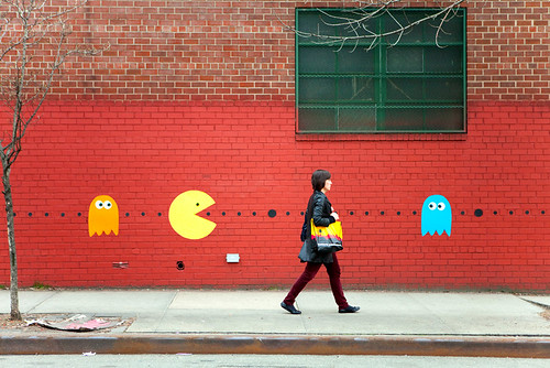
Cool blog Jolie. I wasted a good portion of my morning checking out the photos on the blog. My favorite pictures in the street art section were those with the pac man symbols on the walls. Maybe it's because I have a special spot in my heart for all things video games, but I really think this whole concept is so creative. If I saw pac man dots on the street, I'd probably think it was part of some sort of advertising campaign, but I'd still follow them to see what they were all about.

I like how in her about me section, she classifies herself as a "fun maker" (Jolie this totally seems like something you'd put on your blog). I also really like the pictures in this section, because they are extremely bright and colorful. I'm usually not a fan of designs that are this "playful", but it works for her personality. She's been featured in a lot of press, which impressed me. Has anyone else in the class ever been written about for their designs?

Re: Street Art

I agree with a lot of the love/hate for Color Me Katie. I love the playfulness of all her stuff and I wish it could be applied to ALL projects I do.
Her site reminds me of another blog I read: Sarah Hearts. Her stuff ranges from DIY projects to color palettes and to food recipes. It's nice and elegant to look at. I used one of her party DIY projects for one of my birthday parties :) Not too much postings on Street Art though...
I highly recommend "Exit Through The Gift Shop". It includes some of the world's most famous street artists and pokes fun at art and what is perceived as art. GO SEE IT!
I have the book Wall and Piece by Banksy and I highly recommend it if you're interested in clever Street Art and/or Banksy.

Sunday, September 25, 2011

Re: Street Art

I agree with Anthony. I don't know whether to love colormekatie or hate her because she is so damn whimsy and fun. I love this blog. It has so many bright colors! So many good ideas. Bubble machine in the shower, carousel horse race, using a heart punch for make heart vines. I found her street art very fun. The cut outs are a great idea (as well as for business cards), though I don't know about laying down on the sidewalk pretending to fly a kite. I'm a bit of a germaphobe. I agree with Jolie if I saw this kind of street art on my way into school, it would brighten my day. On a side note, I think colormekatie would buy Anthony's likable wall decals.

Saturday, September 24, 2011

Re: Street Art

Clearly I'm a big fan of blogs. I'm also a big fan of street art - Banksy style and then just street art and graffiti in general. I've yet to see the Banksy movie "Exit Through the Gift Shop" but it's in my queue. I took the believe photo in the 1000 block of Lovegrove Alley a couple years ago, and I'm always reminded of its poignance when I drive through the blue light areas in Baltimore. I agree with Jolie, street art can make something ordinary into something special, but depending on the context it can also make a statement. And have you guys been to graffiti alley behind Load of Fun on North Ave? I took that photo a month or two ago. The alley is amazing, but a little sketch so def take a friend.


Thursday, September 22, 2011

Re: Street Art

OMG! ColorMeKatie is so fun! I'm torn between loving her and hating her because she's so neat and creative. I love how bright, vibrant colors are present in almost every photo of hers. AND she looks like she's having fun with everything she does. This is most true in the post where she details how to make a confetti martini. I mean come on! Fantastic!

Blogs like Katie's are great because they present a person's creativity and personality. I'm planning on starting my own blog/website that will serve as both a showcase for my design work and an outlet for my crazy musings via a blog. Awesome post Jolie!

Street Art


In yesterday’s class we talked about blogs that we like to read (or just look at). I am not a huge blog reader, but I do find myself occasionally checking out colormekatie.com.

Katie is like a breath of fresh air. She loves to combine her inner child with her artistic abilities. It seems as though her main goal most days is to just make other people smile. Her simple yet clever approach to her work is what makes it so different. It’s whimsical and fun and always colorful. You can tell when she gets really busy with her job because she will sometimes post entries that are just fluff, like “10 Things I love About My Cat”. But my favorite entries of Katie's involve her street art and her paper crafts. Katie's art has been featured in several publications and has even made it all the way to France.


I love street art because I think it is one of the best ways to make something ordinary into something special. When the same streets you see every day are suddenly turned into works of art, it makes your day more enjoyable. I wish we had more street artists around campus. I think it would give the school a more welcoming vibe. 

Tuesday, September 20, 2011

Re: Creative Process

Great site!
My process seems to always vary. Sometimes as soon as I would hear about a project, my mind would start formulating some sort of "solution", and I would immediately run with the idea. I would think of the finalized design, and take necessary steps to It usually turns out doing well, but that's only for rare occasions.
If my brain can't think of anything, I would start small and then build it up.
I feel my design process is also asking for the opinions of others. Like anything I do, I need to have that "outside eye" to keep me on track.

Re: Creative Process

The Creative Process is something that all designers go through. For me, I have notice that it only works when I am in school. I come up with an idea, I present it to the class/teacher, I do my drafts and they evolve into something better that I am proud to say that I designed.

I have been freelance for a little over a year now, and I can tell you that the client doesn’t always understand the creative process. They always expect that the first draft should be the final project. A few months back, I was working with a wedding planner, and she wanted a save the date for one of her clients. After the first draft, she said that they were not satisfied and that they would be looking for another designer. When I asked what was wrong with the piece, she said that it was a good concept but I didn’t understand her idea. I still think there was a lot of room to improve the draft I had submitted.

I still believe that we need to educate our clients of our process. What I usually do is to tell them beforehand there’s always room to make the design better, like Molly said it’s a process.

Monday, September 19, 2011

re: creative process

Really great discussion of the creative process. It's always nice to be reminded that ideas are never born fully formed and ready to run.

A few years ago I read an article that showed lettering mistakes Frank Lloyd Wright had made beneath a final piece of signage. It was a great sense of relief to see proof that even the giants in our field start out with the same weak, naive scribbles and have to slug it out just like the rest of us. Whenever we see the finished piece it's easy to forget the scraps of post it notes and balled up pieces of notebook paper recording the less successful attempts that went into arriving at the solution.

One of the valuable lessons I learned from Ed's creative concepts class was that there are many processes people use. What's important is discovering the one that works for you. It helped clear misconceptions I held of a golden process which was "correct". There are certainly guideposts and exercises designers can make use but ultimately what  separates strong solutions from feeble mush is diligent work and a openness to making mistakes.

Re: The Creative Process

I really liked the blog you posted. I've been intrigued with the world of wedding invitation design since I was way younger, and this blog had some really unique invitation designs to look at. I love modern looking designs, and this save the date card stuck out to me. It's so clean and totally different from other save the date cards I've seen. Thanks for the great link.

The creative process and I have a love/hate relationship going on right now, especially in this class. I have a ton of great ideas for project 1 in my head, but I'm having difficulty executing them the way I envisioned. I know by the time I'm ready to hand the project in I'll be somewhat satisfied with my concept and designs, but the beginning stages are always the hardest part for me. Even though getting feedback on designs can be scary, especially if everyone hates my work, it really is the best part of the whole creative process. Without feedback, ideas I never would have thought of can be incorporated into my designs, making them better than before. I'm really looking forward to seeing everyones beginning designs on Wednesday.

Re: The Creative Process

Awesome post and site Molly. I'll definitely be bookmarking that one. Also, I really like Alex Merto's work. It reminds me of another designer I happened to stumble upon - Christopher Brand. Here's a link to his site: http://www.christopher-brand.com/. Both designers are talented with typography and it's obvious from their work. I love that Alex presented some alternatives to his book covers. I wish every designer did that!

Along with Kelly, Valerie, and Steve, I also took Creative Concepts with Ed Gold last fall. That class really helped me to think about design as a conceptually solution to a problem. It was challenging but I came out of it really inspired and confident that I could dictate my own creative process without freaking out too much.

Sunday, September 18, 2011

Re: The Creative Process

I love this blog! I especially love this series of beer labels. 
Like Jaime mentioned, I do believe the creative process is more frequently used when it comes to class projects, where the possibilities seem to be endless. Just recently, a friend asked me to design something for her wedding and I came up with what I thought was a great solution; it was typographically interesting, had great hierarchy and was simple but still satisfied all of her requirements. After sitting with her for about 20 minutes, just about every part of my original design was changed before she was completely happy. And let's just say that I don't think I'm going to go out of my way to take credit for the end result. I haven't worked with many clients in the "real world" but if they are anything like this, I'm not so sure that I'm looking forward to it.
When I do get the luxury of coming up with my own designs without having to please others, I find that my best ideas come to me either in my dreams or right before I fall asleep. Oh, and also in the shower. I get great ideas in the shower.

Re: The Creative Process

Very interesting read, I really liked the designs by Alex Merto.

It's neat to see all the different possible end results for a project. I also think it is amazing that this designer somehow finds the time not just to make one finished product, but four. How is it that I spend every free minute designing for one complete design and this Merto guy goes above and beyond?

While these are four different completed products, the majority of them appear to be similar in one fashion or another. Merto seems to have worked through one design and then altered it for the remaining three. I like the way he works, with alternate styles branching out from one main design Merto has the ability to redesign and keep the design evolving.

Re: The Creative Process

Great blog post and great website! I have a different point of view on this particular topic. I unfortunately feel that the creative process is a luxury that I only get to have when I am designing for classes or personal projects. At work, when every second of my day is being counted and billed, you have to make things work FAST and the FIRST TIME. Only occasionally do clients want to see several different ideas for a project. The design/printing industry is obviously very competitive, and with a lot of companies being tight on cash, they don't want hours and hours spent on design. I routinely get projects on my desk with only an hour or two of design time authorized.

Now, I obviously don't work for a high-end agency with deep-pocket clients, but my company does do work for some well known names. I think that with the economy in its current state, many people are not willing to spend the extra money for "better" design. They would rather spend the extra money on more product. In these situations where I am pressed for time, I find that a few quick pencil sketches only take a few minutes, and are WAY better than doing nothing. I also find that using a grid on every project usually makes my work a lot quicker.

Re: The Creative Process

You're not alone. I go through the same process, often crying at my desk instead of screaming at my screen. I find too that after I finish a project, months, maybe a year down the road, I take a look at it, and I feel different about it. I think our designs are constantly in a state of revision, because our tastes changes over periods of time. Creative Concepts was a great class here at UB to take to learn first hand that there are many different approaches to a design problem. Still the hardest part (I think) is having patience with yourself if you don't come up with the "perfect" idea the first time.

I agree with Hannah that Alex Merto's versions all seem to come from the same thought process, and I would like to read in his words about his process with each of those designs, and to see if there was any radical different approaches. Great blog Molly!

Friday, September 16, 2011

re: The Creative Process

Well I’ve definitely been there so (so so so) many times. I think working through the design direction you’ve chosen is very important as well. Once we start on a design project, we revise it, and revise it, and revise it again. And then when the final is due, the professor will sometimes says, “Ok but it’s still not finished,” or even you might say “Ok but it’s still not finished.” But once it’s really finished, it’s (hopefully) a great solution that a lot of careful thought, consideration and cleanup has gone into.

It’s interesting to see Alex Merto’s versions because they all seem to have come from the same thought process, and are just different variations and style experiments of a direction. I’ve always found it hard to go in two opposite directions to see which I’ve liked best, and have found that variations on an a single idea is the best way for me to move forward.

And then I’ll go ahead and dump my design proofs onto friends and family members and hold them hostage until they give me feedback.

Thanks for the designworklife.com link Molly - another blog to add to my “read these while procrastinating” list.


Thursday, September 15, 2011

The Creative Process


If you haven't heard of the design blog, designworklife.com, do yourself a favor and check it out. There was a post on Monday about designer Alex Merto, of whom I had never heard of, including a few examples of his book covers (which are fantastic). What is more great about his work, is that he shows examples of the different designs he developed during the creative process, leading up to the final product (above).

As designers, we all know that there a million different ways to approach a project, and after careful consideration, and a lot of research (well, most of the time), we dive head first into an idea/concept that we consider the "perfect" solution. And alllllll too often we find ourselves staring at the screen, sometimes screaming at it, when the direction of the design that we thought was going to be amazing starts to look, well for lack of a better word, like sh**. (You all go through this too, right? Or am I alone here....)

Point being, I think it is incredibly important to realize that the "perfect" design is likely not going to come out of your first attempt. And probably not after the second, or even the third. The creative process is just that, a process. The final design is sometimes the polar opposite of where you began, and that's OK! What we need to remember, is that in order to develop the best solution for whatever project we are tackling, we must be patient with ourselves. "If at first you don't succeed, try, try, again" (thank you 1st grade). If you feel that a design isn't working, or could simply benefit from a fresh approach, put that small piece of blood sweat and tears aside, and open a new document.

ALSO remember that there is often more than one good solution to the design. It is just a matter of which solution is the best for the project. This is why it is extra important to give yourself options, and to share those options with a fresh set of eyes, be it classmates, co-workers, clients, etc. I think that Alex Merto provides perfect examples of how there can be multiple "good", even great, solutions to a project.

To see more of Alex Merto's work check out his website alexmerto.com

Wednesday, September 14, 2011

Fast Co. United States of Design 2011

Every year Fast Company puts out their yearly design issue, this year is about the current state of American design. I highly recommend you check this out. There are really amazing articles (and a free iPad app as well)

Tuesday, September 13, 2011

Re: Storefronts

Storefront displays may be a dying art to some degree. Because of online stores as Steve pointed out, and the fact that many stores are in malls now, where there is usually less opportunity for a fancy storefront design.

I was not in New York this weekend, but I would have liked to take some photos for this discussion. I do really like this one on Howard Street though! Frightening, but memorable!

Re: Sewingpalooza

For starters the Allsaints Spitalfields window display is outstanding. The industrial design of the vintage sewing machines fits this brand flawlessly. Most of their apparel comes in a "neutral color palette" with a ton of black, grey, brown, and white, which gives the clothes themselves an industrial feel. Their logo, and website (including photography and layout) embody this sort of "vintage steel" identity. The tone of the entire brand is "smoky and serious", which is the exact opposite of Anthropologie's.

Anthropologie's displays (window and interior) are equally as beautiful as Allsaints Spitalfields', however embody an entirely different tone and identity. The "artwork" they use is far more playful, colorful, and dynamic. This fits their brand flawlessly as well, as their clothes are of a much richer color palette and full of a variety of patterns and styles. Anthropologie's logo and website (again including photography and layout) also have a "lighter/brighter" tone, which is extended into their displays. Great examples of well rounded company branding.

Design Brief-- Sorry for the delay!

Hey all! I totally forgot to post one of the examples of a design brief from my last class, and I'm not at my home computer right now, so I found one online that is pretty similar to what we did in that class.

Here is the link

If that doesn't work, click here and when you get to the page, click on the design brief.

I'm also including one of my own that I found in my old emails. It's not the best, but you can get the idea (and, it's short!) The assignment for this was to recreate a movie poster to sort of rebrand the movie.

The subheads we included were:
Organization overview (self-explanatory)
Identification of target audience (who does this organization reach, and who are you hoping to reach with your campaign/event, etc)
Identification of competing brands (what companies are your client's competition?)
Positioning statement (What is the point of your campaign/event/etc. What are you trying to accomplish?)
Organizational personality. (If your client was a human/person, what would they be like.)

An over view of the organization

When Harry Met Sally is a classic romantic comedy, made in 1989 and featuring Meg Ryan and Sally and Billy Crystal as Harry. Harry and Sally meet in college, and then run into each other over and over again for years before their friendship develops. After supporting each other through multiple breakups, their relationship eventually takes a romantic turn. The movie’s theme is an analysis of the question: Can men and women really be “just friends’? Both Harry and Sally stubborn, and it takes the entire 96 minute film for them to realize that they are meant to be.

Identification of target audience

When Harry Met Sally is a classic romantic comedy, and it’s target audience encompasses women of all ages, particularly 20-somethings and older. When Harry Met Sally is the “favorite” of many women in their 40’s, as the film was released when today’s 40-somethings were 20-something.

Identification of competing brands

Competing films include other “old” romantic comedies, like Sleepless in Seattle, Pretty Woman, Steel Magnolias, You’ve Got Mail, Runaway Bride, Must Love Dogs and While You Were Sleeping.

Positioning Statement

With a new movie poster, When Harry Met Sally looks to re-brand itself to recapture the hearts of women 30+ and introduce itself to younger women who didn’t grow up with the same love of the 80’s and 90’s culture and entertainment.

Organizational Personality

When Harry Met Sally is sweet, spunky and stubborn. It’s not very graceful but rather stumbles on it’s own words and clumsily spills ketchup of coffee on itself on a daily basis. When Harry Met Sally is awkward, but endearing, and straddles a thin line of uniqueness and classical cheesiness.

I hope this helps!!

Monday, September 12, 2011

Storefronts or lack there of

After reading all of the posts about this topic I decided to do a google image search for interesting and fun store fronts. I have to say I was surprised by the lack of results.


I was in Boston this past March, and saw the sewing machine storefront. I thought it was very cool, and also fitting for the feel of the store itself. But passed that one store I really cannot think of seeing any other one that was really dynamic. I've never really thought about it, but it is very shocking in this visual age. One would expect that to garner street traffic and dynamic storefront might be the way to go.


However, on the flip side I'm thinking that maybe as the internet becomes the major source of stores business they are forgoing flashy and therefore creative storefronts. Maybe they feel that less people will see them or that it will not draw in the amount of people neccasary. Whatever it is, store fronts are not a major source of interesting design.

Re: Sewingpalooza

I think the importance given to store facades and displays is well deserved and a perfect example of what we strive for as Graphic Designers. The first thing that came to mind when I saw this post was the fake store facades that cities like Detroit have adopted to make their abandoned streets appear more enticing.

For those of you unfamiliar, a few years ago when the Super Bowl was located in Detroit the city underwent a rehabilitation of sorts, covering most of the dilapidated buildings with plywood cutouts of store fronts and houses. Behind the plywood was just scaffolding. The intent was for the main areas that would be nationally broadcast to entice viewers to consider Detroit as a viable neighborhood when considering buying a house.

I remember it being pretty surreal seeing pictures of what looked like broadway stage pieces laid out throughout the street.

The whole situation stands as a great example of the evolution of stores and facades, to the point where the goods sold and branding are no longer even relevant, and the facades serve a completely different purpose than were originally intended.

I wish I could find some pictures of the Detroit storefronts but I did not see any.

Re: Sewingpalooza

Window displays always remind me of a movie made back in '87 called "Mannequin" where Andrew McCarthy is hired by a department store to design their window displays to help sales. His displays end up being a success and the department store is saved! (There's also that storyline where the mannequin comes to life and he falls in love with her).

On a smaller scale of Allsaints Spitalfields, I'm also reminded of Teavana's Window display. They have their tea sets on display, and they're absolutely beautiful. I love that both stores display the hardware in which their products are made from (although I doubt those sewing machines are for sale(?)).

I also have seen the freeze models on display in Nordstrom (inside the store rather than a window display) and I have to say it really creeped me out. I hadn't noticed they were there until they started moving. Not sure if it'll attract me as a customer because I immediately went the opposite direction.

Re: Sewingpalooza

The Allsaints storefront that Amy posted perfectly visualizes their brand. Their clothing always gives off a sense of British vintage fashion. I imagine characters from Sweeney Todd would wear Allsaints.

One of the best storefronts is Anthropologie. Like Jolie said, Anthropologie has consistently eye-catching window displays that represents their brand perfectly. Every display of theirs shows some aspect of the brand and what they have to offer inside.

Storefronts are important because they give shoppers the first glimpse of what's inside the store. The storefronts that do it right are visually representations of the brand and Allsaints and Anthropologie and the leaders of the pack.

interactive window displays

After reading this post, I did a search and found these interesting interactive window displays. Although, I don't think they can compete with the emotional response of an entire storefront of vintage sewing machines. The repetitive quality of something antique is especially alluring. However, these interactive window displays certainly would draw me in and have clearly staked their claim in the field of window displays.

I am especially fond of the Caroline display. Who doesn't want to see themselves with buttons for eyes? Haha! And the last post on this link is for artist Robet Statton. His storefront window displays have an electronic interactive canvas that senses hand movements through the window glass, allowing the viewer to influence the outcome of the art on the screen. I haven't seen it, but I get the sense it would be like finger painting with out the muss.

Sunday, September 11, 2011

The risks and traps fashion presents are daunting and it reminds me of that episode of Will & Grace, when Jack hires himself to create the Barney's Christmas window display and we, along with Parker Posey, see it's a complete disaster.


Jack doesn't get why Karen whipping 6 half naked body builders pulling a sleigh isn't the christmas cheer Barney's wants to spread. We get it, Posey gets it. Branding humor, ha ha! Gays love whips and muscle men, ha ha!

The displays that everyone's posted on the blog on the other hand are really smart and do hit the mark.

They're also a nice reminder that brick & mortar stores are still a critical element in reinforcing a brand as well as delivering a personal message that can be lacking with an online presence. As much as technology has changed the way we go about shopping today it still hasn't supplanted the need for the consumer to have a physical connection.

There's a healthy dose of nostalgia and an argument can be made concerning the "honesty" in new companies being able to easily acquire the reputation of tradition without actually putting in any of the time. Although considering the seemingly endless appeal of "neo-traditionalism"  and fake authenticity such arguments are strictly hypothetical.

Overall the art direction for each of these projects brings to mind William Morris in the 19'th century and his reaction towards the industrialization of product design. Both Morris and the examples of visual merchandising in the previous posts are focused on production that places a high value on exceptional craft with traditional mediums. Perhaps today's designers are rebelling against the virtual landscape the internet has created and reminding us of our emotional and human connection with consumption and shopping?

Fetishizing of the past is hardly new. What does change however is the manner that designers approach and utilize it.

Back in the 80's and 90's, for reasons lost to us today, casual dining restaurants  weren't satisfied until every available inch of their establishment was covered with random old crap. The only thing thicker than the sentimentality was the layer of dust that would inevitably cover their tin sign advertisements and rotted pair of ice skates. It was junky and cluttered and the joy they initially brought became a depressing joke and enthusiasm waned.

Allsaints Spitalfields on the other hand has a clear concept and focus that highlights the beauty of sewing machines by presenting them in a grid and perfectly lit. It will be interesting to see how perception changes in time and if Allsaints Spitalfields storefront will one day seem as inauthentic as a "home style" dinner at the local Bennigans.

There's so many avenues someone can take take that could lead them to this line of work. Of particular interest to me is illustration and James Jean's work for a Prada window display from a few years ago. It's tasteful and beautiful, traditional and modern. It ably grasps the elusive quality of fashion. Double click it to really check it out.


They extended the branding through advertising and products as well...


Also this video with music is by Coco Rosie was produced. Coco Rosie were fashionably hot at the time.

Pretty stuff, no? Doubly impressive considering that most comic book artists consider mustard stained sweats and ill fitting Wolverine tee shirts perfectly acceptable.

Design Brief Exampes?

I am working on the design brief for class and I want to be sure that I'm including the correct information. Does anyone know of any good examples of a design brief that we can use as a reference? The class readings give good information about how to arrive at information that should be used as a basis for the brief, but not the scope of the content that should be included.
I found these references so far:
http://www.davidairey.com/how-do-you-write-a-graphic-design-brief/
http://www.cleardesignuk.com/design-brief.html

Re: Sewingpalooza


I am loving the blog topic for this week because #1, when I was 10, Mannequin was the best movie of ALL TIME and #2, one of my favorite Christmas pastimes is going to New York City to see all of the window displays. I love Macy's and Bloomingdale's traditional Christmas windows, but my favorite every year is Bergdorf Goodman's windows. There is actually a short film about last year's window displays here:
http://blog.bergdorfgoodman.com/windows/day-tripping

Their windows always have daring styling, amazing costumes and couture, and have some of the best art direction I have ever seen.

This is a slideshow of the best holiday window displays from last year:
http://www.refinery29.com/nyc-best-holiday-windows/slideshow#slide-1

Re: Sewingpalooza

Storefront displays are so interesting, and I’ve seen multiple job openings for visual merchandisers. Design*Sponge has a good post on Anthropologie’s visual merchandising here. It sounds like every Anthropologie location has their own set of artists responsible for the store’s displays.

When I was younger I saw a store in the White Marsh Mall — I think it was Rue 21 — use freeze modeling for their mannequin window displays. Basically, instead of having mannequins stand in the store window modeling clothing, real models stand in the windows and pose like mannequins. If I’m still being unclear, check out a video here of freeze modeling in action. I remember it being so cool and I kept walking by the store to see if they moved or switched or whatever.


Saturday, September 10, 2011

Re: Sewingpalooza


While it seems like we’re on the topic of storefronts, I thought I’d share my most favorite store to visit solely because of their window displays—Anthropologie. Known for creating inspirational art out of unconventional materials like hangers, wine corks and clothespins, Anthropologie’s design team never ceases to amaze me. They effortlessly tie their works of art into the latest trends of the season. Even if you don’t love their price tags, it’s hard not to love Anthropologie’s one-of-a-kind displays. This website has great photos of some of the astonishing designs. Also check out this video and this video for some awesome behind the scenes footage!

Re: Sewingpalooza


I love the Boston store front. I definitely would stand there and look at it for hours before walking in. I've never been to the Apple store in New York, but I have seen the amazing store fronts from Macy's at Christmastime. Since I did a boutique for my Project One, this was a good reminder to keep the store front in mind when laying out the floor plan. Store fronts are the "first impression" of your business, and I know the more unique or creative a store front is, the more I want to go in and check the place out no matter what they are selling.

Friday, September 9, 2011

Re: Sewingpalooza

Amy - That was a very cool storefront. I haven't been to Boston in quite a while, so that store isn't familiar to me. The antique sewing machines definitely give the store a vintage feel, and I would definitely be inclined to browse through to see what the store is all about.

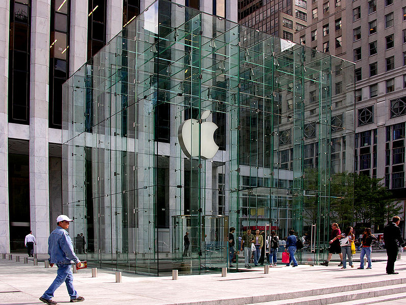
Since I'm the first one to post after Amy, I just had to talk about this Apple storefront before anyone else did. I'm sure many of you have at least passed by Apple's Fifth Avenue store in New York City. This storefront if extremely unique. If you've never seen it before, the store is actually completely underground. What you see at first glance is a crystal clear cube with the Apple logo hanging down. The logo glows at nighttime, which draws in swarms of people (similar to how those bug zapper machines draw in mosquitos).  Once you walk through the doors, you take stairs down to the actual store. According to our most trusted source Wikipedia, this storefront was designed by Bohlin Cywinski Jackson, and actually won an architectural award for its design.

I think the entire design of the storefront is just amazing. Although the Apple store could be located inside a cardboard box and still be crowded with customers, I think this design is extremely innovative and inviting. Apparently, the store is actually in the process of getting redesigned. According to this article, "The glass cube is being rebuilt, this time out of 15 huge panes of glass instead of the 90 that were in place." Interesting. I'm curious to see what the new storefront will look like when it's completed.

Thursday, September 8, 2011

Sewingpalooza

This is far too short, I'm sure, to count as my post for the week- but for right now, it's all I've got :) I'll post more later, but to get things rolling this week, I'd thought I'd share a few photos. (Found online from other blogs)

I was in Boston for the first time this weekend, walking down Newbury Street, and I absolutely fell in love with this storefront. The store is called Allsaints Spitalfields, and from what I hear/what I found online they sell super cute/trendy clothes, (pretty expensive) and there are locations all over- Boston, Chicago, LA, Miami etc. The store is based out of the UK, but from what I got from the website, the US headquarters are in New Jersey.

Anyway, the store windows are lined with antique singer sewing machines. I LOVE this! I think it's so interesting and modern, but with such an interesting touch considering the pieces are all antiques.

From far away (across the street) it looks super industrial, and then close up you get a nostalgic feeling like you're staring at something your grandmother had. What a combo!

For the rest of the weekend I kept an eye out for other interesting storefronts, but the only thing close I noticed was the wall of baseballs in the window of the ticket office at Fenway. Interesting, but predictable. (Sorry, I don't have a photo of that.)

Wednesday, September 7, 2011

Project 1

After we talked about my project in class, I am a little confuse about what to do. The organization name is "Foto Konbit". To see who they are, what they do, you can click here
I was thinking about doing a traveling exhibit. I was thinking about doing the signs, the posters to promote the exhibit, and I don't know what else. I could use some ideas. 
What do you think if I call the exhibit "through their eyes"? I am open to any ideas that you have. 

Tuesday, September 6, 2011

Re: Museums, Baseball and Design

I have to agree that this is a great example for our first project. At first glance I would have not known this was for a baseball museum. The type treatment is modern and fantastic and I like how they incorporated circles into the design to represent baseball, but not in a way where it becomes annoying.


Like Anthony said, I do agree there is a bit of a retro/vintage feel with the selection of type and combination of color, which I find that to be a nice contrast with the technology and digital solutions they also used in the exhibit. It's refreshing to see print and digital work together.

Sunday, September 4, 2011

Re: Museums, Baseball and design.

This is a great example of a branding campaign for our Project 1. I was a little afraid that I wouldn't understand anything because the project had to do with both sports and math and that's like speaking two different languages to me. But the design is so well done that I not only understood it, but I also enjoyed it!

The typography is top notch and it really conveys the tone of the whole campaign. Together with the colors, layout, and other little design details, the typography conveys the retro/vintage feel of the campaign. I also agree with Rich in that there's a good hierarchy in the design and a great sense of flow. Thanks for posting Steve!

Saturday, September 3, 2011

Re: Museums, Baseball and design.

I’m not that into sports, especially when it comes to baseball, but the typographic elements in this exhibit grab my interest. I love when museums are more than just, as Steve put it, look, move and repeat. Adding interactive elements really enhances the entire museum experience.

When I was in 10th grade, we took a field trip to the Spy Museum in DC. Because of those special interactive elements, I will never forget it. The best part was toward the end of the museum--a cut out in an air duct allowed you to crawl through the ceiling and spy from above on people in the beginning parts of the museum. It was so concealed that there was no way they could see you. I loved that! Another thing I remember is being taken into a room with a “guard” and told that I needed to quickly adopt a cover identity and memorize specific details about it. The urgency of the scenario really made me feel (I assume) how a real spy might feel.

Re: Museums, Baseball and design.

The Baseball Hall of Fame example definitely brings a little more understanding to the project one assignment. I can see how the “One for the Books” exhibit is a different entity from the hall of fame, yet it still fits in with the hall’s brand. The signage and collateral look super fun, and the layout of factual information is really engaging and easy to visually scan.

I’ve never thought about applying design to sports but HOW Magazine has had multiple (if I’m remembering correctly) articles this past year about the application of graphic design in relation to sports teams and events. May’s issue had a 3 page article in their In-House Issues section about the Indianapolis 500. The article discussed reinventing the logo and look every year, and the pressure the designer’s feel because of how into the graphics the fans are. The article itself was a really interesting look into the design department of a yearly event, but I was most interested in the idea of memorabilia and how that plays a significant role in design. I’m sure the program for the special exhibit at the Baseball Hall of Fame will be held onto for years as a keepsake of the trip. Because of this idea, it’s so important to think about a lasting impression and how that should affect our design choices.

Sports and Design

Steve, I really liked the pictures you posted. The last museum I visited was Smithsonian American Art Museum, and I don't remember any exhibits having modern designs like this baseball exhibit. I know that many museums deal with serious topics, so this typographic treatment probably wouldn't be appropriate, but I think the design really fits the subject matter in this case. I'm not a huge fan of baseball, but I would definitely take a look at the One for the Books exhibit because the design would immediately draw me in. The designer really made the information aesthetically pleasing.

I know this doesn't relate to a museum in any way, but it does have to do with modernizing the world of sports. I read an article a few days ago about iPads replacing paper playbooks in the NFL, and I thought you guys might be interested in it. The Buccaneers are the first team to do so, but I anticipate other teams will follow in Tampa Bay's footsteps in the next year or two. You can check out the article here.

Friday, September 2, 2011

Just wanted to share this

I saw this advertisement for a fast food company today and I was FLOORED by the design work. The stop-action animation work and art direction, as well as the message, are truly inspiring. This could be a lesson to other companies on marketing. Just thought I would share:


Thursday, September 1, 2011

Museums, Baseball and design.


After discussing the first project further in class Wednesday, I immediately thought of what I felt was a similar project. I think this may also be where I go with my idea for the first project. Over the summer I went to Copperstown, home of the baseball hall of fame. (Don't worry, this isn't all about sports) I had been there prior and was a little less than impressed. It felt like a fairly dated museum in all honesty. This trip was quite a bit different.

It just happened to be the opening of new exhibit; “One for the Books: Baseball Records and The Stories Behind Them.” If there was ever a change of pace in a museum, it was this. Most of the exhibits in Cooperstown are fairly “normal.” Look it's an object, here is some info. Move and Repeat. The design is fairly minimal and pretty boring.

As you can see from the photos above, this exhibit seems to be changing things. They began using fun typographic treatments not only in the program guide but also in the exhibit itself. It really made for an all encompassing presentation.

And if it wasn't enough to use good design they added a few interactive elements as well. The main was a large tower in the center of the exhibit. Within it was every number and stat a baseball lover could ever hope to investigate in a digital format. The amount of information in this tower could probably fill ten Cooperstowns, but by embracing technology and digital solutions, they have made the information easily accessible. Furthermore, they had small touch screen kiosk that had a trivia game on it. Again using technology wisely.

All in all, I was very impressed with the exhibit. It made to happy to see good design applied to sports in a meaningful way. I look forward to everyone thoughts and I apologize for the bad pics, there was no photography in the exhibit during the first week. You can find links to a little more info about the exhibit here and here.