Thursday, October 31, 2013

The Oatmeal: Humor from a designer's POV


I've managed to find a way to worm THE OATMEAL into every class blog in which I've ever participated, so I'm glad I get to do it again here. The creator, Matthew Inman, started out as a designer, but he now does this website full time. He makes comics about all kinds of stuff, not just design humor, so it's well worth a long perusal. His cat comics are especially hilarious....


Re: DESIGN HUMOR

For a quick dose of designer humor, it's hard to go wrong with Clients From Hell. I can't vouch for the veracity of these stories, but a lot of them are funny. Here's a sample:
After designing a new brochure and preparing a draft copy, I went through it with my line manager. He highlighted (with yellow and orange flouresant markers) words and text that he wanted to bring to the attention of the MD for his final approval. We then presented it to the MD and asked for his thoughts, which were “I like it, and I like these bright yellow and orange parts. You should do that for every other word.”

Re: Design Humor


design funny


I'm almost embarrassed to admit I own this shirt: 

If you know anyone who is hiring, please forward my application:

And this just made me giggle:


Wednesday, October 30, 2013

She's Alive, she's alive!

As promised, a zombie chic for Halloween...


Tuesday, October 29, 2013

LIVING GIRAFFE!

I promised to post photos of my Victorian (well, one is from the reign of William IV) poster tea towels, so here they are. I hope the images are large and clear enough to read all the text, because it's marvelous.


Sunday, October 27, 2013

Re: Design Humor

Found some design humor on a Pinterest board (http://www.pinterest.com/hollymccaig/design-humor/)


Saturday, October 26, 2013

Poster Advice Por Favor

Hi guys, if I could get your opinions that would be great. I have scaled down the mans face a bit, and played with the placement. I think I found a good placement and size, but still feel like it is a little awkward (so maybe I haven't?). I have placed it in three different ways around the photos. Do any of them work? Which do you like best? Do you have any suggestions on how it could fit in with the series better? Thanks. I put the three options below. and then add the other two posters so you can somewhat see them in context. Let me know what you think. Thanks again!


Final Posters

Hi, everyone. Here is my final posters --if you have any suggestions, please share by Monday so I have time to consider changes before I go to press.

Thanks and I cannot wait to see everyone's posters!


RE: Design Humor

Great topic Antoinette. I don't know if I have any humorous image posts to share that have happened to me, but here are a few images that made me chuckle (one is not so funny, but I thought it was super clever so I threw it in there too).


There is also site I found about a year ago during W&I (I didn't want to put this as my whole post since half of you were in that class with me). The site displays humorous and interesting posters created by designers incorporating annoying (to most) critiques. See my favorites here or view the full site. Here is a sneak peak of one (ok two, it is so hard to pick just one!):


Revised Wes Craven Poster

Hi, everyone! Thanks for all your helpful comments in class. I haven't fixed my image color yet, but I've changed the font layout (which now will be the same on all of the posters), my title font (using Soho--thanks to Nathan for the suggestion), and experimented with the gray rectangles vs black. The gray is 97% black. I also tried using the color pulled from the image for the rectangles instead of using it for the AFI logo.

Let me know what you think of my changes and which rectangle you prefer.


Friday, October 25, 2013

DESIGN HUMOR

We have a little over a month and a half left in the fall semester. We all have projects due and they  are piling up quickly. Our jobs always seem to demand the most from us when we have the most going on in life. We have a lot on our plate and not enough hours in the day. School + work + homework +life = an exhausted advanced graphic design student.

So...for this week's blog, I thought it would be fun  to post images of design humor to lighten the load! Your task is to find (or create) then post a hilarious flyer, comic strip, poster, statement, e-card, picture, animation, or ANYTHING related to graphic design. Feel free to include a story of your experience with the image. Maybe we can relate to something you post or perhaps we've had a frustrating experience with a statement- the goal is to identify an experience and laugh it off. After all, life's too short :o)

Enjoy!


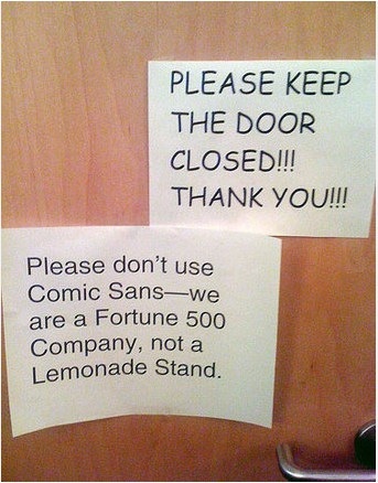
I've had to post many signs, created by a previous boss, using Comic Sans. Non-designers think it's a cute, friendly font and I agree...but it has no place in a professional environment! This image says it all.


No matter how hard you try to look away, you can't help but return to the poster to mentally fix the errors. They MUST be fixed!


#funny #joke #humor #Design_humor 
 I've had this happen... a lot. I assume clients know to just attach an image in an email; but apparently not everyone knows how to do that. They think the proper way is to include it in the Word file along with the copy. Who knew?! Now I make sure to tell them to send the original image by itself. The Rock's facial expression in the last srip probably mirrored my own at that moment!

Thursday, October 24, 2013

Re: Logo Mashups


Great Blog topic! Lots of the ones in the original post are amazing, but the Gerber Gucci baby is pure genius.....

Re: Logo Mashups

I thought these were good ones:


RE: Logo Mashup


Ignore the shoddy image quality.
 

Re: Logo Mashups

Eh, I've got nothing. Some of the mashups work for me (I like the ones that form puns, like the Playboy Bunny and IHOP), and others don't. I'm sure I couldn't do any better.

Instead, why not play a quick round of Name That Blue, a game that makes you identify brands based only on a single color?

RE: Logo Mashup

This was hard... here's what I came up with: