Just in case anyone needs some social media icons (I got these free off the internet and put them in a dropbox folder)
https://www.dropbox.com/sh/sjgd1foa75dyx2j/j0yNnCk2h6
Tuesday, November 26, 2013
Sunday, November 24, 2013

Thursday, November 21, 2013
Facebook PSD Download
Here is the site I used for my Facebook download: http://drewmatthews.ca/projects/facebookPSD/. It is really good, with clear labels and layers. I did have to duplicate "post" boxes though, so make sure you keep an original version to help modify. Hope this helps :)
Mucha Logos for Feedback
Hi All,
Sorry I'm not there tonight, but here are some visual identity ideas to ponder.
I'm 95% on the font... What do you guys think?
Arrangement of elements has been tougher to pin down, but I'm drawn to the simplicity of the 3 single letters. Thoughts and suggestions are welcome and appreciated--Thank you, and Happy Thanksgiving!


RE: Merry Thanksgivikah and A Happy New Year!
What a fun post! I'm not a drawing wizard, so please don't judge me too harshly :o)


Wednesday, November 20, 2013
Have a holly Jolly Christmas....
If it's cool with everyone, I'm going to fly right over Thanksgiving and land on Christmas, which is my favorite Holiday and one I approach as a purely secular event. I think the sheen and glimmer of childhood Christmases never really wore off for me, and--cheesy as t sounds--it still feels like a magical time. I love getting to hang with my extended family, eat good food, exchange presents and all that good stuff, but mostly I love Christmas because it's a visual feast. I love colored lights, I love shiny things, and I love decorating.... ANYTHING. I love shopping for fancy wrapping paper at Target, baking and ornately icing cookies, cutting paper snowflakes, trimming the tree in vintage glass bulbs, making holiday cards by hand, etc.
Click HERE to view an e-card I made using an animation program called Hype. It's an easy program to learn and is very affordable. Highly recommended!
Anyway, here are a few holiday-related things from my illustration archives. If I could get a job designing retro X-mas decorations and wrapping paper, I'm pretty sure I could do that for the rest of my life and be totally happy.
Happy Holidays!!!!!

Sunday, November 17, 2013
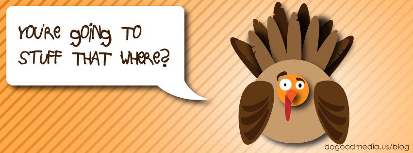
Designer Turkey
I decided to go posh with my turkey design. While I used a basic clip art turkey for shape guidance, I did this all by hand--no tracing. Thanks to Nathan again for the shape builder tool demonstration--that is how I created her eyelids!


Friday, November 15, 2013
Merry Thanksgivikah and A Happy New Year!
So I had originally planned on making this blog topic about calendar design, but I misplaced the notes and samples I had collected for it. Luckily a few days ago, Stephanie gave me the good idea of getting in the thanksgiving spirit by requesting everyone to post a creative, illustrated turkey or holiday symbol this week. Here is mine; its a turkey menorah:

So get creative and illustrate away. Maybe some of you will have turkey zombies because promised zombies were forgotten about. And, feel free to also leave a comment or example of a type of calendar design you like. After all, it is that time of year when you start hunting for the perfect calendar to display by your desk at work for another whole year. Do you go for the traditional wall calendar? Is your focus on design, readability, or a little bit of both? Are you calendars Interactive? Here is a link with a load of creative calendars from a "Calendar" Pinterest board. Which will you buy for 2014?

Thursday, November 14, 2013

Wednesday, November 13, 2013
Off Topic
Apropos of nothing, how do I get departmental permission to enroll in Portfolio and Seminar next semester? Who do I need to talk to about that?
Typography Trends
When I asked professor Google about typography trends, I discovered a few common threads: Larger typeface sizes (16-18 pts for body copy), slab serifs fonts, flat design (as Stephanie mentioned early on), and handwritten type. Writers also mentioned simpler, sleeker design styles, a general increase in white space, and a preponderance of vintage styles.
Below are some scans I made of Anthroplogie's November lookbook. Although the photos are readily available online, the beautiful typography is conspicuously missing from their website. I used to throw these lookbooks away as soon as I got them (because they only reminded me of how broke I am), but now I love to look at them: Anthro's aesthetic sensibility is so sympatico with my own, I just can't tear my eyes away from their print catalogs.
The large decorative font they've use below is so lovely, flat, geometric, and clean, with extreme stroke contrast and a definitively vintage look. My favorite element has to be the unique long, sweeping tails/ascenders/descenders/etc. I actually re-drew it in Illustrator (minus all the long tails) so I could produce a large enough image to send through Myfonts.com's font identifying program, WhatTheFont. Unfortunately, I seem to have stumped them. If anyone recognizes this typeface, please tell me what it is!


Tuesday, November 12, 2013
RE: 2013 Design Trends in Print
What a fantastic article!
I took the time to search for unusual paper sources. Unfortunately I was not able to capture any with my phone, but I was lucky enough to find some "interesting" stock:
1) Elephant Paper- Handmade paper made from 80% elephant dung and 20% rice paddy stubble. Great for calligraphy. Acid free and pulped in Sri Lanka.

2) Stone Based Paper- The stones are ground down to a fine chalk-like powder then a small quantity (about 20%) of non-toxic resin (HDPE- High Density Polyethylene) is added as a binder for the calcium carbonate. Together these materials create a soft, smooth, bright white paper that is tough, durable and both water and tear resistant. The paper is chlorine free, acid free, and safe for the environment.

3) Water- similar to 3-D printing, water printing seems to be making its way up

4) Concrete- who would've thought the ground we walk on could be used as a paper stock? In a few years time we can print out our own house.


I took the time to search for unusual paper sources. Unfortunately I was not able to capture any with my phone, but I was lucky enough to find some "interesting" stock:
1) Elephant Paper- Handmade paper made from 80% elephant dung and 20% rice paddy stubble. Great for calligraphy. Acid free and pulped in Sri Lanka.
2) Stone Based Paper- The stones are ground down to a fine chalk-like powder then a small quantity (about 20%) of non-toxic resin (HDPE- High Density Polyethylene) is added as a binder for the calcium carbonate. Together these materials create a soft, smooth, bright white paper that is tough, durable and both water and tear resistant. The paper is chlorine free, acid free, and safe for the environment.
3) Water- similar to 3-D printing, water printing seems to be making its way up
4) Concrete- who would've thought the ground we walk on could be used as a paper stock? In a few years time we can print out our own house.
Re: 2013 Design Trends in Print
Design trends. Hm. Well, in light of the original Aaron Kitney blog post, here's something of a rebuttal: 13 Popular Print Design Trends of 2013 (That Make Us Cringe). I don't entirely agree with all of these points--some of these techniques have their uses, while others are much more fundamentally flawed and don't have much to do with 2013--but it's not a bad overview of design mistakes.
And speaking of trends, here's a predictive infographic I found here:

I hope it's wrong, because it's really, really ugly.
But here's the problem with trends: they're transient and temporary, by definition. Rather than spending our time and effort concerning ourselves with trends (following them, creating them, consciously avoiding them), wouldn't we be better off pursuing an ideal, timeless design philosophy? Plato's design, if you will. It would look good and be usable for any audience, at any time. This may be impossible, but I'm not willing to believe that yet.
Of all the sites I've seen on the Internet, MetaFilter probably comes closest to timeless perfection in visual design. Here's what the front page looked like in its beta-test infancy in 1999:

And here's what it looked like this very afternoon:

Very little has changed. Even the colors are the same. The layout is clear and usable. Instead of chasing trends, maybe we should strive to get things right the first time.
And speaking of trends, here's a predictive infographic I found here:
I hope it's wrong, because it's really, really ugly.
But here's the problem with trends: they're transient and temporary, by definition. Rather than spending our time and effort concerning ourselves with trends (following them, creating them, consciously avoiding them), wouldn't we be better off pursuing an ideal, timeless design philosophy? Plato's design, if you will. It would look good and be usable for any audience, at any time. This may be impossible, but I'm not willing to believe that yet.
Of all the sites I've seen on the Internet, MetaFilter probably comes closest to timeless perfection in visual design. Here's what the front page looked like in its beta-test infancy in 1999:
And here's what it looked like this very afternoon:

Very little has changed. Even the colors are the same. The layout is clear and usable. Instead of chasing trends, maybe we should strive to get things right the first time.
Illustration versus Photography
I found a good web article that touches on the trend Tracy brought up--the new tendancy to use illustrations instead of photographys. According to the article I read, there are several reasons for this latest trend, which I will summarize for you:
The article also speaks to the creation of a new art form: photo-illustration. Photo-illustration combines both photography and illustration as seen in this nude portrait by Justin M. Maller, the creative director of The Depthcore collective.

- Photography has been overused for 40 years now
- Editors and Advertisers are looking for new ways to capture attention, and illustration is not as overexposed as photography
- Photography is considered less exceptional now that everyone has access to photography through instagram and other social media.
- Illustration is cheaper than photography (costly sets, stylists, make-up artists, props, models, airfare).
- Illustration has the ability to be infographic.
- Illustration has the ability to relate abstract ideas and concepts since it isn't bound by reality.
The article also speaks to the creation of a new art form: photo-illustration. Photo-illustration combines both photography and illustration as seen in this nude portrait by Justin M. Maller, the creative director of The Depthcore collective.

Monday, November 11, 2013
RE: Trends
Pantone releases the 2014 color trends for spring/summer
Well, I was exploring the trends that are going to be…since we are in the middle of 2013, and we are always looking forward…I found Pantone released their color predictions for spring/summer of 2014.
Pantone is a wonderful reference for all designers, whether you are focused in interior, graphic, print, web…
The colors and palettes that Pantone has predicted for the coming season are not too off from what we’ve been using already. The difference is that the use of the colors are changing. Not just the tones and such. While bold is still a huge hit, the way it is used is predicted to be different. Bold colors will be more harmonious and modulated.
Pastels are predicted to go in two directions. A shaded, grown-up version, and a floral, more playful version.
As always, Pantone allows designers to buy their colors and the palettes before they hit the market. Please follow the link at the bottom of this article to find out more….
Pantone LLC, an X-Rite company and the global authority on color and provider of professional color standards for the design industries, today announced the Spring/Summer 2014 edition ofPANTONE® VIEW Colour Planner. Looking at color as a language, this multi-discipline color forecast, titled Portal, highlights the key palettes for women’s wear, menswear, active wear, cosmetics and lifestyle, as well as industrial and graphic design.
Similarly, the colors on our wheel for Spring/Summer 2014 are all interconnected. As we travel through the portal we see the use of strong color continuing, becoming more grown-up, mellow and sophisticated in its level of thinking.
“Color has the power to stimulate consumer emotions and influence purchasing decisions. As today’s consumer becomes increasingly color savvy, it is critical that color remains a pivotal part of any design strategy,” said Laurie Pressman, vice president of the Pantone Color Institute. “The PANTONE VIEW Colour Planner forecast not only provides fresh and unexpected color combinations needed to capture the attention of the consumer, but also the context, material and product direction for how the colors can be used.”
PANTONE VIEW Colour Planner Spring/Summer 2014 contains the following seven palettes:
Natural Dimension
The Natural Dimension colors blend fossilized beiges, including bone sand, concentrated smoke grays, metallic lime and frozen ether – the colors of ruins that tell us stories from the past.
Passage
Passage highlights blue, a color most appreciated through personal perception: Blues of innocence, sadness and hope, and blues of the sky, the infinite, the everything and the nothing.
Both Sides Now
Both Sides Now draws on the past to paint a modern future with a palette immersed in rich sepia tones, antique white, lamp black and yellow ochre, blended to obscure and reveal hidden layers.
Turned on its Head
Turned on its Head reflects the passion for fantasy and augmented realities, revealing vivid pink, red and orange color exchanges to create fabulous and sometimes unsettling color blends.
Flux
Flux celebrates nature’s springtime colors – blossom pinks burst forth into sky blues and lush, sappy greens with buttercup yellow casting a vivid sunbeam over this kinetic family of floral inspired pastels.
Trip Time
Trip Time is a combination of bright and intense colors inspired by moments of growth in nature and the energy exchange between light, water and heat.
Harmonic Oscillation
Harmonic Oscillation is a mosaic drawn from nature where dark blue is over-dyed with green lichen, teamed to lagoon greens, scaled to sand, as well as a hint of gray taken from the morning sky.
Portal shows a continued interest in bold colors; however, the overall feeling has evolved to be more mature and refined:
Published bi-annually, 18 to 24 months in advance of the season, the PANTONE VIEW Colour Planner is based on thePANTONE FASHION + HOME Color System, the most widely used and recognized color standard in the world. The book is produced by a team of leading visionaries from all over the world with expertise in different disciplines, providing a comprehensive color-forecasting service for multiple design areas.
Within each of the season’s directional color palettes, a general introduction outlines the colors included and the philosophy behind them. In addition, a specific breakdown of each palette highlights harmonies, suggested color combinations and suitable patterns, fabrics and products according to end use. For added convenience and usability, at the end of each palette section, a printed version of each PANTONE FASHION + HOME Color is featured in perforated chip form and 1” x 4” detachable cotton strips. The PANTONE VIEW Colour Planner Spring/Summer 2014 also comes with a comprehensive color card highlighting the entire seasonal forecast in cotton swatch format, a DVD containing static images of photos used to illustrate the seasonal themes along with a movie version that has music to set the unique mood of each individual palette, and a poster-sized overview of the season.
|

RE: 2013 Design Trends in Print
So, after looking at the blog Stephanie posted and doing a quick design trend google search, I found a few more trends. The one that seemed to be popping up most (outside of the 5 Stephanie already listed) was print design using illustrations rather then photography. I think that this trend pretty much goes hand in hand with Stephanie's number 1 on her list, the trend of flat design, but hey, not all illustrations are flat so I am going with it as a different trend (and I think you guys should too...good discussion point *wink,wink*).
It just so happened that I went to NYC this weekend - what luck - a great chance to take photos (extra credit Stephanie) of billboards, advertisements, and other print design around the city. Too bad I had camera issues the entire trip which resulted in me discovering one of the things I am putting on my holiday wishlist. Because of this, I wound up taking photos with my six year old "dumb" phone. So, please bear with me on these somewhat blurry and small photos.


The first set is from Grand Central Station, where they use the illustration of a clock as the main artwork/logo (besides bold typography). While it turns out the illustration is flat design, the choice of an illustrated clock over a photograph of one or even photography of a train(s) was a definitely a conscious design choice to mold to the trend. The decision to then make it "flat" was a second conscious decision to follow the trends of today even more.
 The second piece is a banner advertising CBRE, the worlds largest commercial real estate services firm, that was hung on lamp posts. The designer again made the choice to illustrate rather then photograph building windows and the statue of liberty hand, and mesh it into one image. A photographic mosaic of this just would not have had the same effect.
Any-who, sorry about the hard to see photos. I hope you get the gist and can see it well enough to let me know what you think about the designs I have chosen to share.
Oh, and I also found this blog link that discusses design trends of all types of media and formats that I thought was pretty awesome and informative (if they are accurate, but after all, "I found it on the internet and everything on the internet is true..." another funny video to be watched.)
Friday, November 8, 2013
2013 Design Trends in Print
I have a serious problem--I am terrible about is keeping up with design trends--or at least consciously keeping up with them. Tracy's food packaging lecture was very inspiring, so I searched for some top design trends in print. I found a great blog that showcased 5 top design trends in print. And I bet there are many more.
Your Blog Assignment:
Find 1 design trend in either print design or typography to share and at one or two images that illustrate the trend.
Below is the blog article that I found posted by Aaron Kitney on Creative BLOQ (Kitney is a freelance graphic designer and art director based in London and Vancouver).
Now I know what you are going to say--I didn't work hard enough for this blog (I hear you, Valerie), so I will do my best to post pictures of items I encounter in my day-to-day world that exemplify these trends. Which leads us to your....
Extra Credit Blog Assignment
If you are so moved, post images that you take (be it with your android, smart phone, old fashioned camera, or photogenic eye) that exemplify one (or more) of the design trends that someone posts.
What's in it for you, you ask?
Well, you can feel justified in your excellent market research, your superior knowledge of the field, or your fantastic photography skills. Not enough, you say? Fine--I promise to bring you treats if you fulfill the extra credit blog assignment.
Deadline
And lastly, for the love of all that is holy and right in this crazy world we live in, can you guys post by Tuesday so there will be time to read/respond to each other's posts?
__________________________________________________________________________________
Top trends in print design for 2013
01. Flat design

This series of flat illustrations called Re-Vision (above) was created by Barcelona studio Forma & Co and printed as promotional postcards and posters. An exercise in style and synthesis of different cultural icons, Re-Vision is typical of the new trend for flat design in print.
02. Typographic contrast

03. Experimental distortion

04. Unusual paper stock

05. Being playful

Post by Aaron Kitney
One more fun thing...
I made a discovery after watching the Pterodactyl song on youtube (awsome, btw). Metro Trains in Melbourne, Australia launched this campaign to encourage railway safety. The website is great, interactive, and has simple yet funny animation, just like the below video and accompanying song: Dumb Ways to Die.
This campaign, which went viral in 2012 and spawned a top 10 iTunes download, was conceived by McCann Melbourne for a fraction of the cost of a single TV ad.
Such is the power of social media.....
This campaign, which went viral in 2012 and spawned a top 10 iTunes download, was conceived by McCann Melbourne for a fraction of the cost of a single TV ad.
Such is the power of social media.....
Sh-Boom
This is what y'all get for getting "Sh-Boom" stuck in my head last night. Make way for Stan Freberg.
Thursday, November 7, 2013
Re: Videos
MY favorite, from The Might Boosh:
Flula: the German man learning english sayings:
If you are opposed to swearing and some sick sh*t, don't watch this (but you're missing out on a really catchy song):
History lesson on the mustache:
Underwear Horoscope:
Todrick Hall's version of Beauty and the Beast:
God I need to stop. Seriously, this is the last one. If you liked the first one, you'll love this. I'm Old Greg, mothalicka! This is the video most people remember from The Might Boosh:
If you watch all of these, your prize is a picture of my cat, Thor. Enjoy!

Cats and things

These two beasts are Frisky and Missy. We didn't name them; they actually belonged to the previous owner of our house. He couldn't take them with him when he moved, and he didn't want to separate them, so we volunteered to keep them on. Missy loves catnip and hugs. Frisky is a big bully who eats Missy's food. They sing in harmony when it's time for breakfast.

This is my co-worker, Taxi. She was discovered a year ago hanging around behind the office, with no identification or chip, so I convinced my boss to take her in. She likes sitting on office equipment, shoving things off desks, and demanding belly rubs.

This is just a photo I took of a utility pole near campus; it's since been painted over. Poor Donut. :(
And finally, as promised, Mouse vs. Biscuit:
Subscribe to:
Posts (Atom)