Showing posts with label design. Show all posts

Tuesday, September 17, 2013

RE: Get ready to be Scared!

I agree that the logos Stephanie has selected are either 1. Truly awful, or 2. creatively simple. I was looking through the 80 inspiring logos link you provided and I was going to post my favorite, but I realized I liked so many of them that it would be hard to choose. Instead I have decided to post a few of my favorites in no particular order:


Looking at the logos I have selected all together I have noticed a trend. I like clever, but I also like simple. If you look at the logos, each makes you feel a certain way, each has substance to it, each has depth. But if you take a closer look at the logos, you realize that each is merely a set of letters to form a word. They are all black and white (except for the small amount of blue in the last logo). There are no fancy or intricate decorations or designs. So, how can something so simple create so much emotion?

I think it is the simplicity that creates this feeling around the logo. (Note: I am not saying these logos were is to create. I am sure it took days if not months to think of having the word "peeled" look like peeling paper in all the right places, or to have the word "boot" stacked into the shape of a boot...). But think about it. Would Bison have as much of an impact if it was the word "Bison" layered on top of an image of a bison? Or, would the hole in the logo HOLE have as much significance if it was a hole around the entire word? How about if the quotation marks in talkmore were around the entire word rather then made into the "a' and "e?" Maybe, but probably not.

I have learned that when creating a logo, or anything for that matter, less is more. You must learn to compliment and enhance your design with each addition and change you make. And, it can be the little additions that make or break the design. I am sure that The Computer Doctors thought that their computer mouse concept was brilliant, and it probably could have been. But the execution was not there. This is not to say the designer is not a good designer, but as we discussed in class, take a step back to make sure everything is working. I loved my Active sweatband, but I never would have thought it could be misconstrued as a head wound because I was too close to the subject. I am sure that is the same as Shirley's comfy chair design. It is an awful (sometimes funny) feeling when you realize this, but all you can do is grow move on, and make a better design.

Saturday, September 7, 2013

RE: Dance or Type?

I think I counted 15 different typefaces, but like Antoinette said, some scenes moved so quickly I may have missed some or counted the same twice. When I first watched this video after reading the blog title "Dance or Type" I was expecting to see people making words or letters with there body. I realize this may have been a kind of ridiculous idea, but I must admit I was a little disappointed to find a typical music video. So, I went searching the internets and found this cool little RickRoll typographical "dance." For your viewing pleasure please click here.

But back to the music video. When I first watched the music video, I honestly didn't think much of it. I saw some cool break dancing, sign spinning, and interesting neighborhood scenes. Nice, but nothing special. But, when I watched it a second time, I realized that everything was shot at a certain angle, in front of a certain sign, for a certain length of time, for a reason. Just like print design, everything was in the screen for a reason. The graffited stores, and store signs, and lettered posters where not in the background just because that was the easiest place to shoot the video. Each decision, each typeface and word and letter help to set the mood of the video. It gives the song and music and dancing another level of meaning.

Thursday, August 30, 2012

First! A note on Authenticity

(Note: my laptop is missing the quotation/apostrophe key, so please forgive any grammar fails that result from the lack of punctuation. Donations towards a new laptop are gratefully accepted!)

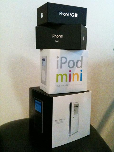
In our field, its easy to be swayed by trends. When Apples package design became the look to follow, and we were (and are) enamoured by the simplicity of design, many lesser products followed suit. We even tried it with a new product line at my job. The packaging looked amazing. It even won awards! But it failed to sell. It wasnt representative of our look, our heritage, or our brand. It wasnt authentic. 
Authenticity is something that can not be faked. The VPX packaging was full of brand violations that have been enforced for ages, and took away the traditional application shots as well as feature and benefit callouts that generally fill all the white space on the packaging of any Black & Decker product. 

In a session called What Consumers Want at a TED Conference, Joe Pine summarized three rules to follow regarding authenticity. (the video doesnt take long to load, but it is almost 15 minutes)

  1. Dont say you are authentic unless you really are authentic. 
  2. Its easier to be authentic if you dont say youre authentic. 
  3. If you say you are authentic, you better be authentic. 
This all may seem obvious, and it should have been obvious to us, but we missed it. 

This came to mind when I was running through ideas about the poster series we will be working on later this semester. I have my director in mind, and I hope I get him, but he has such a unique and specific look and feel to his work, that I already have the rough sketched out in my mind of what the posters should look like. It wont look like his movie posters or the covers of his DVDs, which each authentically represent his films, but it will feel like him, like his cinematography, and hopefully will be recognizable as a series of his work even from a great distance. 

It may not reflect my personal design style, but what better chance to stretch out of our comfort zone as designers than in a class like this?


Thursday, September 1, 2011

Museums, Baseball and design.


After discussing the first project further in class Wednesday, I immediately thought of what I felt was a similar project. I think this may also be where I go with my idea for the first project. Over the summer I went to Copperstown, home of the baseball hall of fame. (Don't worry, this isn't all about sports) I had been there prior and was a little less than impressed. It felt like a fairly dated museum in all honesty. This trip was quite a bit different.

It just happened to be the opening of new exhibit; “One for the Books: Baseball Records and The Stories Behind Them.” If there was ever a change of pace in a museum, it was this. Most of the exhibits in Cooperstown are fairly “normal.” Look it's an object, here is some info. Move and Repeat. The design is fairly minimal and pretty boring.

As you can see from the photos above, this exhibit seems to be changing things. They began using fun typographic treatments not only in the program guide but also in the exhibit itself. It really made for an all encompassing presentation.

And if it wasn't enough to use good design they added a few interactive elements as well. The main was a large tower in the center of the exhibit. Within it was every number and stat a baseball lover could ever hope to investigate in a digital format. The amount of information in this tower could probably fill ten Cooperstowns, but by embracing technology and digital solutions, they have made the information easily accessible. Furthermore, they had small touch screen kiosk that had a trivia game on it. Again using technology wisely.

All in all, I was very impressed with the exhibit. It made to happy to see good design applied to sports in a meaningful way. I look forward to everyone thoughts and I apologize for the bad pics, there was no photography in the exhibit during the first week. You can find links to a little more info about the exhibit here and here.