Friday, September 6, 2013

Dance or Type?

The first time I watched this, I could only see the dancing.


 The second time, I can only see Typography.


Thursday, September 5, 2013

Re: Flat out loud

My first instinct was to lean towards skeumorphism, simply because I enjoy it, even when it is a bit campy like the faux wood on an old station wagon. However, after reading Nathan's post, I found myself more torn. His point about fighting skeumorphism if it's not perfectly to his taste is extremely valid and a great way to approach this debate. If knowing your audience is so important, isn't every designer taking a risk when using skeumorphism. It's impossible to design for your entire audience.
There are always going to be a few stragglers who do or don't know what an 8 track is. That's not to say using it is such a bad idea, but it should certainly be used appropriately, with your audience at the forefront of that decision.

I found a great article at uxmovement.com that outlines good and bad uses of skeuomophic design. It helped me to understand some of the reasons you would want to use it and reasons you should leave it behind. The author "anthony" points out: "Skeuomorphic design is useful when the functionality of an interface mimics a real-world object....For example, this eBook reader interface allows users to turn pages by swiping the screen....Poor uses of skeuomorphism are found on interfaces that only look like, but do not function like the real-world object it’s mimicking."
skeuo-pagecurl
Although, I have to admit, I still like the skeuomorphized calculator in lieu of the flat design. But I totally agree that the fake paper in notes on the iphone  is tacky and doesn't add anything of value to the experience.
http://uxmovement.com/wp-content/uploads/2013/07/skeuo-calc.png

So I come away from this debate as an advocate on both sides. Like Tracy said in her post, "it just depends on the context of the design." I don't think you should use skeumorphism if it's going to clutter the layout, but if it makes sense for the design and your audience, why not?

Wednesday, September 4, 2013

Re: Skeuomorphic design vs. Flat Design


I'm digging flat design! I still own an original Nintendo and my eyes can't stand the 3D "realism" of those new video games those kids are playing nowadays!

Click on the image for an interesting article on converting skeuomorphic design into flat design.

Tuesday, September 3, 2013

Re: FLAT out loud: Flat Design versus Skeumorphism?

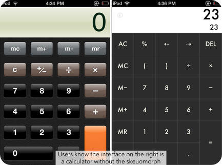
The more I think about this topic, the harder it is for me to write down my thoughts on it. Flat design on skeumorphism? Crunchy peanut butter or smooth? Toilet paper facing inside or out? Mac or windows? The list goes on and on...or so I thought. When I first read Shirley's post and began thinking about which style of design I prefer, I immediately thought I was a flat design type of girl. I am drawn to clean crisp features in a design, nothing so extreme as to cause any chance of confusion (at least when I am looking at designs, I tend to overdo when I am working on my own first drafts). But as I started researching I found my division between the two styles is not so clear. I too found the article Antoinette sited (Flat Design: An In Depth Look), and I was on board, that is until it got to the "Buttons" section.

As stated both design styles work (Windows created an entire phone line with "flat" buttons), but over and over again I find myself adding those skeumorphic features, the gradient, the drop shadow, the shine, to my web buttons.

Nokia Lumia 1020
After some thought I have come to the conclusion that it just depends on the context of the design. I think you need to know about the goal and overall look of your design before you can choose the style: flat or skeumorphic. With the Windows phone, the entire screen is a grid of buttons. There is no need to make them anything but flat because it would feel too cluttered. To have 12 buttons "popping" out at you on one 4.5 inch screen is more then overwhelming. However, when I design web buttons, the button is usually intertwined with a slew of information. The small rectangle needs to stand out on the page somehow.

Then there is print advertising. I have noticed that a lot of the debate between flat design and skeumorphism comes when talking about designing user interfaces, but why is skeumorphism "tacky" on the web and not in a magazine? Is it because the paper the skeumorphic ad is on is tangible like the design visual? A computer screen and phone screen were initially made for looking (let's not get into the new touch screen fad). Ones initial instinct is not to reach out and touch the screens wooden "texture," but a magazine page or poster has that possibility. I like the advertisements that you have to touch because they are so life like you do not know if it is actually textured or and illustrated texture (as long as it does not take away from the message). I also like the advertisements that are clear and right in your face. Again, the side of the line I stand on is a bit wobbly; I am a smooth peanut butter girl, unless I dip into it with just a spoon - you have to spice it up once in a while.

Re: FLAT out loud: Flat Design versus Skeumorphism?

Funny you should mention Apple and iOS7, because they've got some weird things going on with flat design versus skeuomorphism. If I remember correctly, they're abandoning a lot of the shiny, "lickable" style in the icons and such, going for a flatter, matte style. I also seem to recall that they're getting rid of decorative details like the "spine" in the address book. But at the same time, they're adding in new pseudorealistic elements like icons that tilt in simulated 3D when you move the device.

My main problem with skeuomorphic design is that I often want to fight it if it's not perfectly to my taste. I don't necessarily want the style of a 1950s notebook, or a 1990s address book. What if I'd prefer, say, a 17th century ship's log? Why can't I have that, if the differences are purely aesthetic? I'd rather have a purely functional flat design that forces me to take or leave it.

Of course, for my money, the ultimate in flat design is the LCARS interface from Star Trek: The Next Generation. It's the 21st century; why don't more things look like this?

Basic LCARS Design Guidelines
LCARS Standards Development Board

RE: FLAT out loud: Flat Design versus Skeuomorphism?

I definitely prefer flat design over skeuomorphism (thanks to Shirley's post, I now know this term). I have always considered myself a minimalist in training so that is probably why. Also, flat designs  use saturated, pure colors which appeal to my aesthetic.

I agree with Antoinette that they flat design makes it easier to zero in on the intention/action of the design. (thanks for posting that great article!) The less visual clutter there is, the quicker a reader can decode the message.

Here is a BBC article I found on the topic of skeuomorphism: http://www.bbc.co.uk/news/magazine-22840833.  It is interesting that words are also considered skeuomorphism. Taken directly from the article:
"Skeuomorphs are not strictly something that can be designed," he says. "They occur unintentionally when aesthetic styles are inherited without thinking."
Motors were originally placed at the front of cars because horses pulled carts from the front, he says. The word "horsepower" is itself a skeuomorph, remaining long after the horses had disappeared.
While some may think flat design is a trend, the redesigning of icons that no longer make sense is a necessity. For example, take the cassette tape. Today's youth barely know what a cassette tape is, so why would it make sense to keep that icon to symbolize music. While it is sad for my generation (or maybe just me) to see most of the technology I grew up with die off (vcr, cassettes, cds, etc), it is a reality that we can no longer avoid.

Monday, September 2, 2013

FOLLW UP: FLAT out loud: Flat Design vs. Skeumorphism?

When I read this post, I immedietly gravitated more towards Flat design than Skeumorphism. I believe there's something compelling about flat design; its simplicity and clarity draw my attention and forces me to take in whatever is on the page. Much like its definition, flat design is smooth, even, and I would argue against referencing it as dull or boring. Maybe I don't gravitate towards skeumorphism as much because my brain has to work harder at decoding the message due to the various colors, patterns, and other visual elements on the page. I know that not everyone views the world through the same lens and as such, some people may enjoy skeumorphism because it's not "flat" and can compete with other visual and verbal messages from any other medium. However; in this age of visual overload I believe the simplicity of flat design stands out more than skeumorphism.