Sunday, September 9, 2012
Re: Enroll UX 2014: User-Friendly Design
I personally think it is great to have user friendly sites. It's a pain when even people who are technologically savvy have to search for days just to find something simple on a website. Many people believe that you have to forfeit design in order to make things user-friendly, but in the case you have shown us-- a clean, well organized website still has a great design feel to it. Considering the audience in which this website will be used by, although I may be wrong, many people on medicare and medicaid are much older. They aren't as technologically savvy, have a hard time seeing, don't understand what buttons mean what, etc. Looking at the prototype, the font is larger, clean lined, and consistent with branding and colors. Yes, it represents a healthcare website and you can't go overly crazy with creativity, but the organization and simplicity of it will lead to its success. I think you and your team did a great job and hopefully this will make the lives of all these people, as well as yours, a lot easier.

Thursday, September 6, 2012
RE: First! A Note on Authenticity!
After watching the video from the Technology, Entertainment, Design
conference, the statement that stuck with me was that a cup of coffee costs
only two to three cents as a commodity, but is inflated to a few dollars or
more as a good. What I remember from my college barista days is that the
espresso machines used to make lattes and cappuccinos – and the blenders used
to make smoothies and frappuccinos – were much more costly to purchase, repair
and clean than the coffee makers. It was much quicker for me to pour a cup of
the house blend than brew a double espresso to be added to steamed or frothed
milk. I knew that a tall, regular coffee costs much less than its disposable,
logo cup.
Joe Pine speaks about authenticity and experience. It is undeniable
that the relaxed ambiance of a dimly-lit coffee shop with comfortable seating and
modern packaging increases the price of what is essentially the same product
sold at twenty-four hour convenience store. I liked the point he makes that an experience
cannot be inauthentic. Even if consumers visit a chain restaurant in a shopping
mall pretending to be an authentic Mexican taqueria, their experience is still
real. And it is this experience of going to the colorful venue, being greeted
by friendly servers and receiving bottomless nachos and salsa that turns
inexpensive – albeit time-tested and crowd-pleasing – goods into profitable
commodities.


Enroll UX 2014: User-Friendly Design
My day job is at a health care non-profit in Washington, DC. As you can imagine, it's been a wild four years for us, as the Affordable Care Act was introduced, passed, and then ultimately upheld by the Supreme Court. As a result of the law, millions more people will be eligible for Medicaid and millions of people will be eligible for tax credits to buy insurance in state health care exchanges (basically marketplaces). In addition, people in the private market will use these exchanges to sign up for individual plans if they don't get insurance through their job. Each state is responsible for setting up these exchanges and getting people who are eligible for the available programs enrolled.
Previously, the enrollment process for health care products has been a jumble of papers. To apply for public programs in states, there are different forms for each program, they require different documents from the applicant, and the process can be long and drawn out. This process will simply not be feasible moving into a post-2014 Affordable Care Act world (when the law is fully implemented and exchanges open and millions more people will be eligible for Medicaid).
Using new technologies (or not so new, like computers...) states will be able to streamline their application processes. Instead of having to know which programs to apply to and apply to them all individually, there can be one online form for all the programs available in the state, for example, and from that form, the applicant will find out which programs they are eligible. The exchanges also need an interface that allows people to compare plans, submit documents, and enroll in insurance plans.
So, a partnership of between the Centers for Medicare and Medicaid Services (CMS) and eight national and state health foundations sponsored the Enroll UX 2014 project. They hired the design firm IDEO to come up with a user interface. What they produced is a great example of human-centered design that is a pretty solid beginning of a new way of thinking about enrollment. It includes both the public and private plans in one place, so people don't have to worry about which office they need to talk to about this or that program--they just go to this online marketplace. I think it's pretty cool, but I'm a health care nerd.
The interface is incredibly easy to use, with one minor caveat: I don't like how the previous item moves up when you submit it. It seems like an unnecessary animation, and if you are filling out this form for like an hour, that is probably a little bit straining on the eyes and stomach. But moving on to all the things I do like about it: The language isn't that wonky stuff you usually read when trying to sign up for health care plans--it's clear, simple, and concise. They introduce each section with explanations of what you will do in the section. The typography and layout make it easy to know what to read, what to click, and what to fill out. They also tell you the estimated time you will need in order to complete each section, where you are in the process, and where you still have to go. This gives the online form an environment and lets the applicant feel like they are making progress. It also reduces paperwork issues by allowing applicants to submit documents electronically by taking pictures (has anyone been depositing checks this way as of late? LOVE IT) or finding an electronic copy on your computer. There's more, but you should just check out the prototype yourself!
Here is a video that you may find boring, but explains the process:
Some things to respond to if you couldn't care less about health care forms: Are there other online designs that you know of that are (or you anticipate they will) make life easier? Are there things that haven't yet, but would, greatly benefit from this type of treatment?
Previously, the enrollment process for health care products has been a jumble of papers. To apply for public programs in states, there are different forms for each program, they require different documents from the applicant, and the process can be long and drawn out. This process will simply not be feasible moving into a post-2014 Affordable Care Act world (when the law is fully implemented and exchanges open and millions more people will be eligible for Medicaid).
Using new technologies (or not so new, like computers...) states will be able to streamline their application processes. Instead of having to know which programs to apply to and apply to them all individually, there can be one online form for all the programs available in the state, for example, and from that form, the applicant will find out which programs they are eligible. The exchanges also need an interface that allows people to compare plans, submit documents, and enroll in insurance plans.
So, a partnership of between the Centers for Medicare and Medicaid Services (CMS) and eight national and state health foundations sponsored the Enroll UX 2014 project. They hired the design firm IDEO to come up with a user interface. What they produced is a great example of human-centered design that is a pretty solid beginning of a new way of thinking about enrollment. It includes both the public and private plans in one place, so people don't have to worry about which office they need to talk to about this or that program--they just go to this online marketplace. I think it's pretty cool, but I'm a health care nerd.
The interface is incredibly easy to use, with one minor caveat: I don't like how the previous item moves up when you submit it. It seems like an unnecessary animation, and if you are filling out this form for like an hour, that is probably a little bit straining on the eyes and stomach. But moving on to all the things I do like about it: The language isn't that wonky stuff you usually read when trying to sign up for health care plans--it's clear, simple, and concise. They introduce each section with explanations of what you will do in the section. The typography and layout make it easy to know what to read, what to click, and what to fill out. They also tell you the estimated time you will need in order to complete each section, where you are in the process, and where you still have to go. This gives the online form an environment and lets the applicant feel like they are making progress. It also reduces paperwork issues by allowing applicants to submit documents electronically by taking pictures (has anyone been depositing checks this way as of late? LOVE IT) or finding an electronic copy on your computer. There's more, but you should just check out the prototype yourself!
Here is a video that you may find boring, but explains the process:
Some things to respond to if you couldn't care less about health care forms: Are there other online designs that you know of that are (or you anticipate they will) make life easier? Are there things that haven't yet, but would, greatly benefit from this type of treatment?
RE: Authenticity
I, too, originally posted this in the comments section. Sorry Amy!
I think the argument of authenticity is based around your audience. The same people who are buying Macbooks might not be buying a bunch of home improvement tools. Apple's design appeals to a "young, hip" crowd. While I prefer this style of design, it doesn't appeal to everyone--because it is good looking, doesn't mean that it represents the product in the best way possible. I think it's hard for designer to acknowledge that something that they think isn't the best looking design might be the best for the particular product that they are selling. Like you wouldn't want some modern book cover on a romance novel--it wouldn't represent what was inside it and wouldn't give the clues to the person buying that that is what they are buying.
Marie, the Obama design issue is so interesting. These political campaigns have pretty much pitted two ideas of what America is and should be against one another. Mitt Romney was the one accused of being Mayberryish in his speech, but here's Obama pulling out some 1960s nostalgia in his campaign signs and materials. It might be because the campaign recognizes that it needs to appeal to older voters as well as younger ones. Last time, he appealed very heavily to his young base, and largely, we were the ones who got him elected. But many are deflated at this point and he may be less concerned with reaching young people this time around because they may not be as helpful. It's pretty amusing how you can read so much into one design. This is a particularly funny case, because they are kind of trying to elicit that old-timey feel, but it ultimately looks like the modern nostalgia thing that is going around, where it looks vintage, but it's not. So it may end up appealing more to the 30-something artsy types and not to the 50-60 year olds...
I think the argument of authenticity is based around your audience. The same people who are buying Macbooks might not be buying a bunch of home improvement tools. Apple's design appeals to a "young, hip" crowd. While I prefer this style of design, it doesn't appeal to everyone--because it is good looking, doesn't mean that it represents the product in the best way possible. I think it's hard for designer to acknowledge that something that they think isn't the best looking design might be the best for the particular product that they are selling. Like you wouldn't want some modern book cover on a romance novel--it wouldn't represent what was inside it and wouldn't give the clues to the person buying that that is what they are buying.
Marie, the Obama design issue is so interesting. These political campaigns have pretty much pitted two ideas of what America is and should be against one another. Mitt Romney was the one accused of being Mayberryish in his speech, but here's Obama pulling out some 1960s nostalgia in his campaign signs and materials. It might be because the campaign recognizes that it needs to appeal to older voters as well as younger ones. Last time, he appealed very heavily to his young base, and largely, we were the ones who got him elected. But many are deflated at this point and he may be less concerned with reaching young people this time around because they may not be as helpful. It's pretty amusing how you can read so much into one design. This is a particularly funny case, because they are kind of trying to elicit that old-timey feel, but it ultimately looks like the modern nostalgia thing that is going around, where it looks vintage, but it's not. So it may end up appealing more to the 30-something artsy types and not to the 50-60 year olds...
Wednesday, September 5, 2012
Re: Authenticity
I think that it is definitely true that was we feel looks good may not
necessarily be what is authentic. The same way someone posing as
something they are not would feel or look out of place, so would a
design.
If authenticity is something that helps define our personal style in design, I can definitely say I don't think I have found mine yet! I think if I am always designing for someone else in mind, rather than what I, myself, like, then it is difficult to nail down. It speaks volumes to me that I am not at that point. How does one come up with something authentic when there are SO many things to influence us?
ooo this is just too deep for me! :-)
Marie- that article on the new Obama campaign designs is absolutely on point- it seems off to me because it is completely devoid anything vivid. If last elections designs excited me and seemed fresh, then these seem to be completely the opposite- and not like him at all. Where is HE in these designs?
If authenticity is something that helps define our personal style in design, I can definitely say I don't think I have found mine yet! I think if I am always designing for someone else in mind, rather than what I, myself, like, then it is difficult to nail down. It speaks volumes to me that I am not at that point. How does one come up with something authentic when there are SO many things to influence us?
ooo this is just too deep for me! :-)
Marie- that article on the new Obama campaign designs is absolutely on point- it seems off to me because it is completely devoid anything vivid. If last elections designs excited me and seemed fresh, then these seem to be completely the opposite- and not like him at all. Where is HE in these designs?
Re: Authenticity
In your introduction I completely agree that with being in the design field it is easy to be swayed by trends. I feel the same way when dealing with design ideas as well. I can relate to your statement because I often find design work that I absolutely love and ask myself why didn't I think of that?
Although I know it is good to look at examples of something similar I may be designing it sometimes hinders me from thinking of my own ideas, so I tend to refuse to look at examples of a similar assignment sometimes.
Final thought: I think everyone has their own sense of authenticity. :-)
Although I know it is good to look at examples of something similar I may be designing it sometimes hinders me from thinking of my own ideas, so I tend to refuse to look at examples of a similar assignment sometimes.
Final thought: I think everyone has their own sense of authenticity. :-)
Billboards
I really enjoy creative billboards. What I like most about them
is their simplicity. All the best billboards are simple. Below I've added a
bunch of clever billboards and listed the various design aspects that make them
great.
Readability. The content is large enough to read from a distance. When you're traveling 75 mph down the highway, it's unlikely that you're going to be able to read a novel on a big roadside board – although, I have seen this done before. The best billboards seem to have minimal content. They’ll have a website or a slogan and they’ll let the image/graphic do most of the informing. Hierarchy plays a big role here as well.
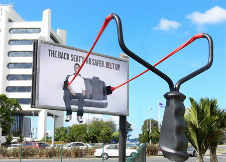


Sometimes billboards
only have a website listed on the billboard like quitplan.com. If you’re a
smoker and you want to quit smoking, this billboard tells you where you can go
to get help, but it's super simple.

Subscribe to:
Posts (Atom)