And here's where I get to my process being myopic. When I have an idea that I like, that I think is strong (and this is true both for my design work and my writing, where most of my experience is), I have real difficulty breaking away from that idea and trying something different. Which makes this course and its focus on process a bit daunting. But this course is probably also the perfect place for me to be at this point. After all, if I'm worried that my process limits my ideas, isn't a course that forces me to focus on that process (even more so than Words and Images did this past Sprint) just what I need?
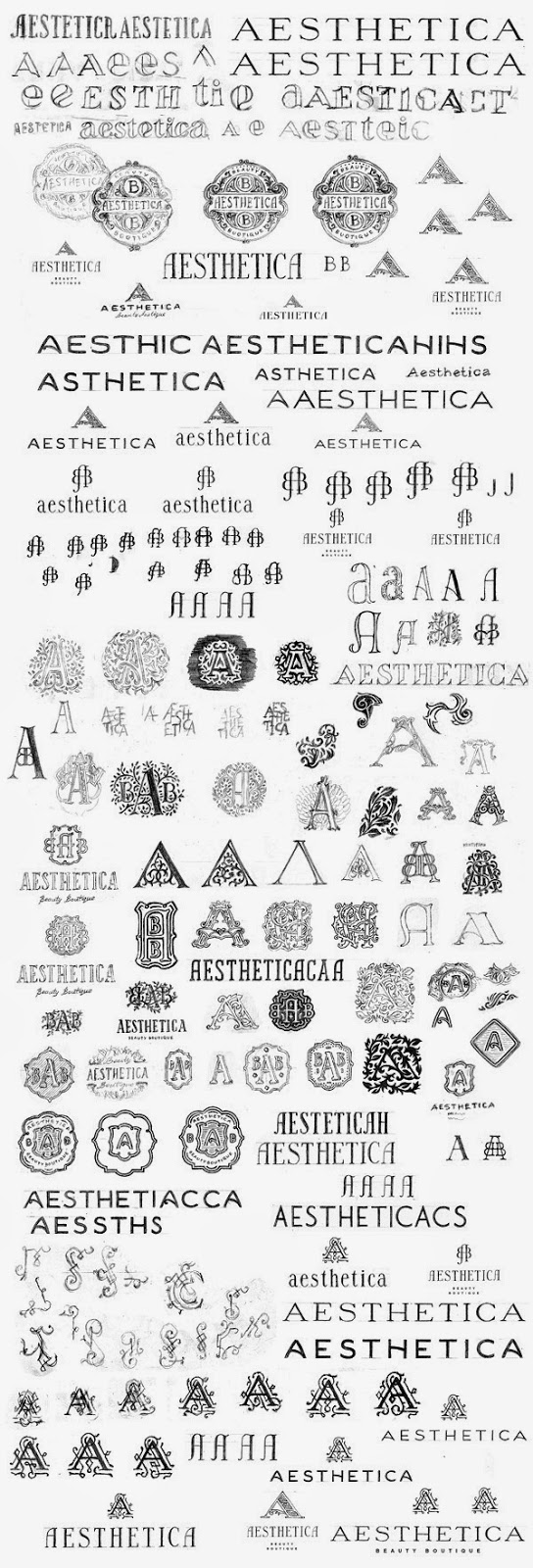
And this leads me to why I started the blog here with process--completely unsure of how to start us off, I of course looked at some design blogs, finding a few posts related to other designers' process. From this post on Graphic Exchange, I followed the linkage rabbit hole to the Behance gallery of a Russian logo designer named Pavel Emelyanov. And just look at the variety of ways he drafts his logos:
The Behance gallery (linked above and if you click the image) includes animated depictions of his process in creating various logos.
On David Airey's personal blog (he's the designer behind Logo Design Love), I came across this post, which is sort of about process, but more about experimentation, as it's titled "Keep Experimenting," and is accompanied by this awesome grass letter form by "design student Sarah Hanson":
What I found most interesting is this piece of advice that Airey quotes from Drew de Soto, a UK designer and author of What to Put in Your Portfolio and Get a Job:
I have no interest in the fact that you tried the name of a new brand for double cream in different typefaces. I am interested if you tried to write in cream, or grass, or whatever, and that led you to a certain type style or treatment.It seems like such a simple idea to try working in a different media. I'm used to working with pencil and paper and drafting out experimental type options before working with the computer, but I've never really experimented with found type or with creating type so organically out of a liquid, or out of food, or out of physical objects. And it's not that I necessarily think I'll do that this semester, because who knows whether it will be useful for my projects after just one night of class, but...it is useful to consider what other techniques for experimentation I haven't thought about.
So, here's my question(s) to you, in case you want a place to start your reply:
- How are you feeling about your process?
- What designers' processes have you come across that you admire?
- What techniques for experimentation do you use/have you used that take your work somewhere unexpected or interesting (even if the ultimate design was different)?
- If you're like me and sometimes find you've limited your own ideas, how do you break out of that?


1 comment:
Thanks for linking to Emelyanov's gallery, that draft pic is really helpful!
Post a Comment